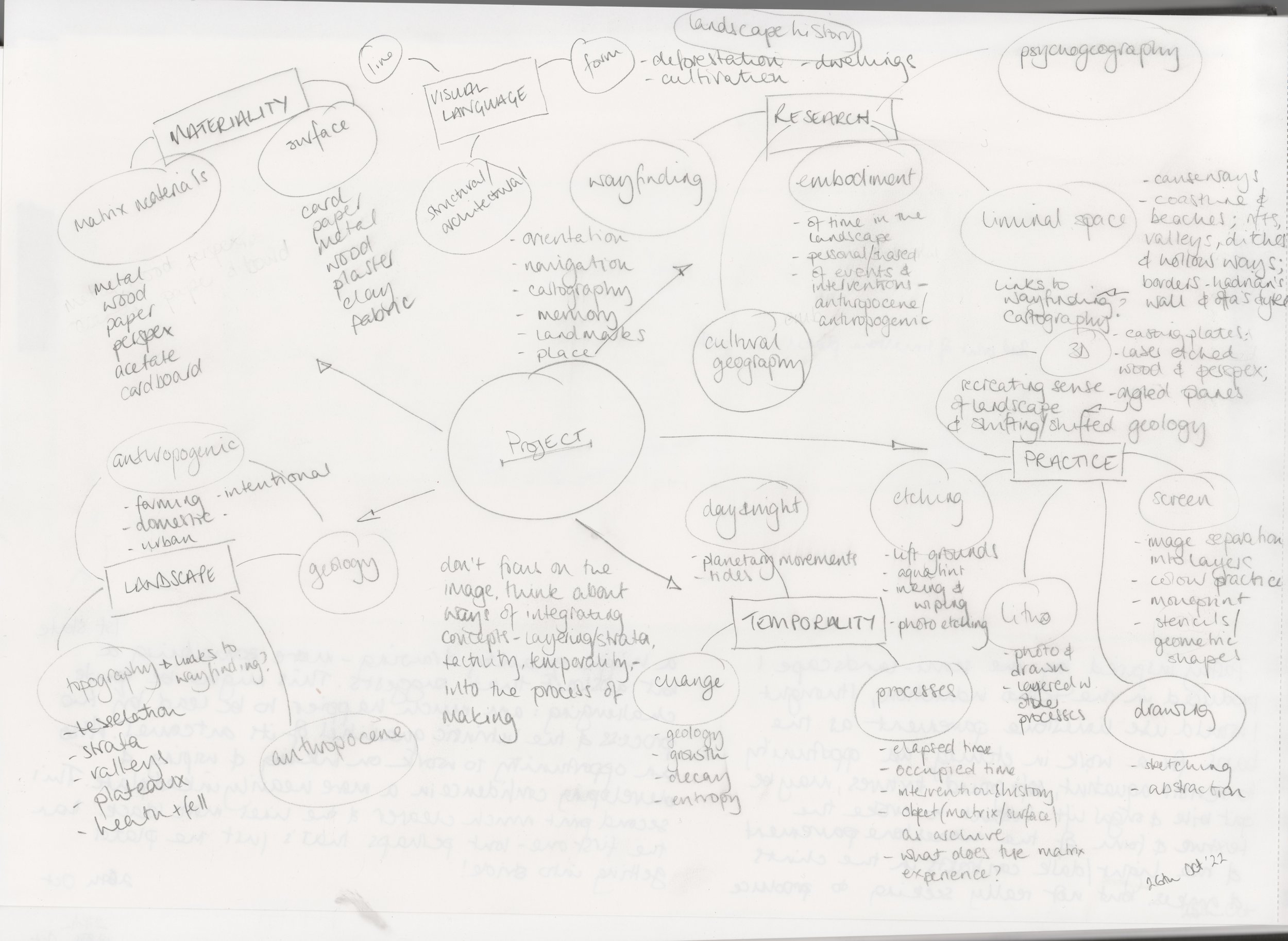
practice
resolved works
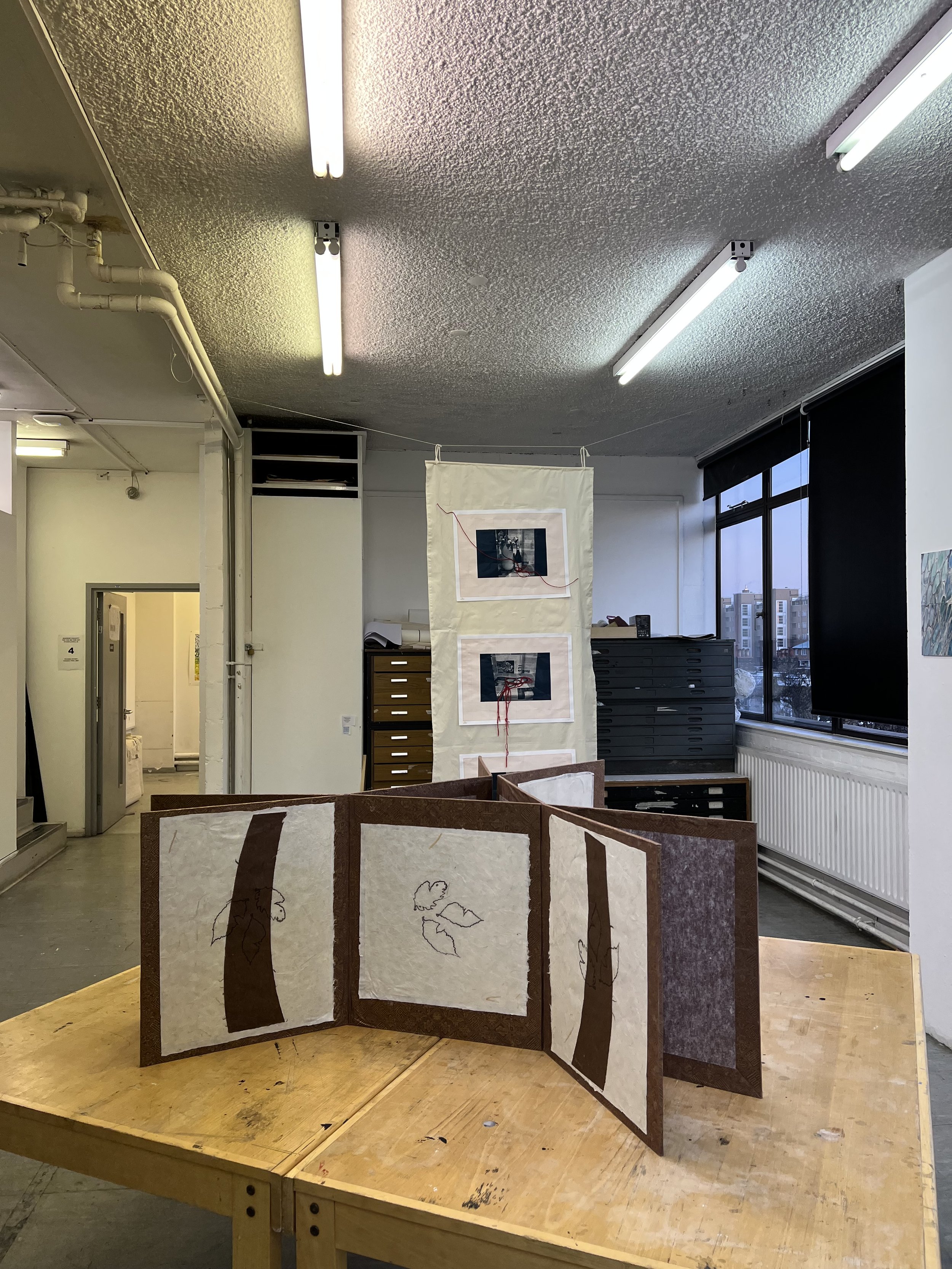
pop up show
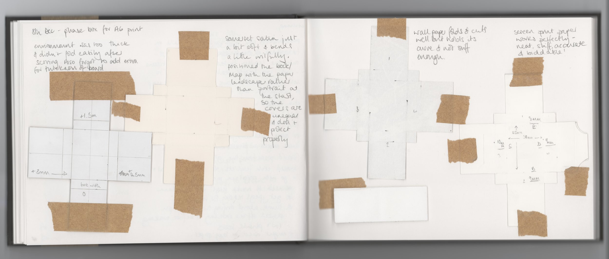
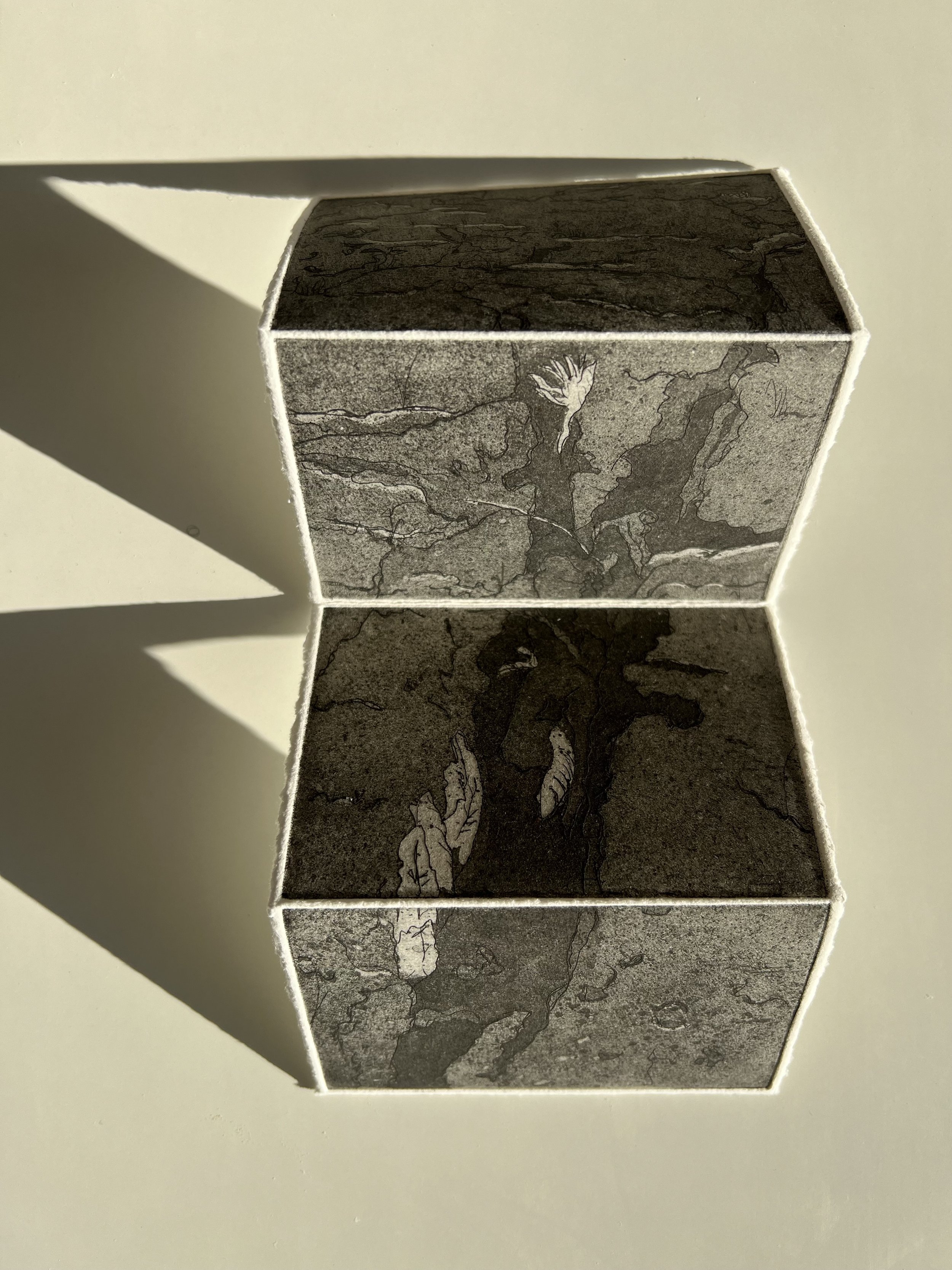
phase boxes
etching
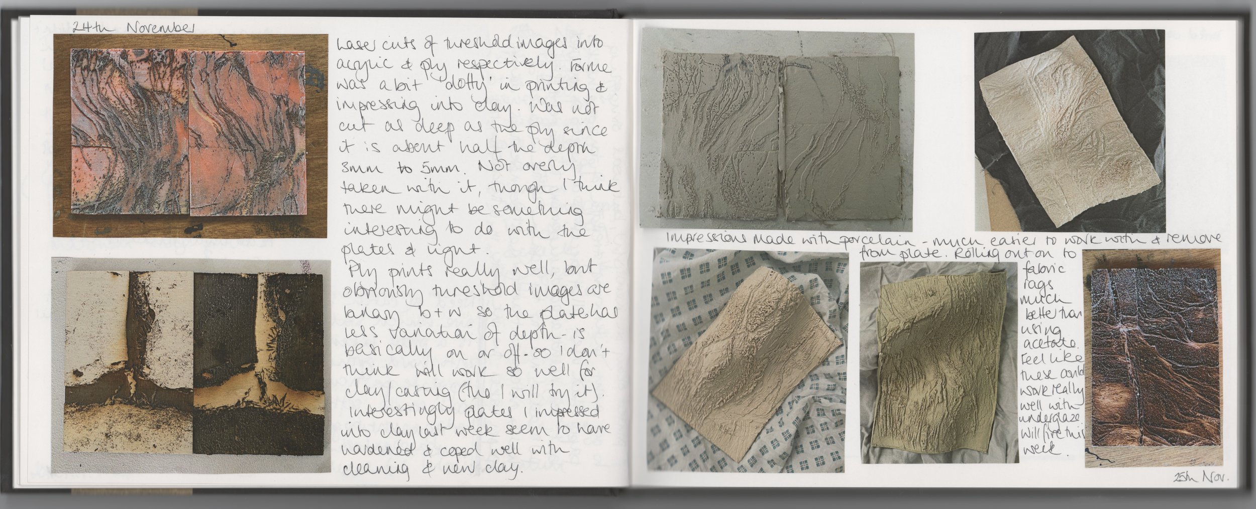
laser cutting
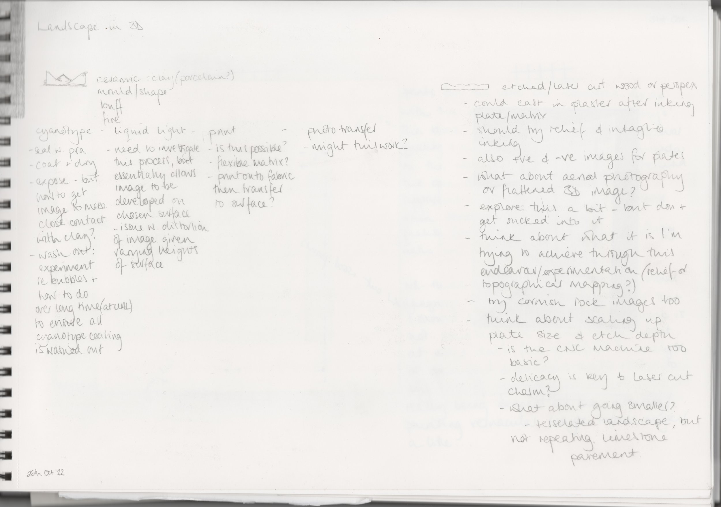
ceramics
lithography
relief print
sketchbooks/notes
resolved works
Ferns, Clints & Grykes, 2022
laser etched intaglio print on Somerset Velvet paper, 20x28cm
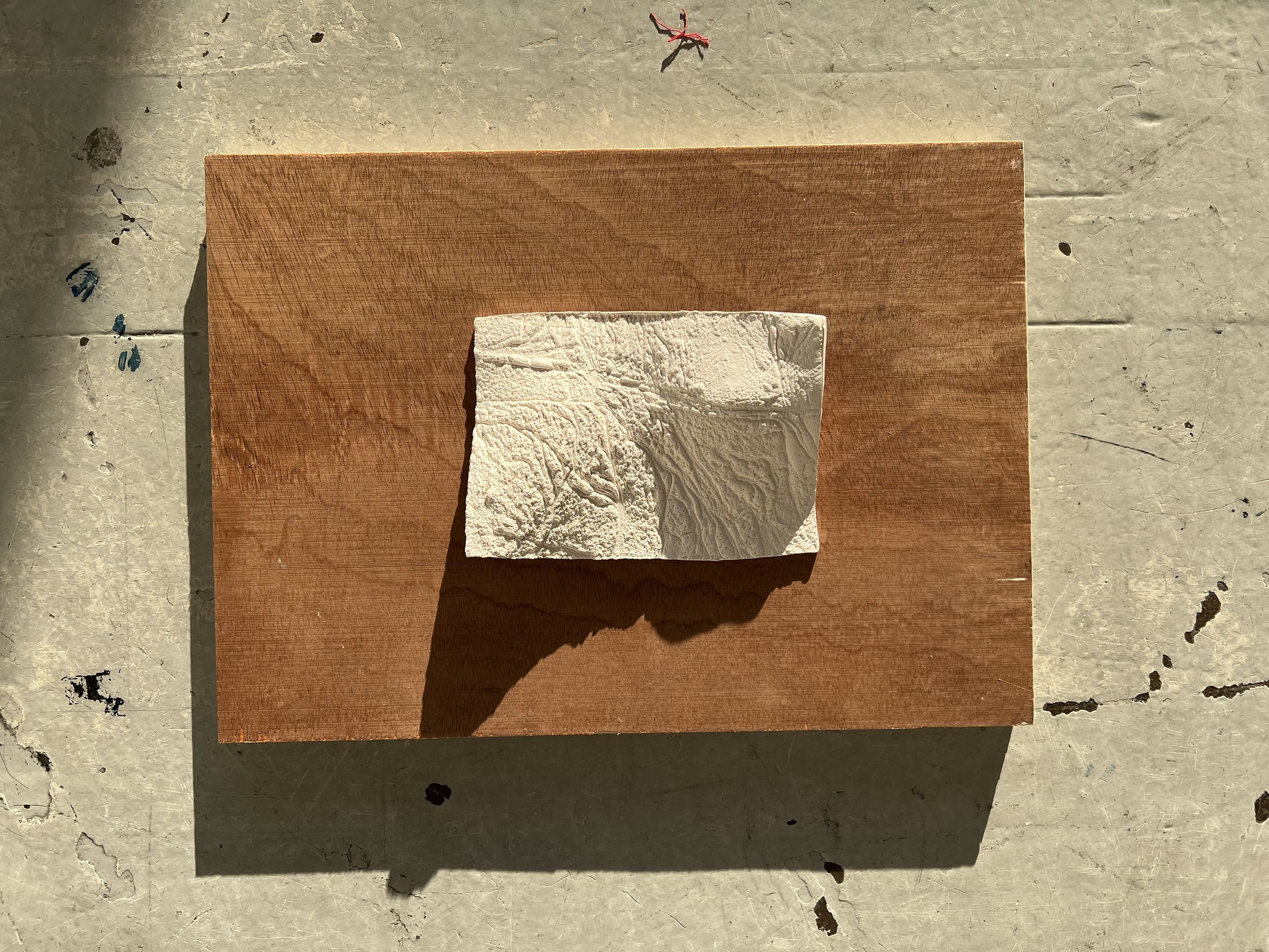
Portscatho Beach, 2022
fired, unglazed porcelain, 9.5x13.5cm
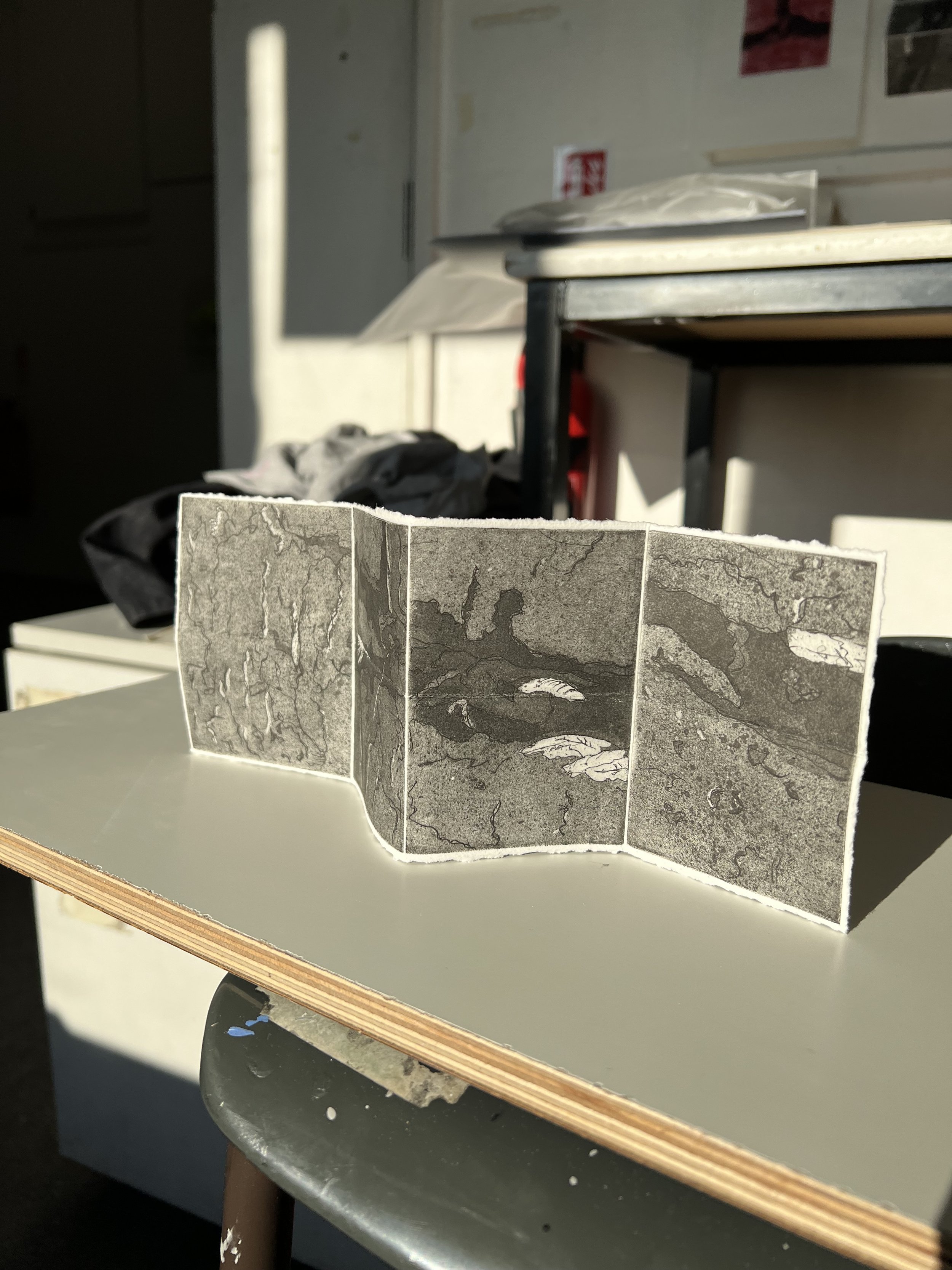
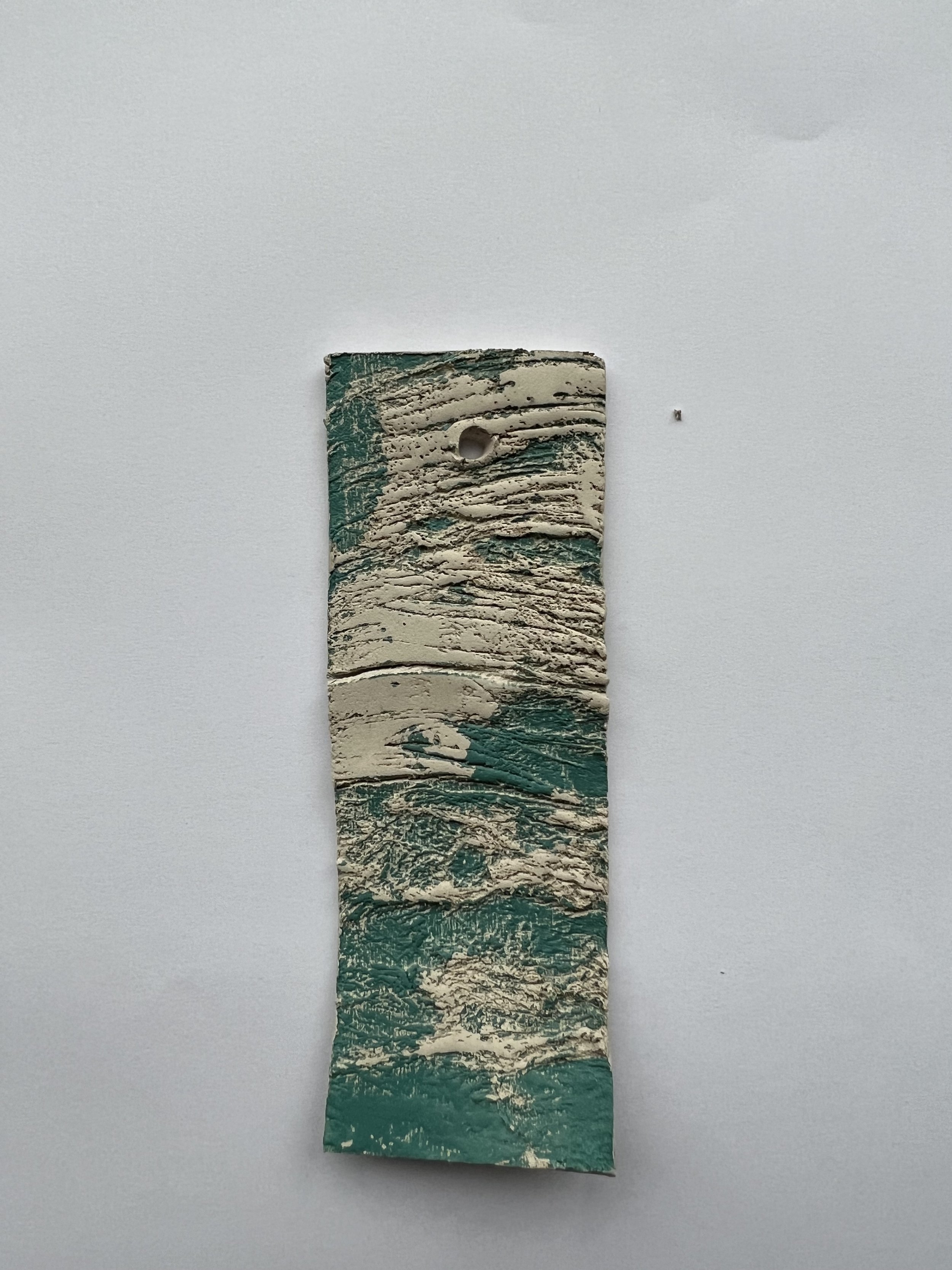
Last Walk With Dad, 2022
screen-printed phase box (3x4cm closed), clay fragment (2.5x3.5cm) , photo transfer intaglio print on Awagami hosho paper (11x15cm)
untitled, 2022
glazed porcelain and ink, 9.5x13.5cm
untitled, 2022
glazed porcelain, 9x13cm
untitled, 2022
glazed porcelain, 9x13cm
Ferns, Clints & Grykes, 2022
photo transfer lithograph on Somerset Satin paper, 29x 42cm

untitled, 2022
laser etched collagraph print on Hahnemühle Etching paper
29x38.5cm
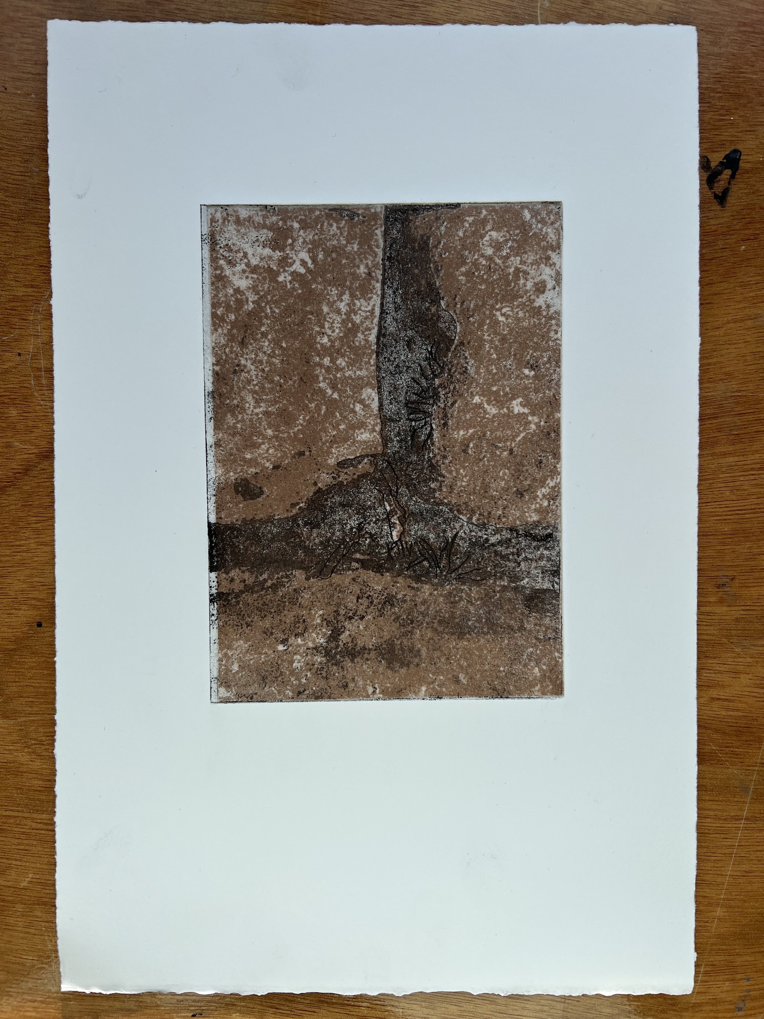
Ferns, Clints & Grykes, 2022
laser etched intaglio print on Hahnemuhle etching paper, 20x29cm
Morning Light at Romy’s, 2022
photopolymer etching on Somerset Satin paper 19x29cm
untitled, 2022
glazed porcelain and ink, 9.5x13.5cm
pop up show - 15th December 2022

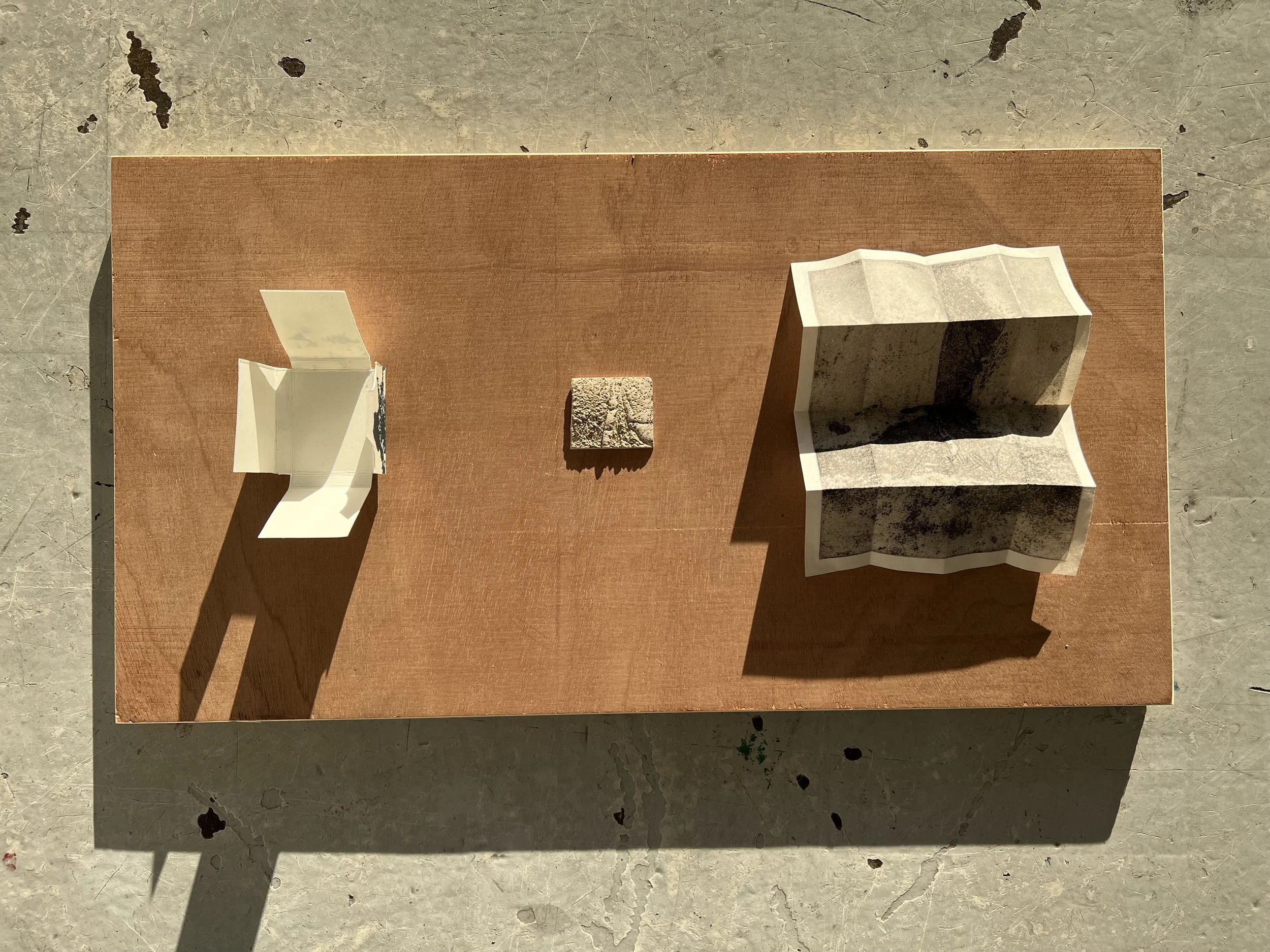


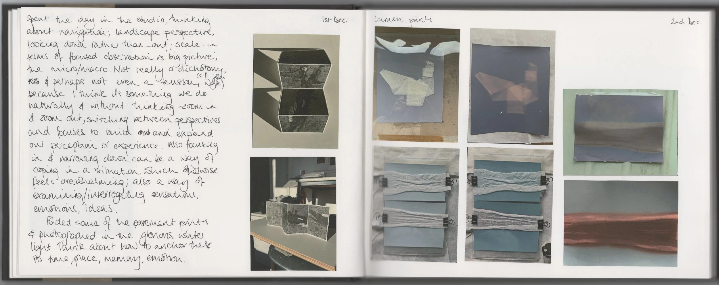
I felt that my ideas were starting to coalesce around a more coherent concept, that brought together broad themes of landscape, memory, scale and portability. Discussions with classmates and second years had me reflecting on the habit many of us have of picking up and taking with us a small memento of a place – a shell or pebble – and, perhaps, worries about the unreliability and fragility of memory. I wanted to find a way to protect or preserve a memory of a particular place, time and, in this case, person that I could ostensibly put in my pocket and carry with me. Last Walk With Dad memorialises the last ‘proper’ walk we did together before his death in 2021, containing within it images of the location, a map of the walk and a physical memento; I wanted it to feel intimate, but also to evoke a sense of recognition in the audience – of love and perhaps also loss, of the importance of place to our memories, of the physicality of being in the landscape and how memories come into being. Portscatho Beach is a less portable iteration of the same idea: essentially, the physical representation of the memory of a specific place and time that is significant for me. I felt I’d achieved what I had intended with both pieces - they look interesting, invite engagement and provoke curiosity; I was pleased with their presentation which I felt would be effective in ensuring the could compete for attention with so much other, much larger, works, as well as suggesting something almost theatrical in their staging.
phase boxes
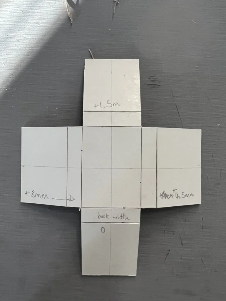
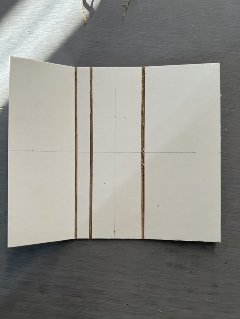
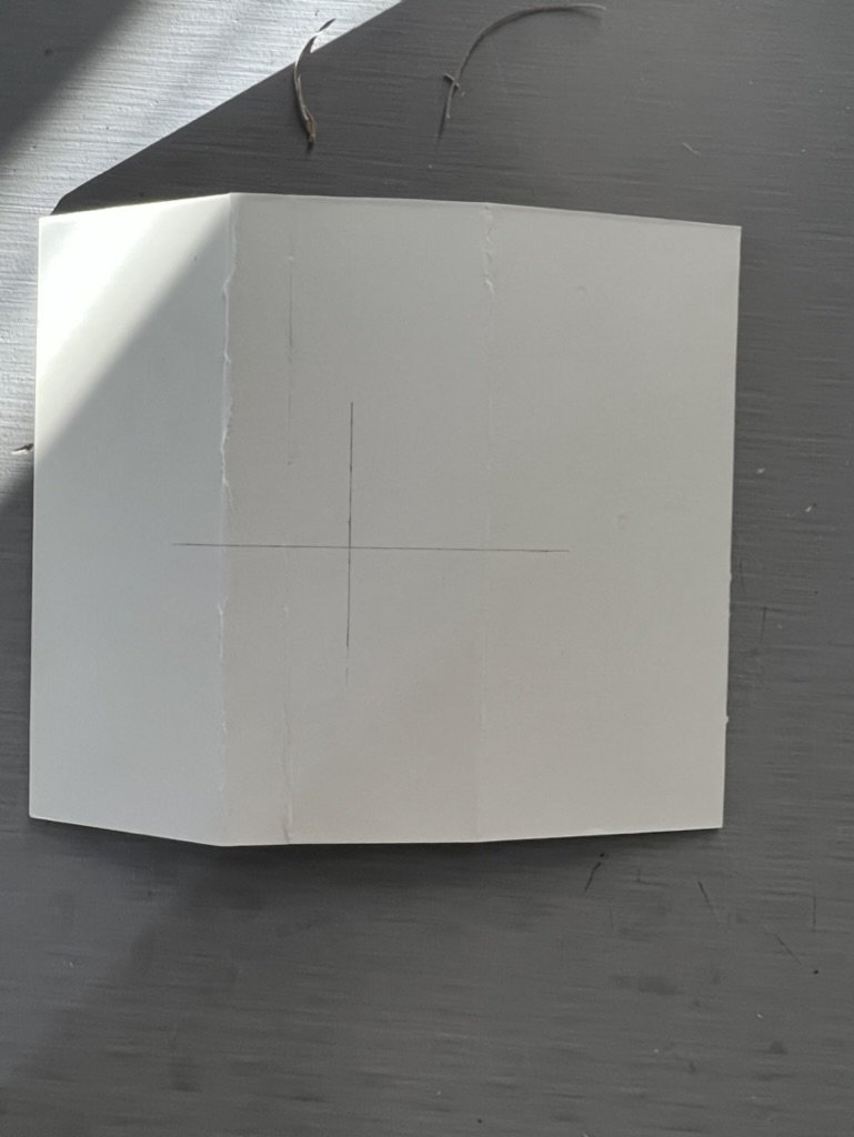

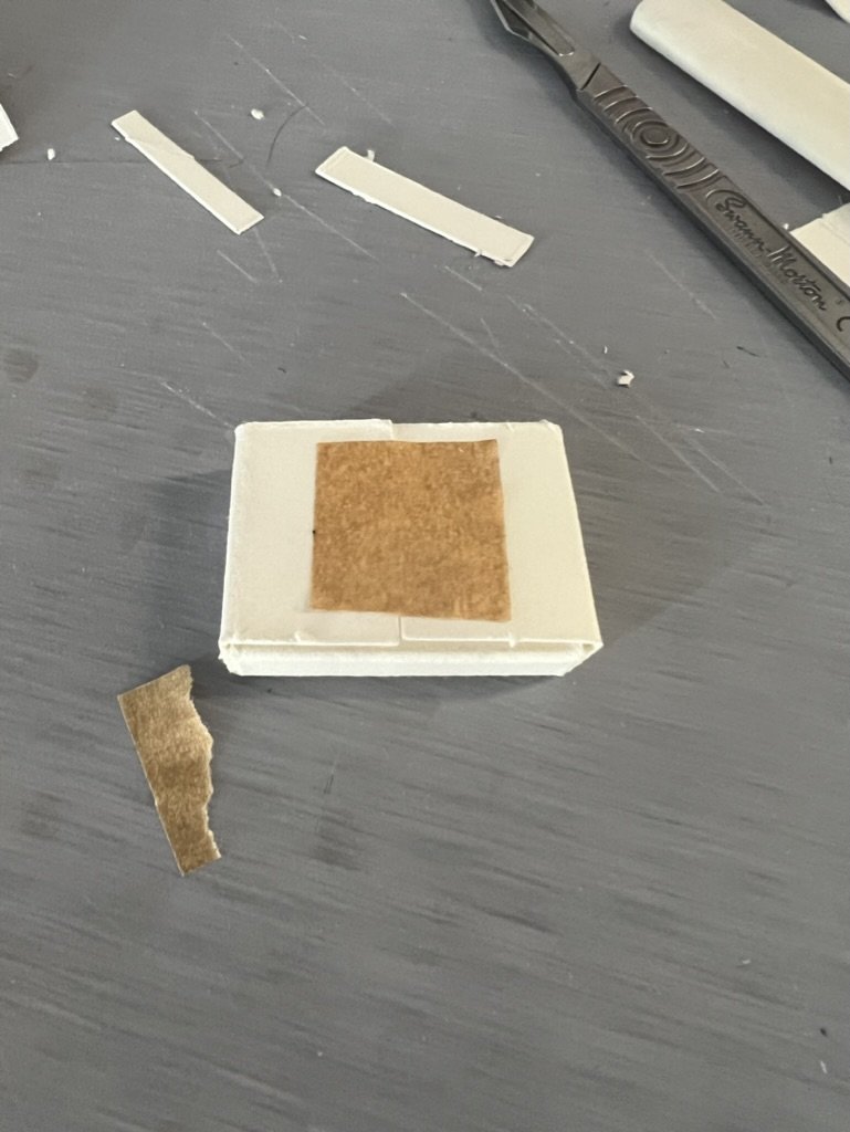

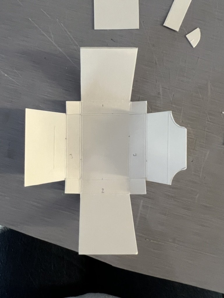

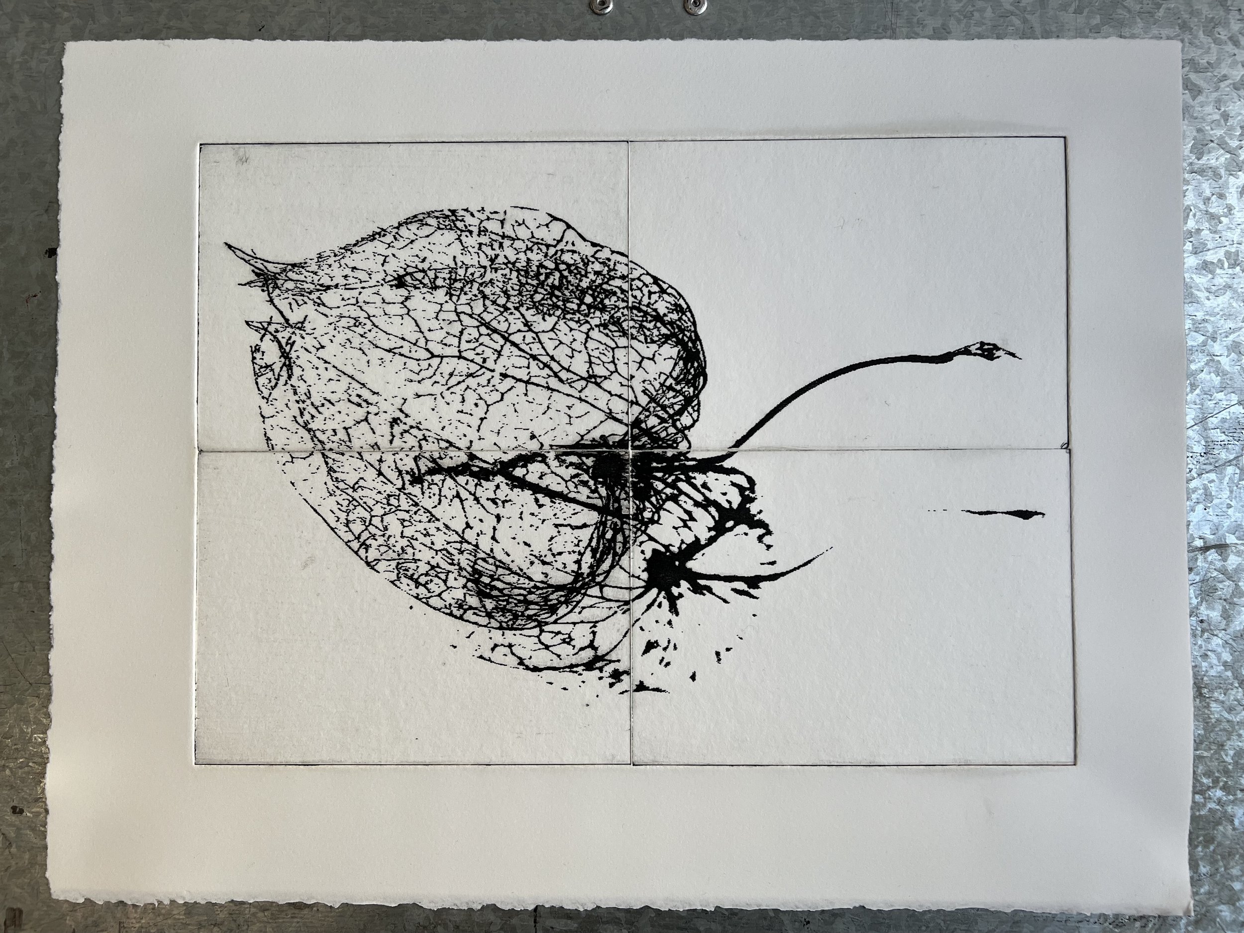
These are temporary housings for rare or fragile books that conservators make very quickly and use for protection while items are waiting to be repaired or whatever is the next phase in their conservation. I came across these when looking for ways to make a simple box in which to contain a fragment of memory and make it portable. The element of temporality in their name appealed to me, as did their utility in preserving and protecting. They are also known as five-minute boxes, as the skilled conservator can make one up in that timescale - it took me 4 hours to produce the first, complete and working version! I found material to be key: the environmount I tried first didn’t work because it was too bulky at the scale I was working and the lamination made it quite fragile; Somerset Satin was too soft and too thick to bend well; wallpaper folded well but wasn’t sufficiently rigid. The screen print paper is what worked in the end - it cuts and folds well, is sufficiently rigid but not too thick. That this paper was the best option for my ‘pocket memory’ led me to make screen prints of some of the limestone pavement images - put through the threshold adjustment on photoshop to make them simple black and white - from which I then made the box for the pop-up show.
Key words: temporality, intimate immensity
etching

hard ground etching

second state with aquatint for tone

sugar lift process

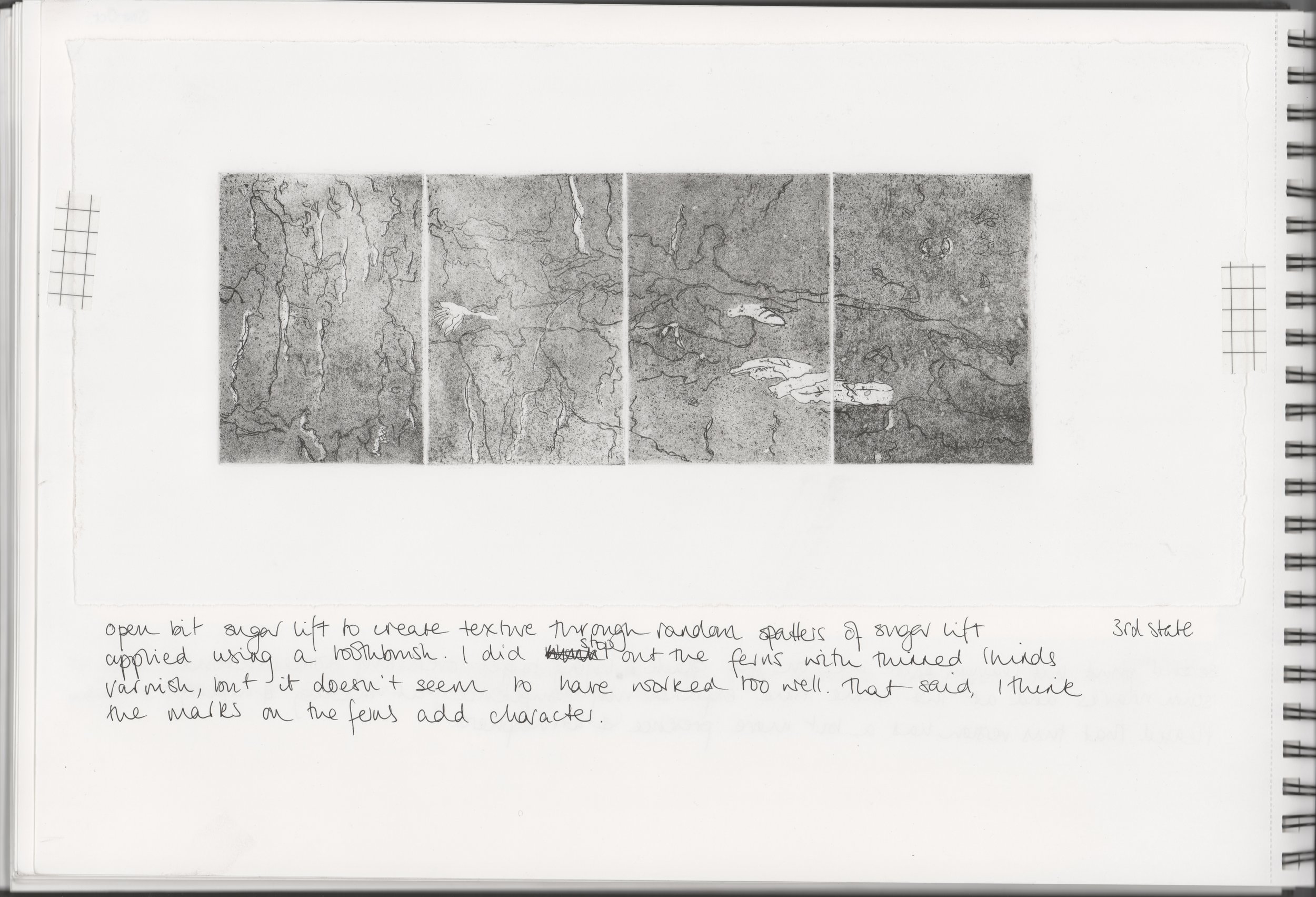
3rd state with sugar lift

4th state with second aquatint

5th state with second sugar lift

after a second sugar lift to add tone

6th state with hard ground drawing to add detail
introducing folds to move into 3D
experimenting with folds and sunshine

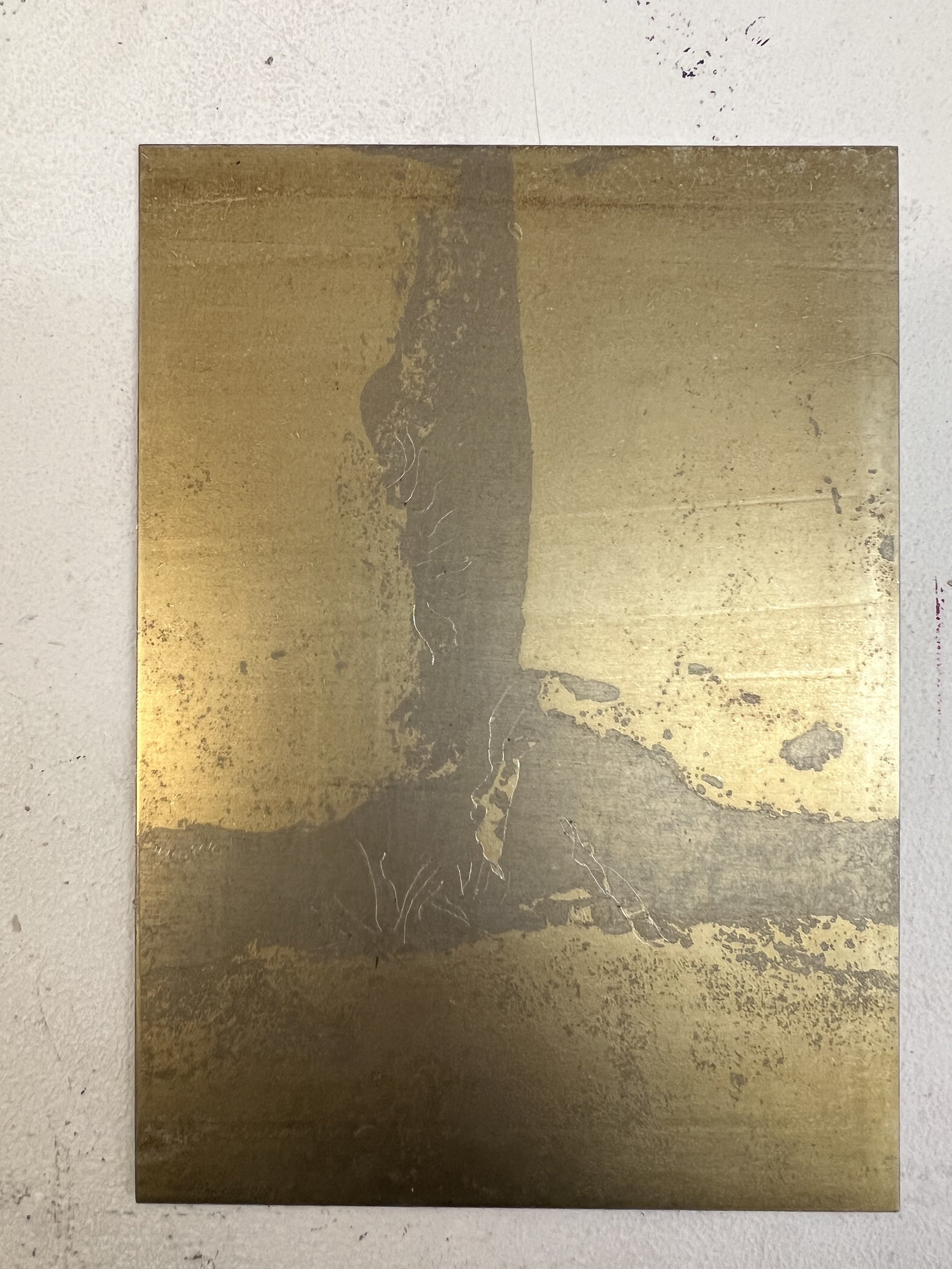
photo transfer on to zinc
the negative that resulted

a second attempt which produced a positive image
positive plate with hard ground to add deawrn detail

plate in acid

2nd state after etching
two colour print made using photo transfer plates

environmount laser etched plate
environmount laser etched plates - starting to think about scaling up

inked environmount plates ready to print
resulting print
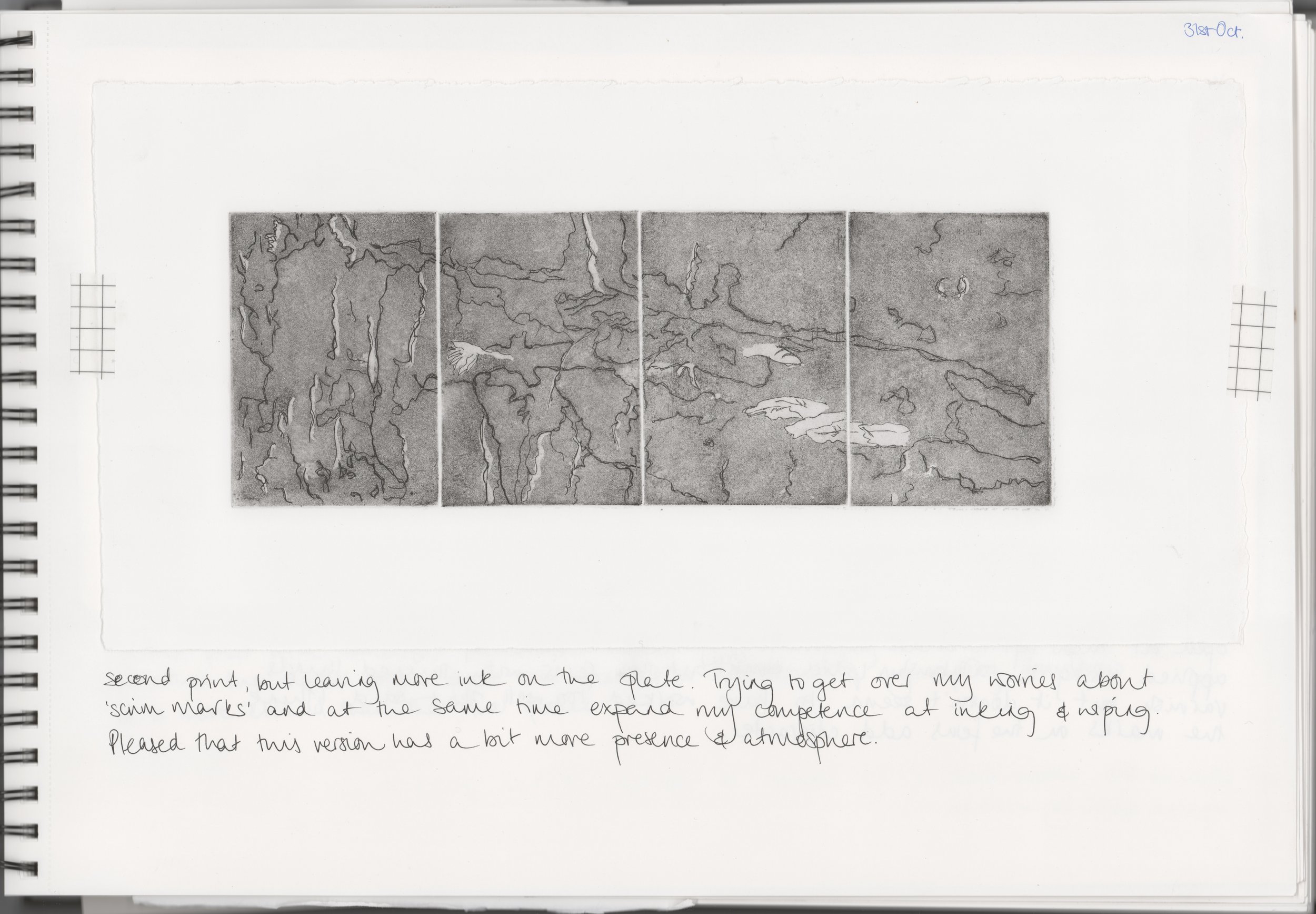
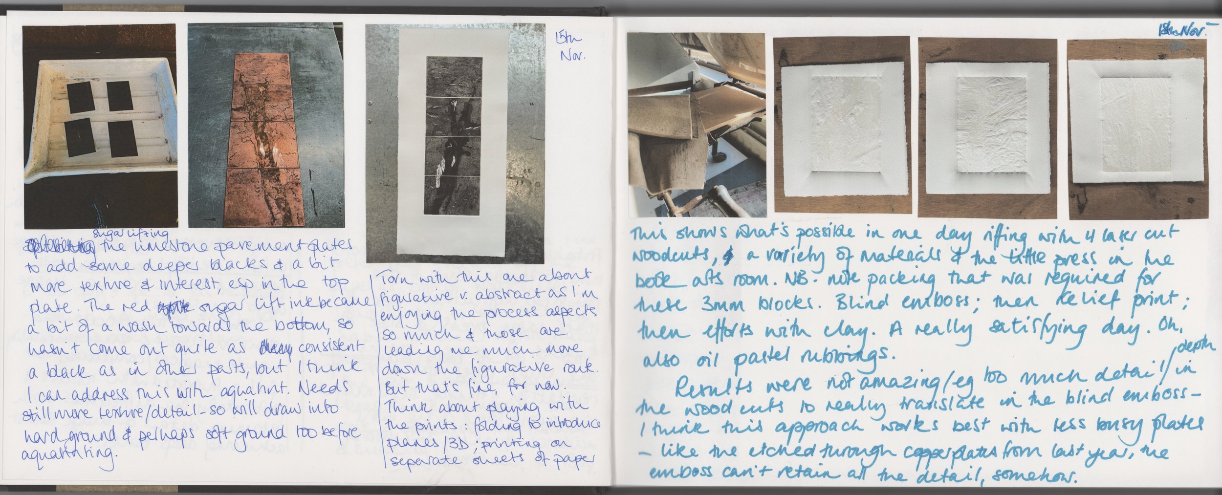
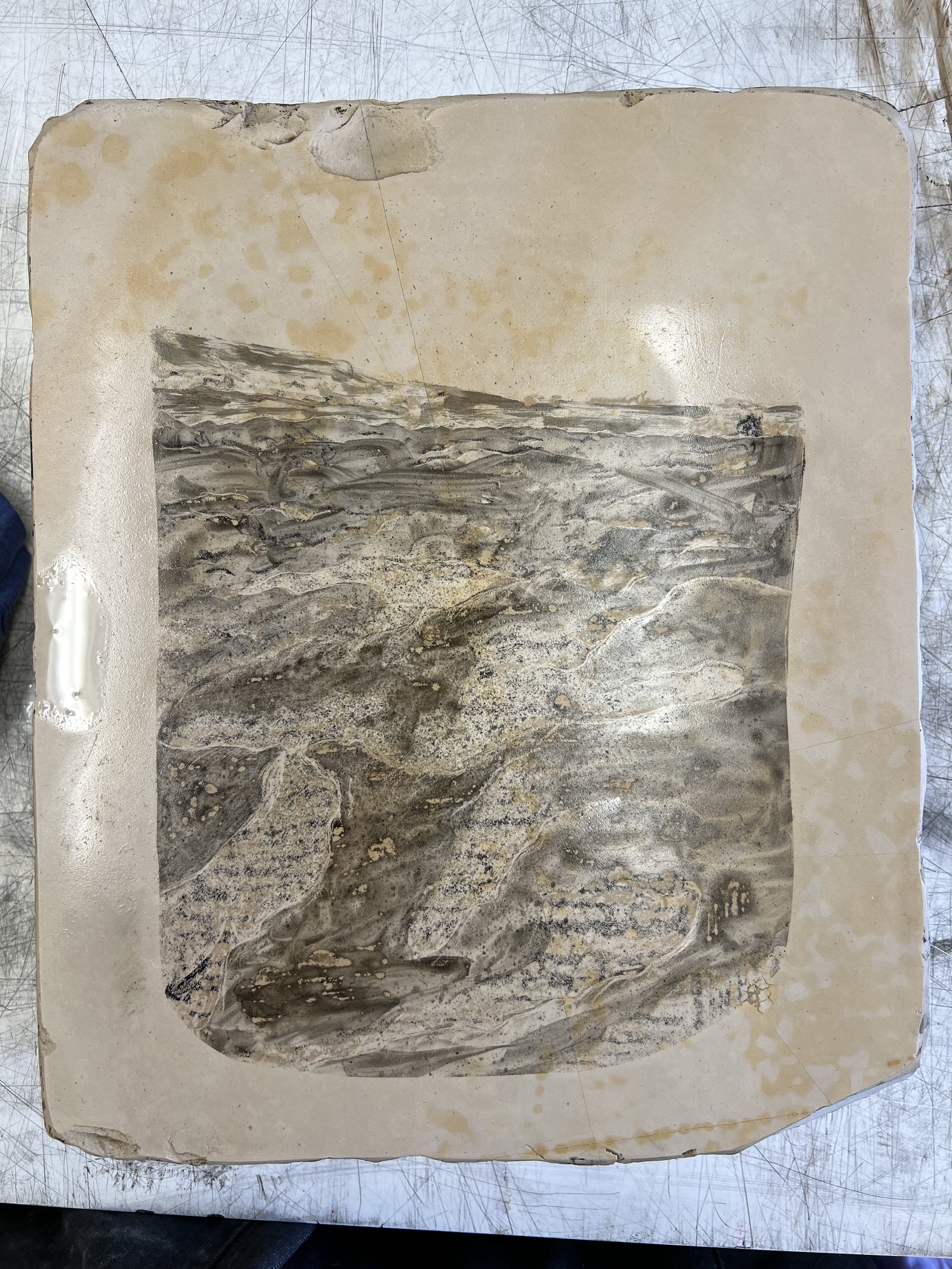
I wanted to develop my skills in intaglio printing so devised an image of limestone pavement across 4 small copper plates so that I could use a range of approaches. I really enjoyed the iterative process and the way that the image develops with each intervention – I used hard ground, aquatint, sugar lift and burnishing; I might add more texture with soft ground impressions, but I think I will treat this piece as a side project – there’s something quite meditiative about an unhurried examination of an image and making small scale adjustments to it without deadlines or an ultimate objective.
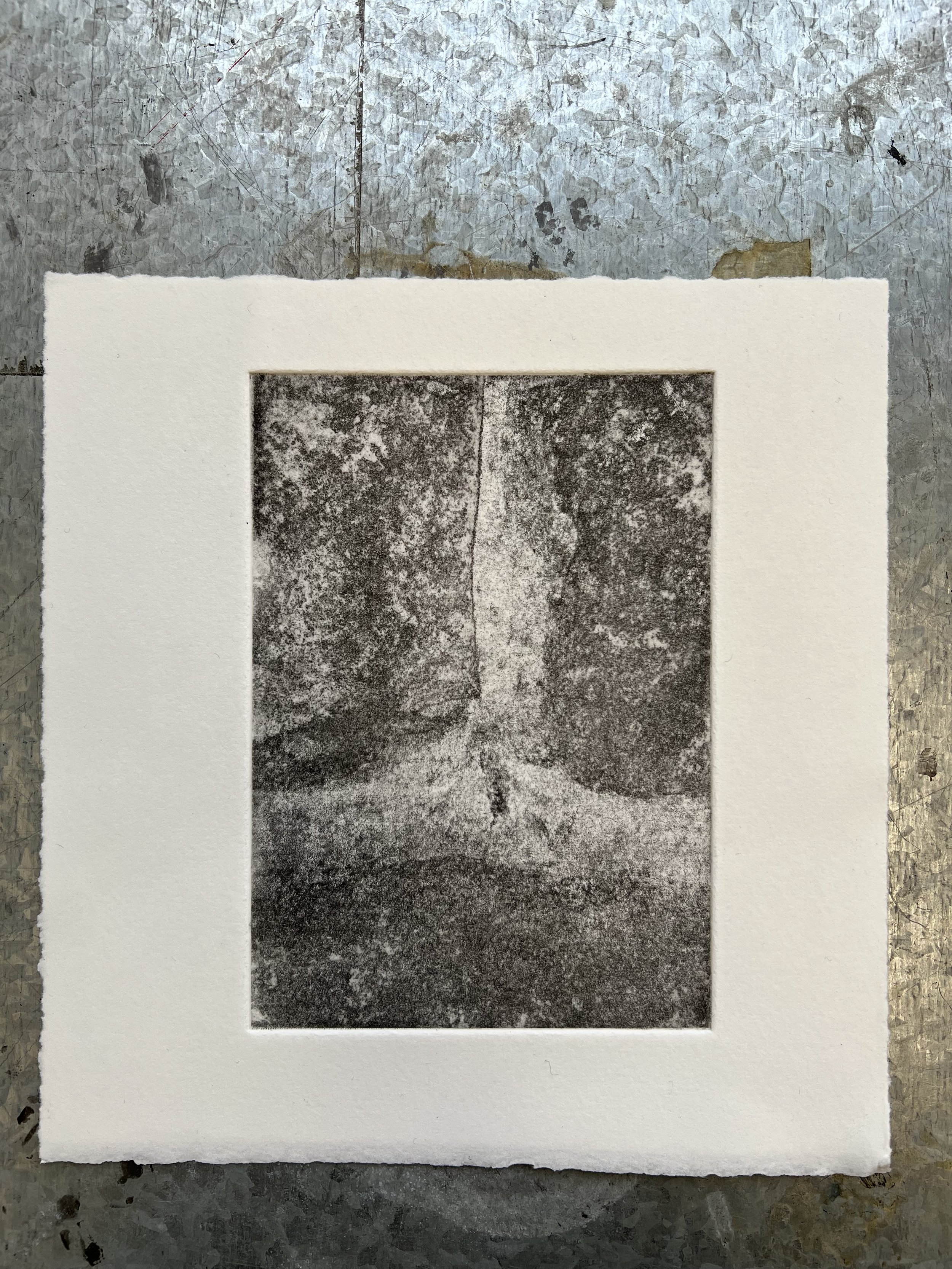
I also tried photo transfer onto zinc, using a photocopy of the limestone clints and grykes image. The first time etched as a negative of the image, so I had a second go which produced the positive: I used the two plates together to produce a two colour print. Useful to practice registration with blocks – not something I have done a lot of and I should do more. The positive image is quite indistinct – I added some hard ground drawing for greater definition, but the next step would be to burnish in the detail of the ferns. This was the image that I used printed on to this washi paper that I knew would fold well, in my pop-up show piece.
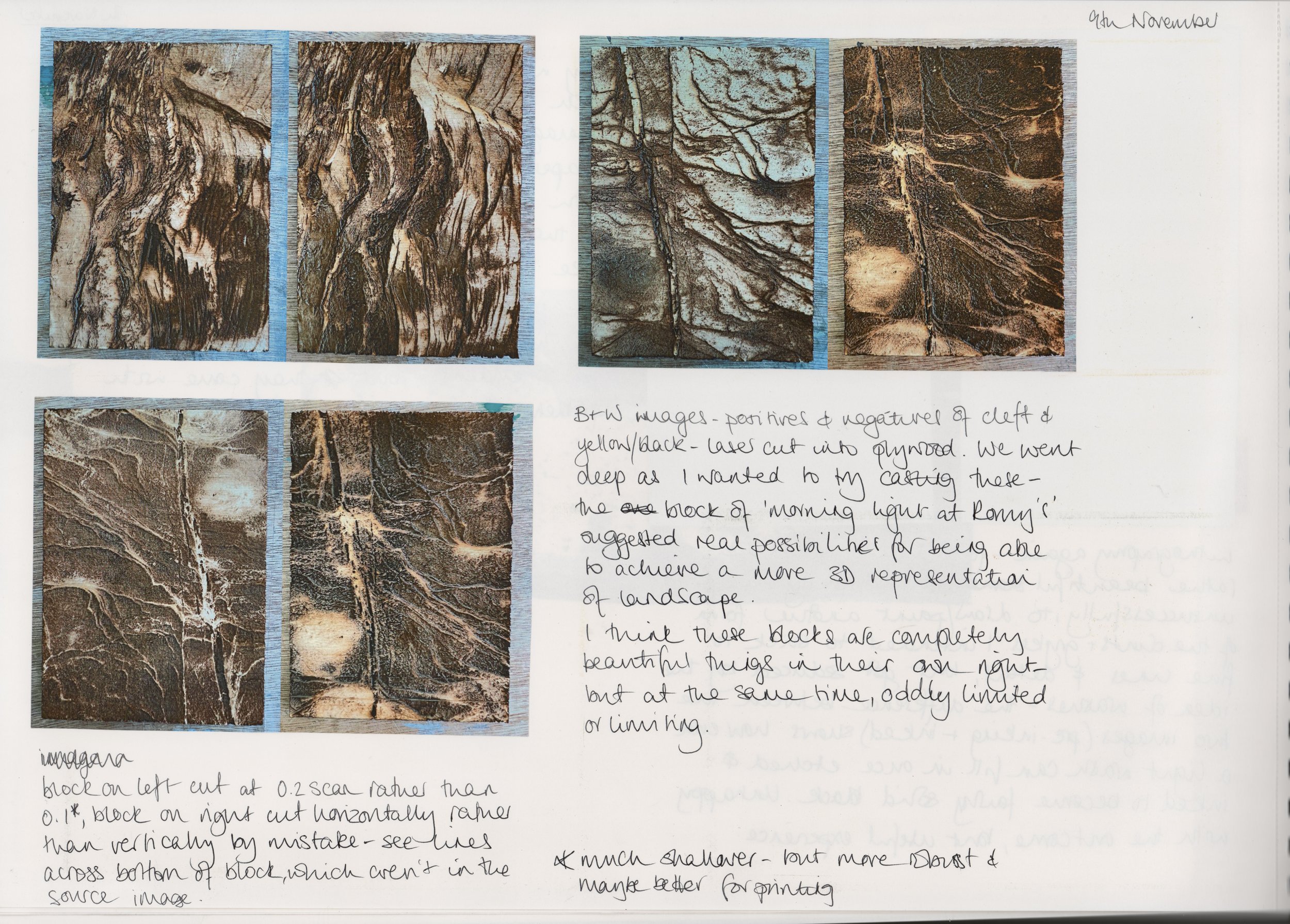
I started testing plates made from laser etched environmount - used by second year Evie to great effect; and she gave me some tips about how to preserve what are quite friable plates. Shellac applied after etching, leaving the plates to harden for a while and cleaning with white spirit after the first pull have all helped to make the plates more robust; and because the laser etch reveals the paper inside the card, the plates hold ink really well and give a rich, deep black in the printing. The material is quite cheap - and sustainable and non-toxic - and the relative modesty of it really appeals, in a world of expensive materials like copper. I have started to think about how to go much larger, producing an image across multiple plates, in relation to ideas about immensity and vastness - I can see real potential here.
Key words: landscape, underfoot
laser cutting

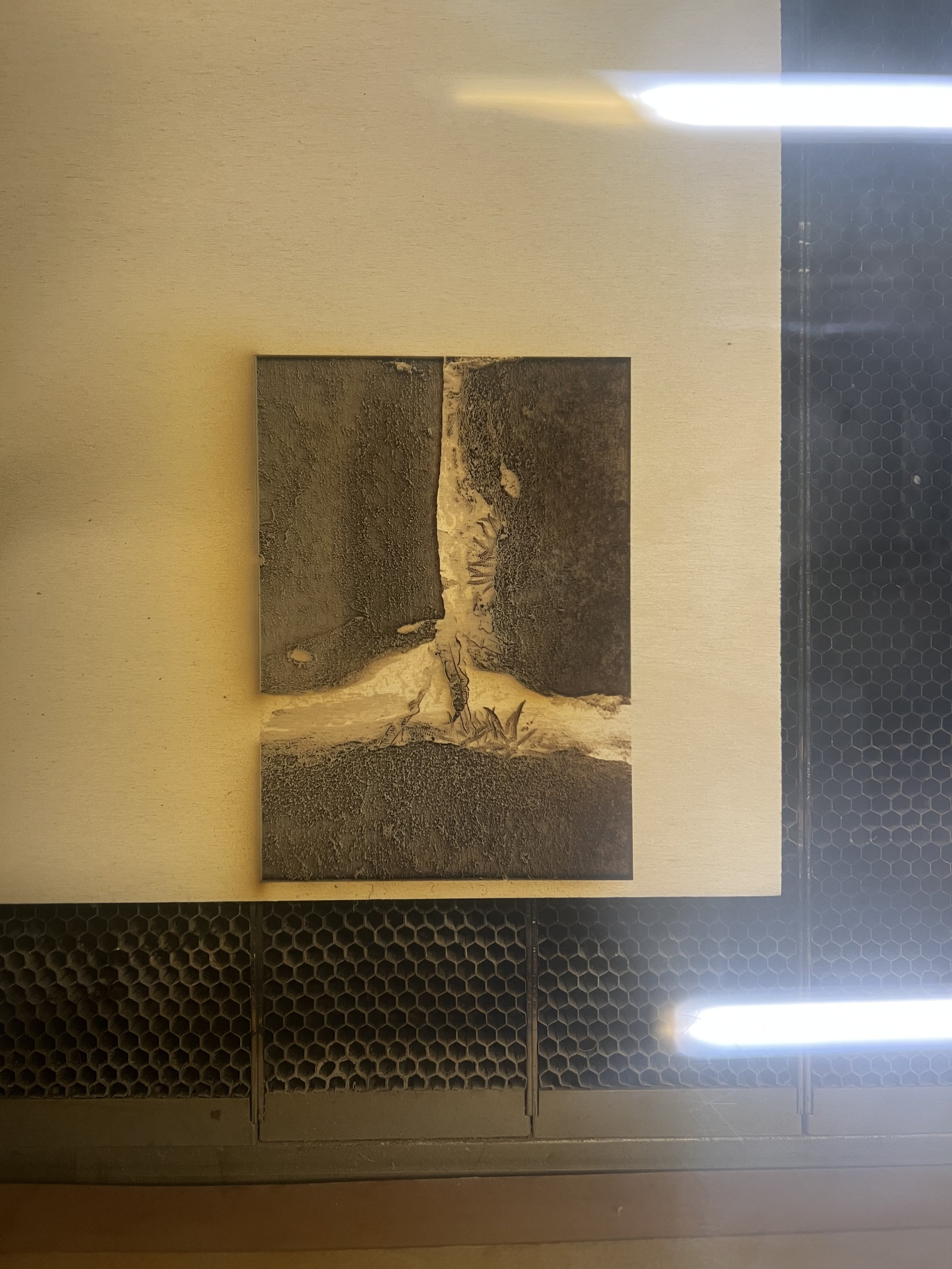
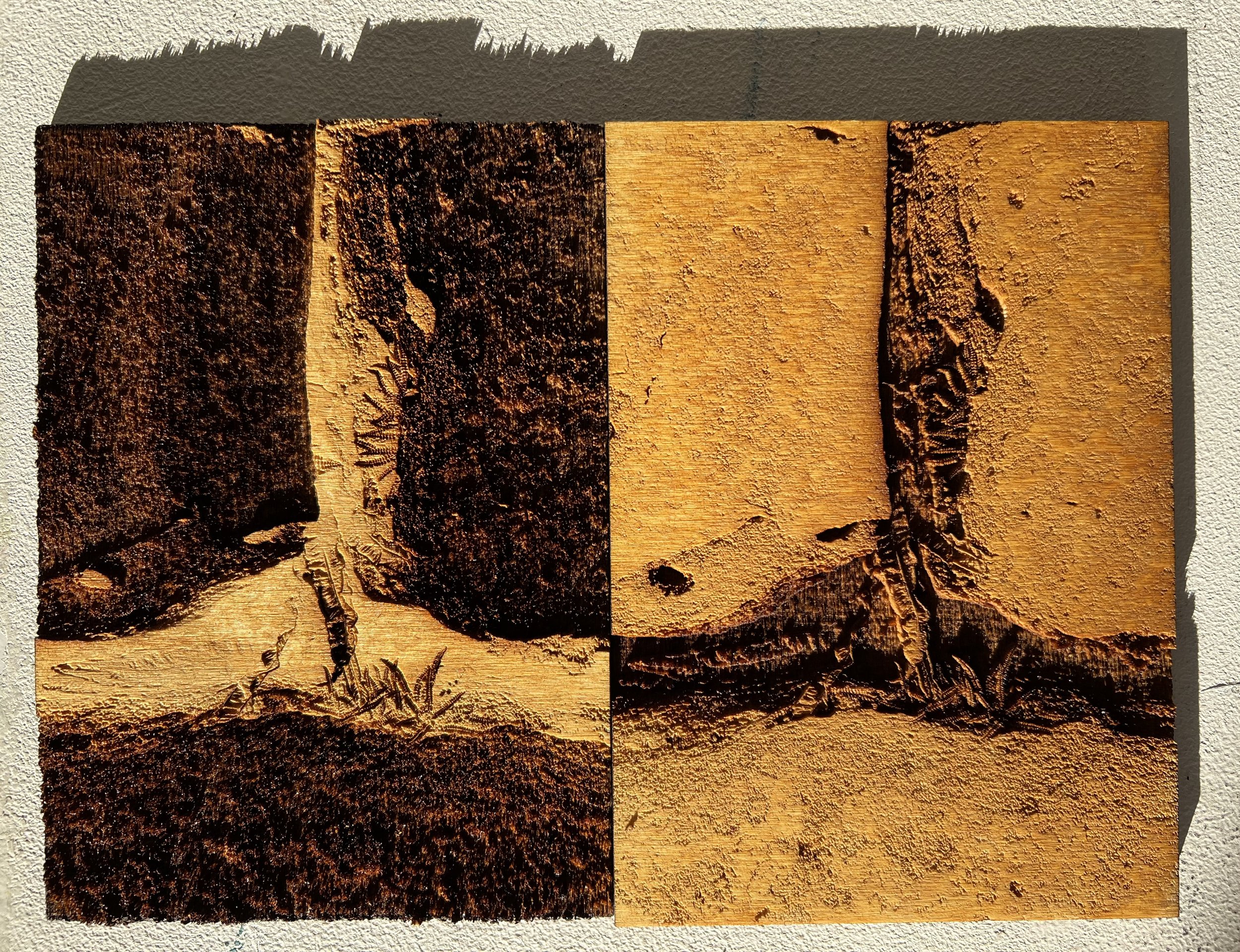
black and white photograph laser etched into plywood

a negative of the same image etched into plywood

black and white photograph of slate laser etched into plywood

negative of the same image etched into plywood
positive and negative of a photo of slate put through photoshop threshold layer and etched into acrylic
plywood negative in the laser cutter
negative and positive in plywood

diffuse dither added to image and etched into environmount

half tone dot added to image and etched into environmount

negative of the same image without half tone adjustment

black and white photo with threshold layer etched into environmount

negative of the same image

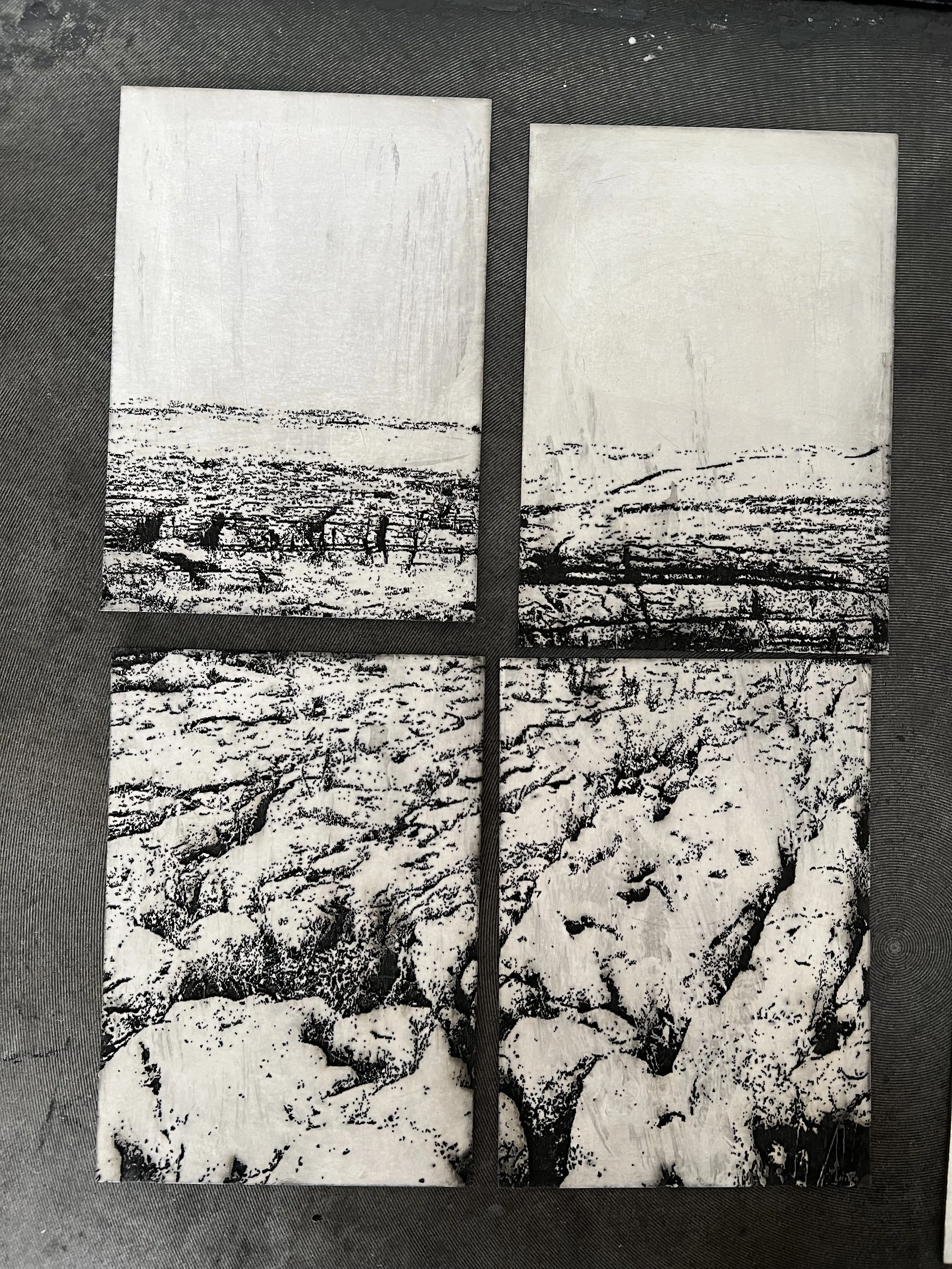
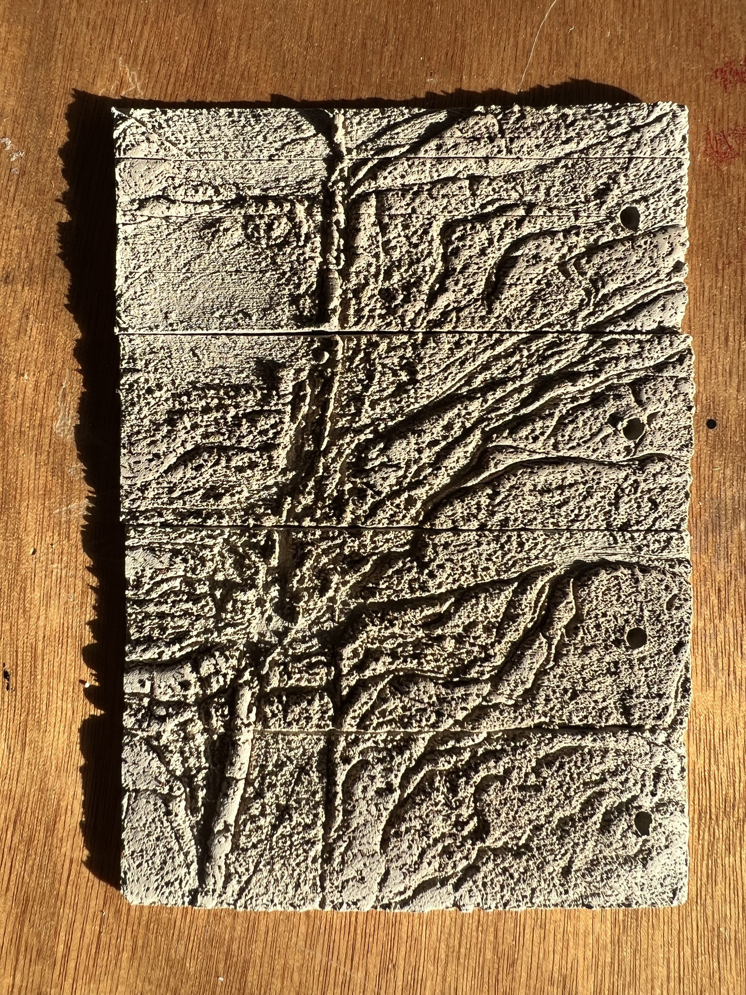
black and white threshold landscape image etched over 4 plates on environmount

black and white threshold object image etched over 4 plates on environmount
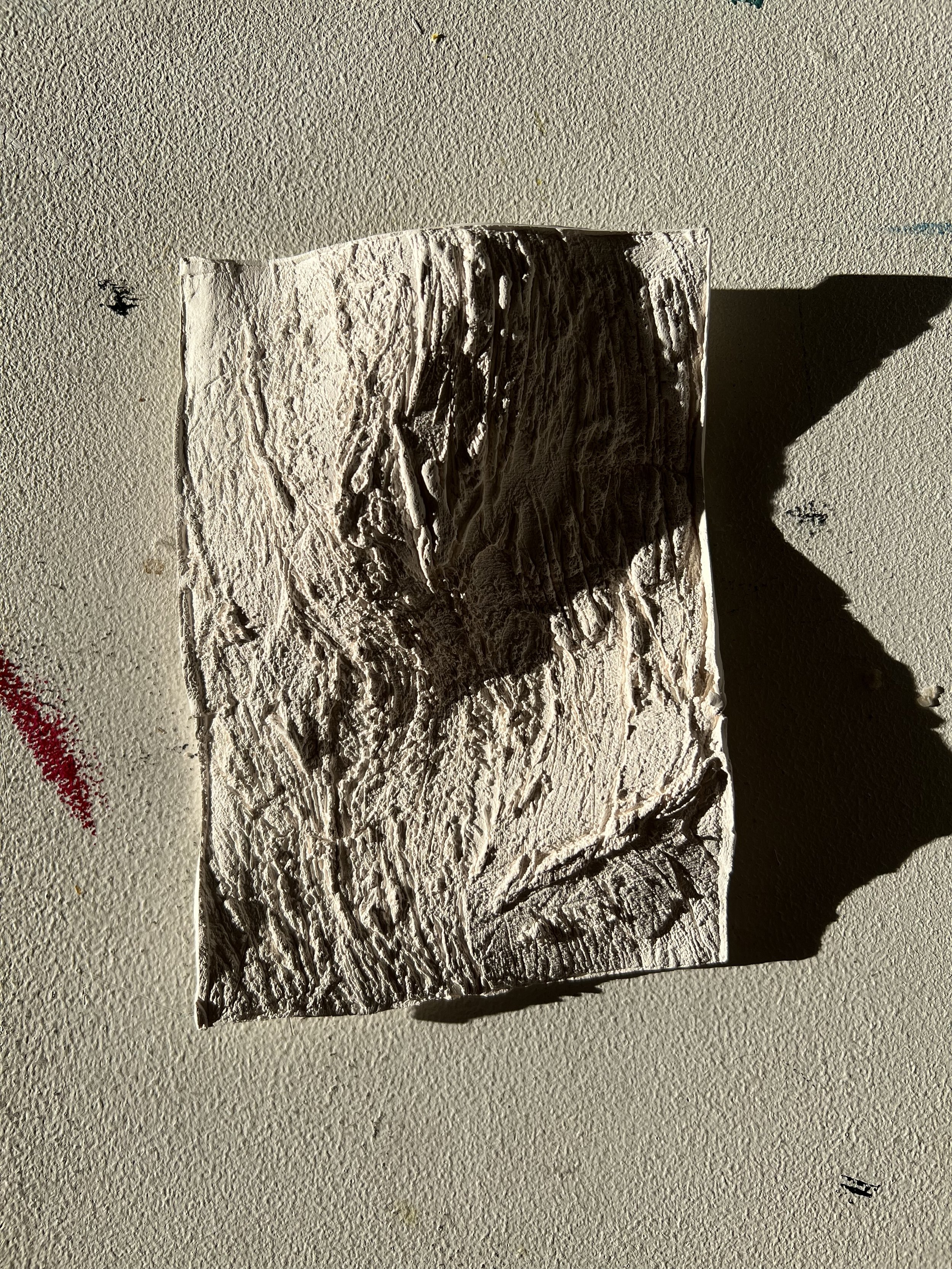
This process was entirely new to me, but I had seen some of the wood blocks that 2nd year students had made and was really taken with them as objects in themselves and also in the potential for embossing with laser etched wood. Clearly wood, like clay, is part of the material of landscape, so that connection also appealed to me. Finally, I saw laser etching as a possible solution to the question I had about how to integrate image into a topographical, 3d representation of landscape. I found the plywood blocks that I cut really compelling, I was really taken with the way the laser translates darkness into depth – which reflects the image in some cases – for example where the white of the limestone pavement contrasts with the black depths of the grykes – but with the slate images produces a wholly new topography. Laser etching into acrylic produced a kind of pixelation that I found distracting: I will try again with different images to see if that is a function of the material, but I’m also less keen to use acrylic for sustainability reasons and because it lacks the material connection to landscape that wood has.
Key words: materiality, landscape
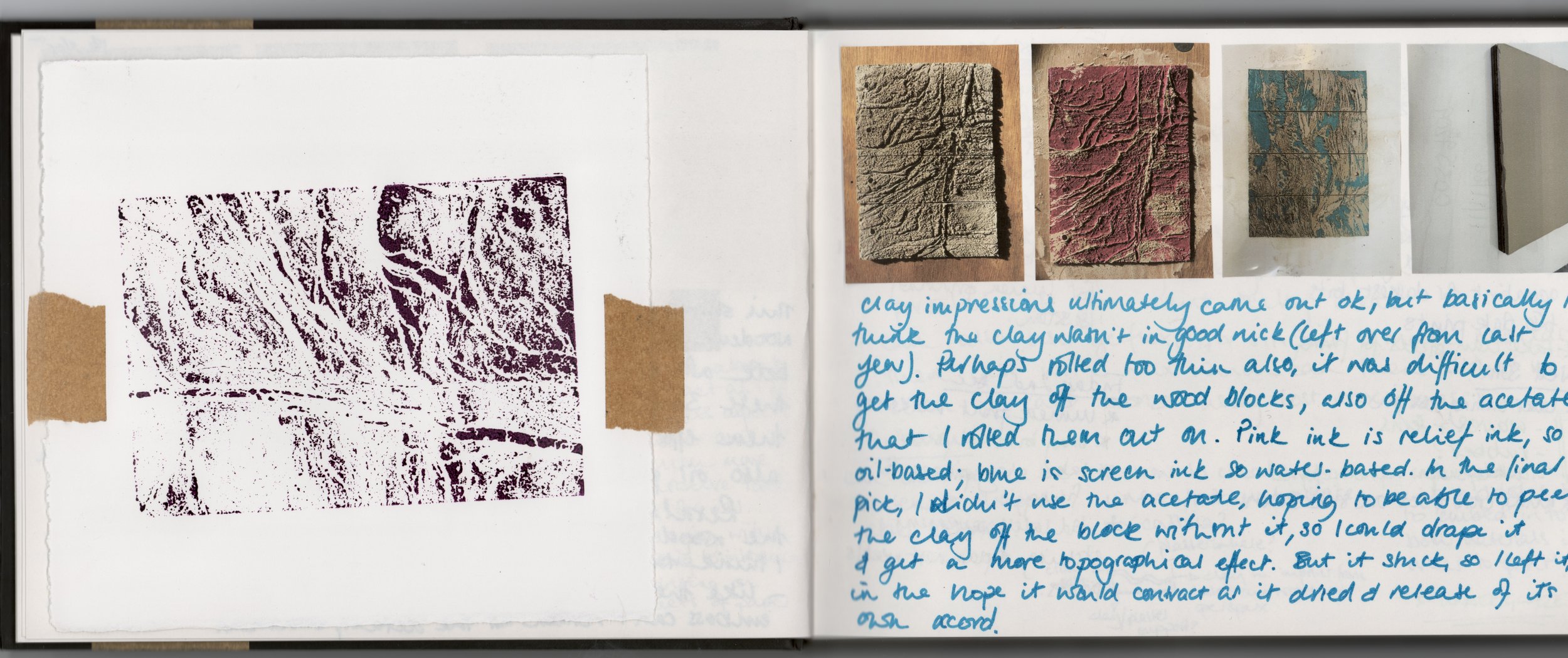
ceramics
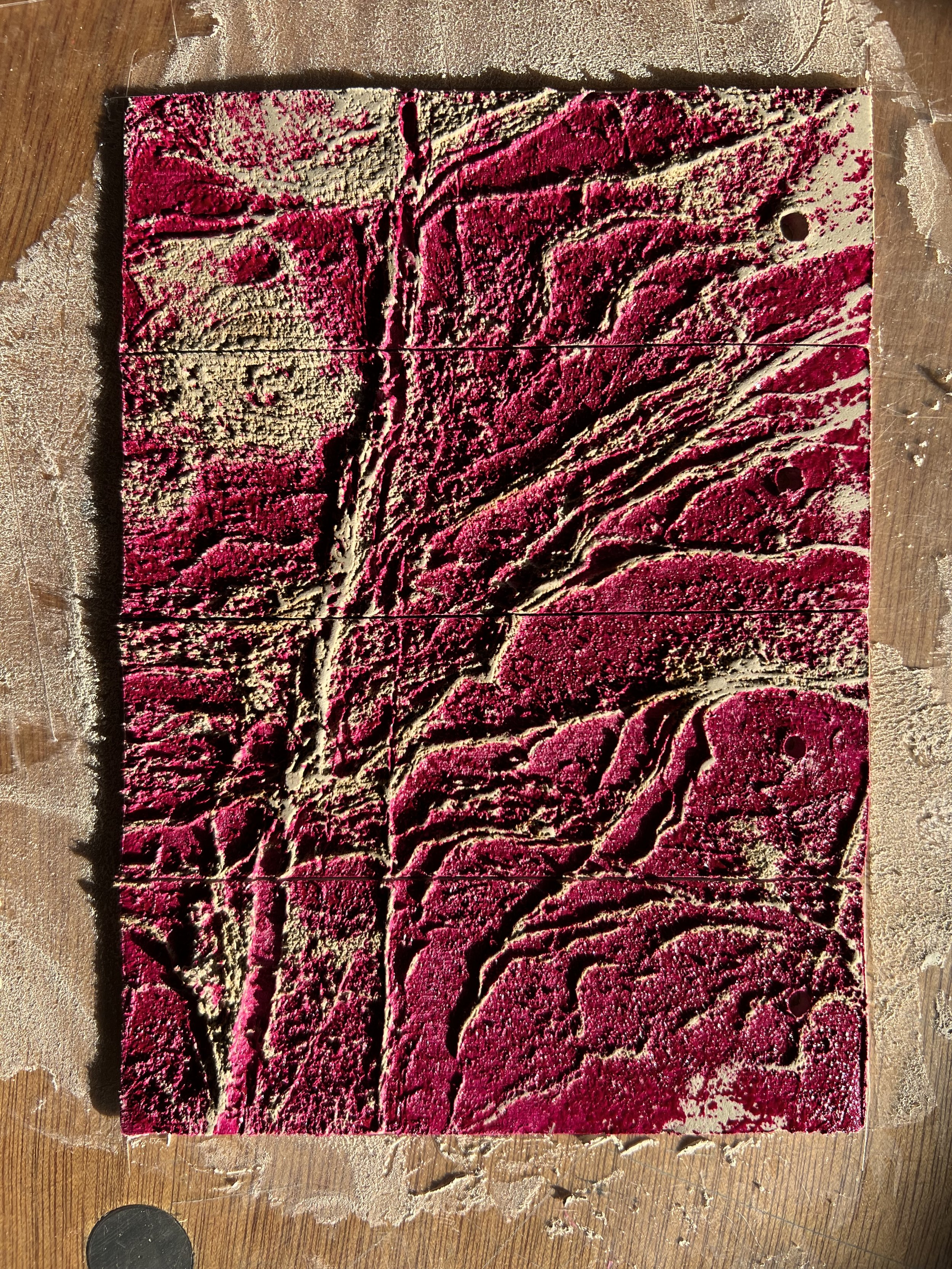
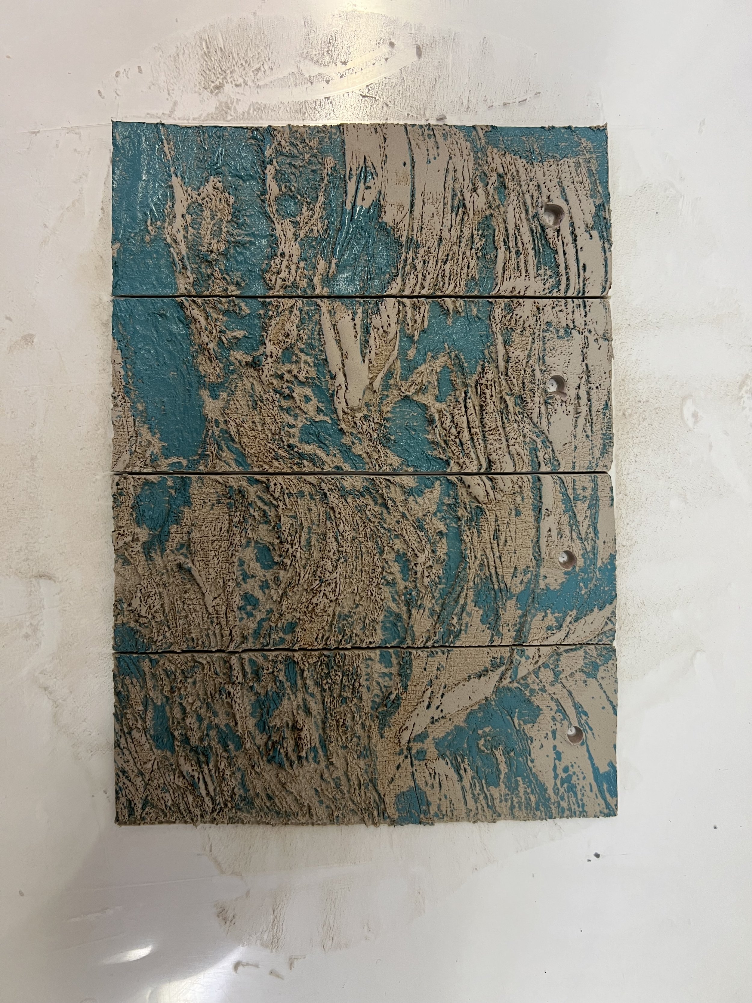


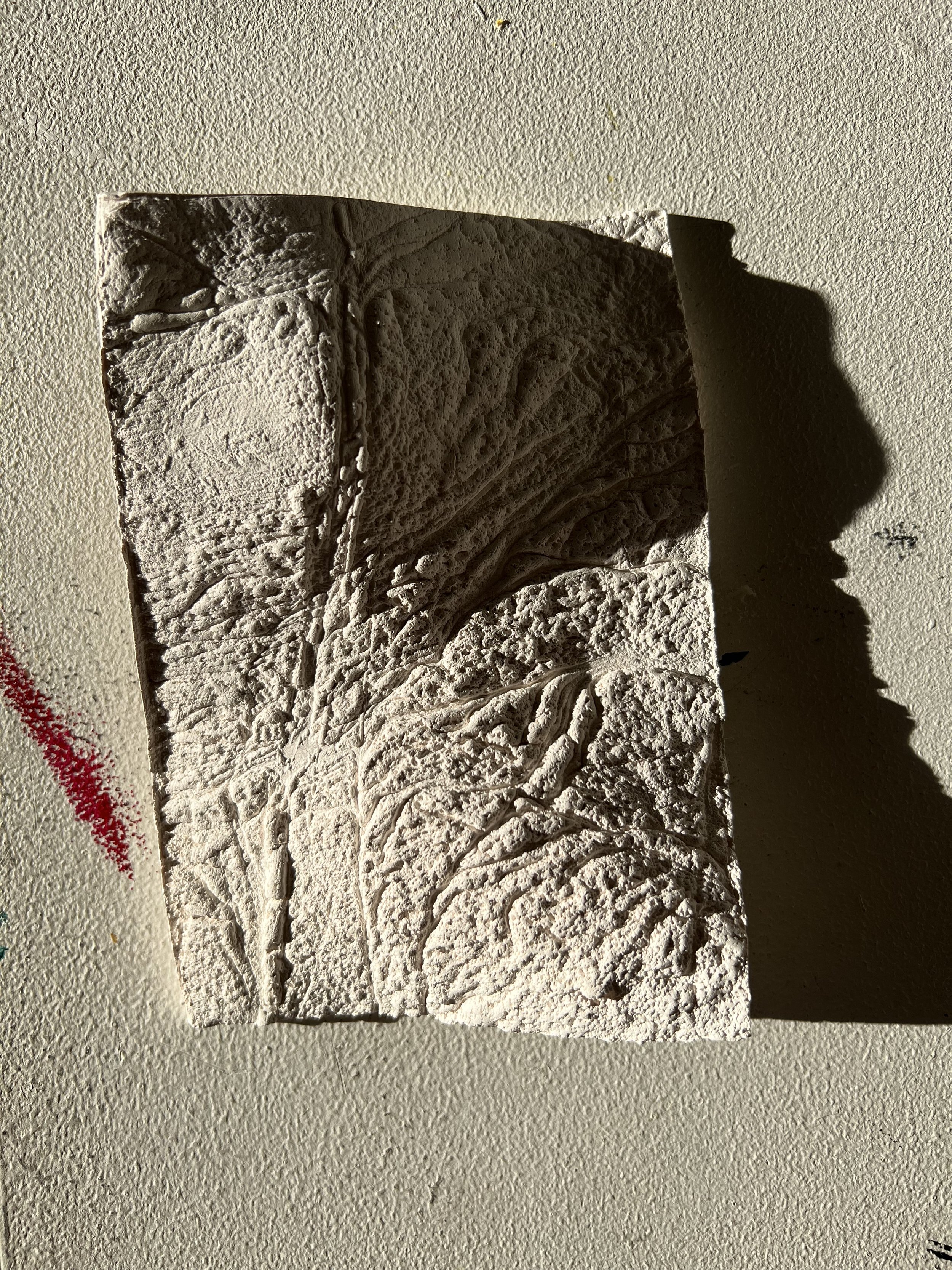
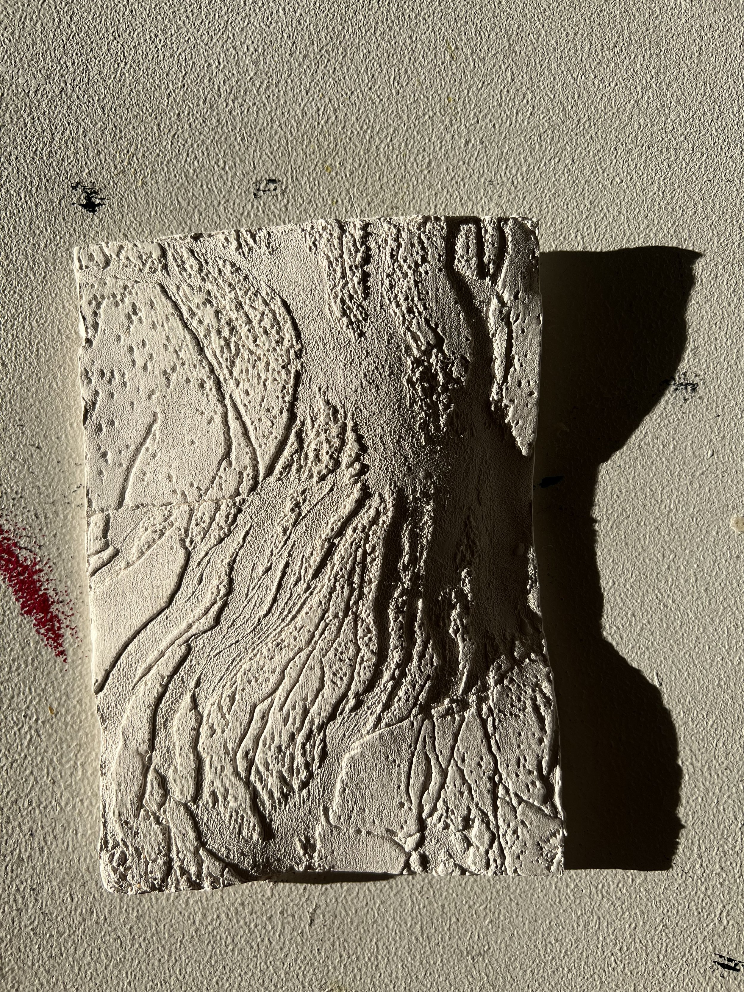
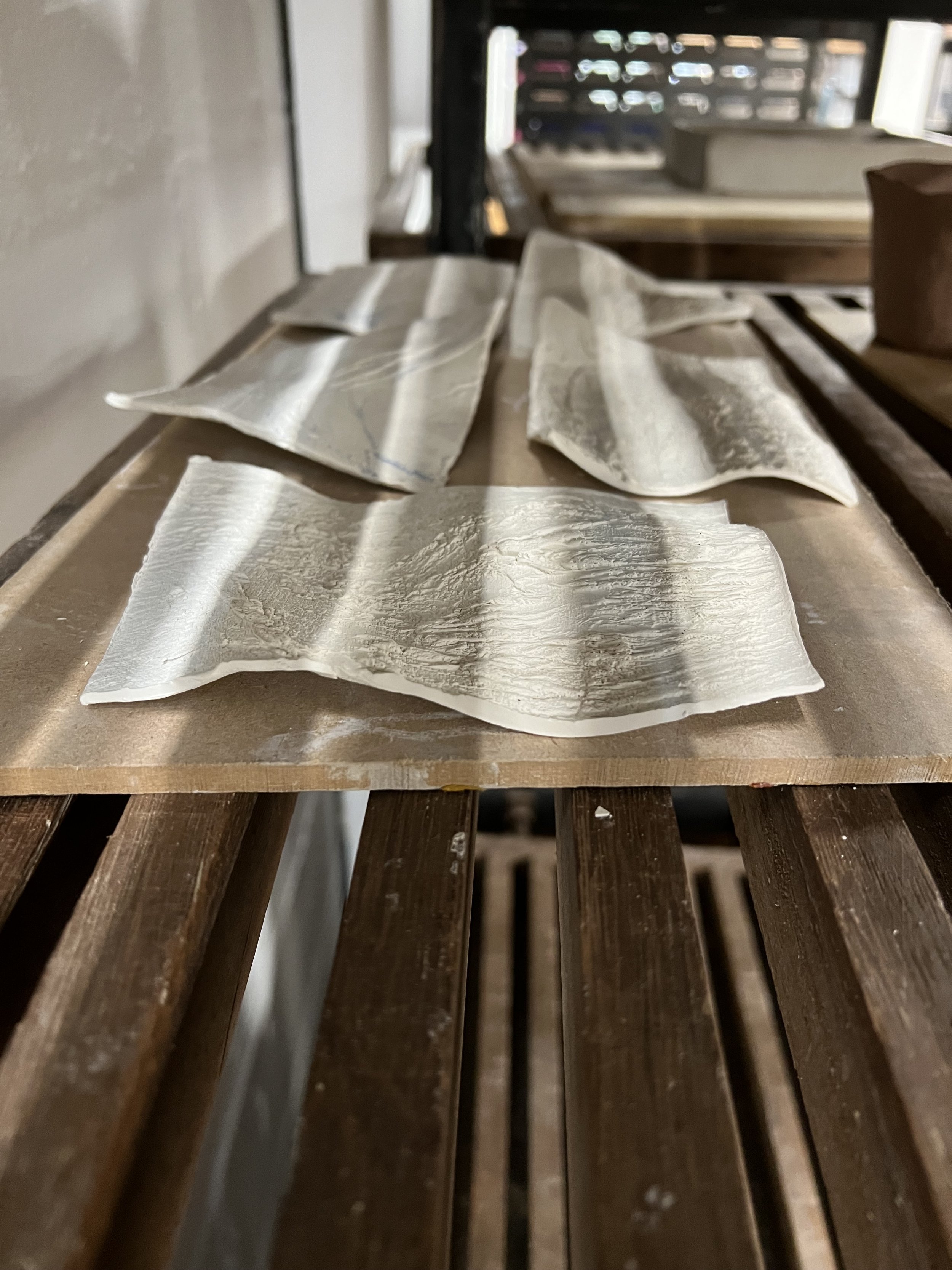
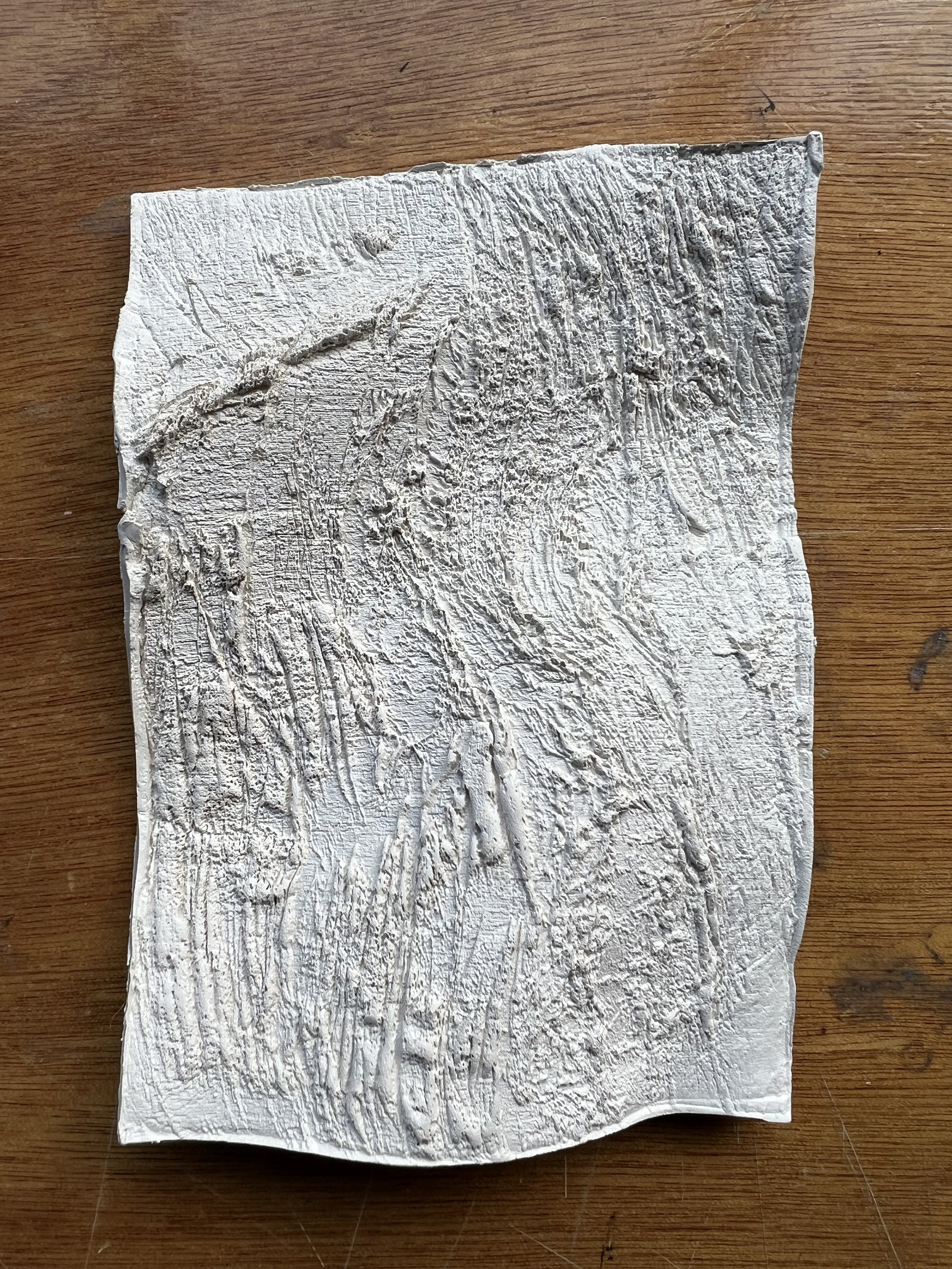
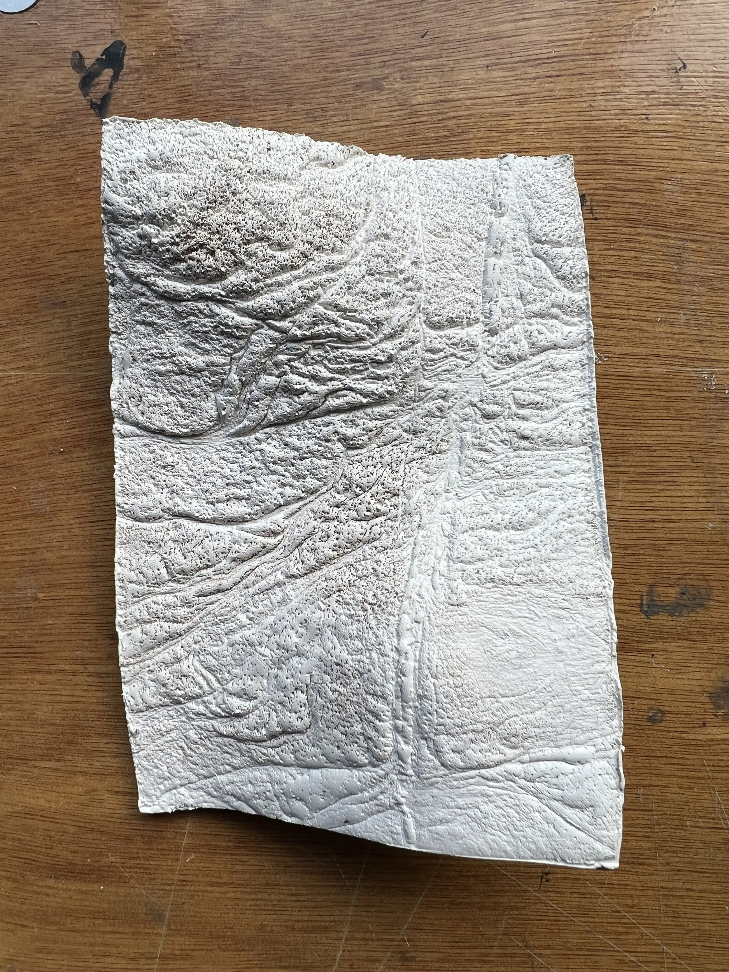


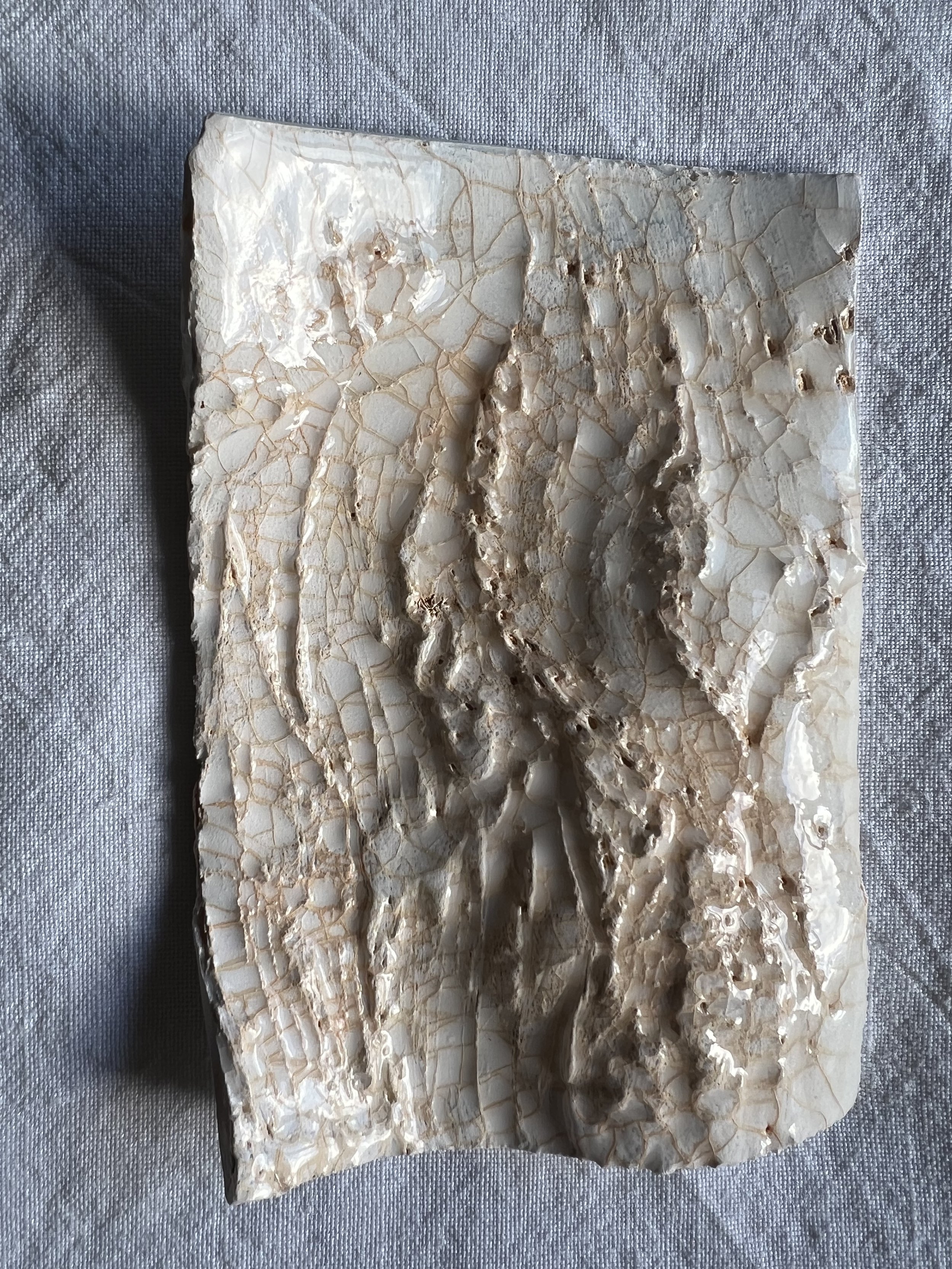
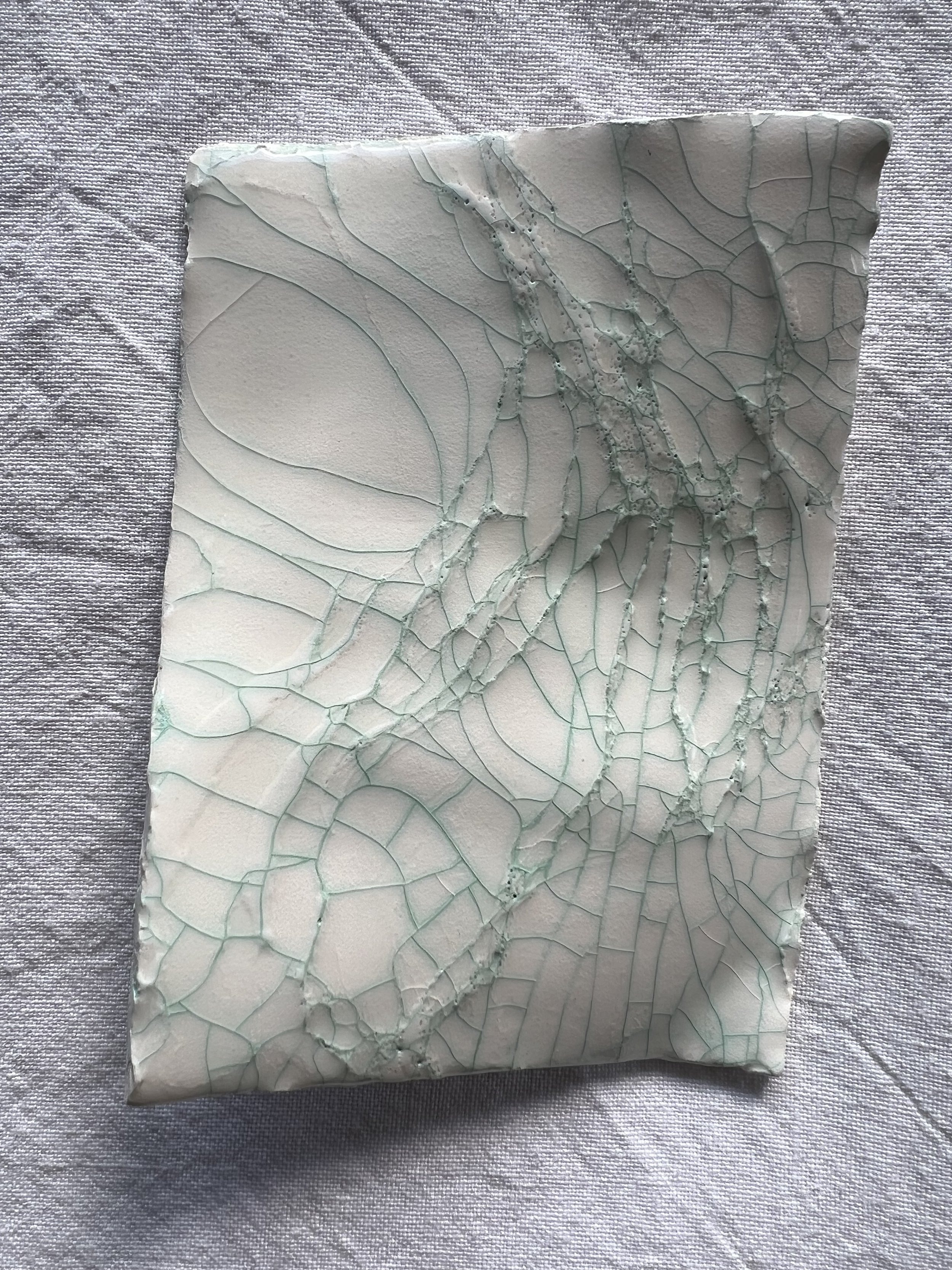


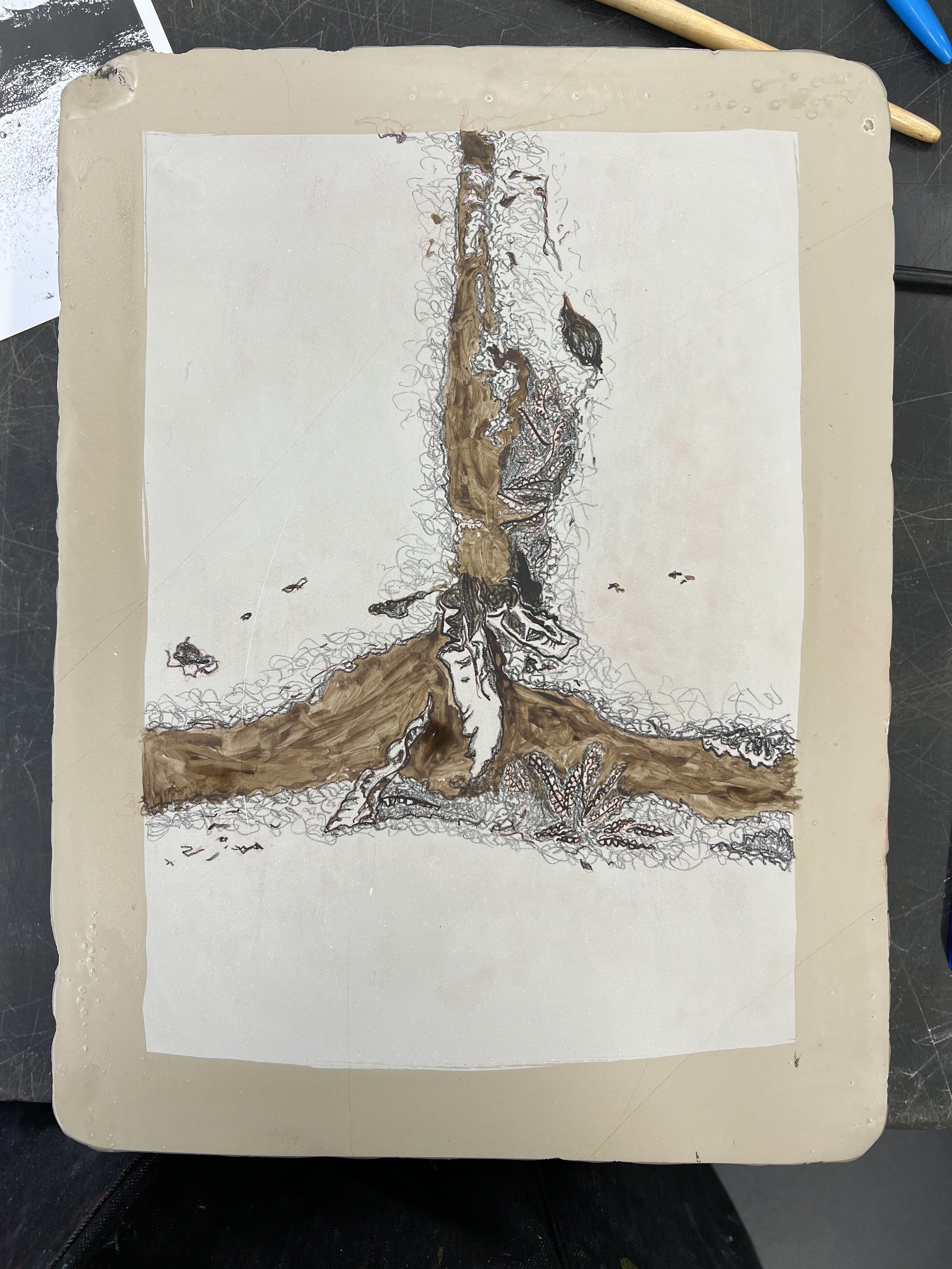
printing into plaster - casting an inked intaglio plate - is an established process that results in an image embedded within the surface of the plaster; I was really keen to try this idea, but I had also been thinking about ways to incorporate a stronger element of relief, to try to reflect the topography of the image, or to evoke a sense of landscape itself. The ceramic pieces that I produced last year were an effort at abstracted landscapes - reflecting the undulations of hills and valleys - and I wondered whether I could combine that idea with the specific topography of the laser cut images that I had produced. My first efforts were using the Strava paper clay that I had to hand and although the results are interesting, the material was very difficult to work with: difficult to manipulate and release from the wood block; and fragile, friable, frustrating… I was pleased with the how the colours came out - both applied to the wood block with a roller, pink oil-based etching ink and blue water-based screen printing ink. I talked to James in the ceramics studio about what might happen if these inks were fired - he thought they would probably simply burn off and introduced me to the idea of underglazes instead, and also to dusting the wood blocks with talc to make release easier. My next experiment was with porcelain and I think the newness of the clay made a big difference in how easy it was to roll, shape, impress into the laser cut blocks and release afterwards. I fired all five pieces and then glazed four of them - the remaining piece being exhibited in the pop up show. The jade glaze covered the pieces really well but, being fired at a higher temperature, led to the porcelain melting a little and flattening out; the transparent glaze didn’t cover so well and had the effect of filling too much of the relief detail - but it did, as I intended, crackle in a pleasing way, which I then highlighted with ink to contrast with the porcelain. I was interested in how the patterns in the glaze evoke field boundaries from an aerial view or drawn on a map in the piece using green ink and emphasised the apparent topography of the piece using burnt siena.
Key words: landscape, materiality
lithography


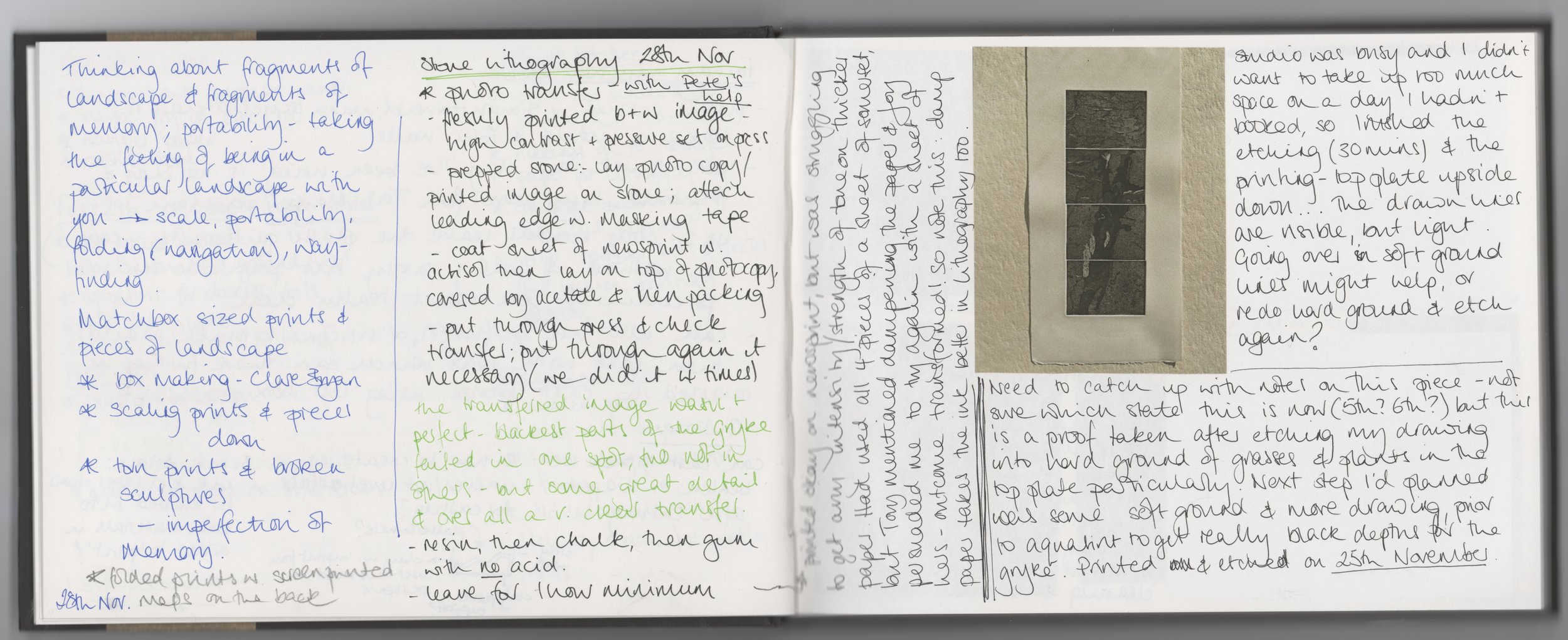
I struggled to grasp how lithography works and still don’t really understand the complexities, but think that I can with time and practice. The limestone blocks are beautiful things, charged with age and use. I chose a particularly battered one as the materiality of the stone is a key part of what’s interesting about the process. And because it’s limestone, I decided to work from and with images I had taken at Malham Cove and Goredale Scar. This first effort was an experiment in texture, using tusche washes and litho crayons. Interesting to see how little resemblance the drawn image on the stone can bear to the resulting print; and ensuring the ink sticks to the stone without filling in the detail of the image is clearly difficult.
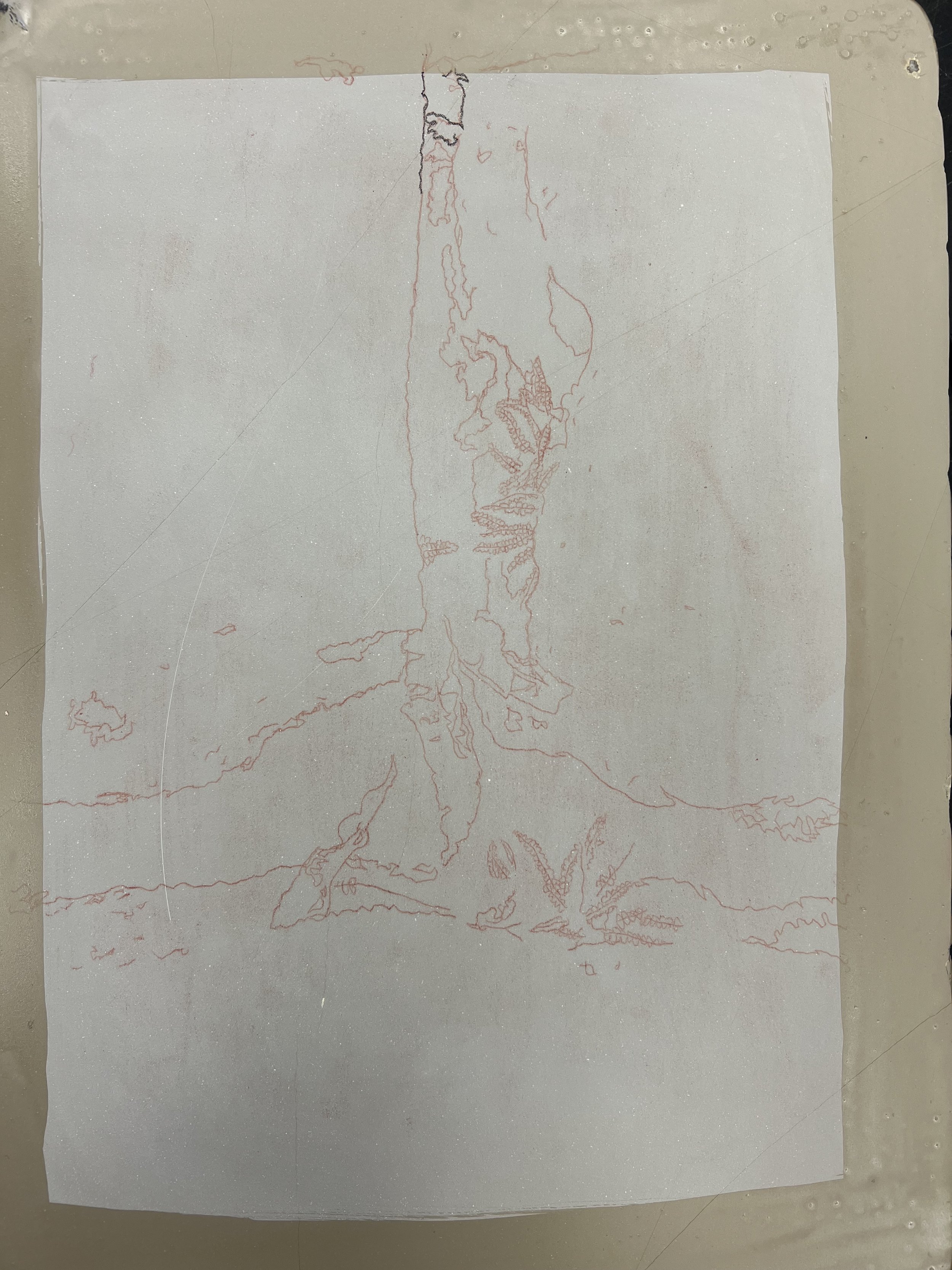
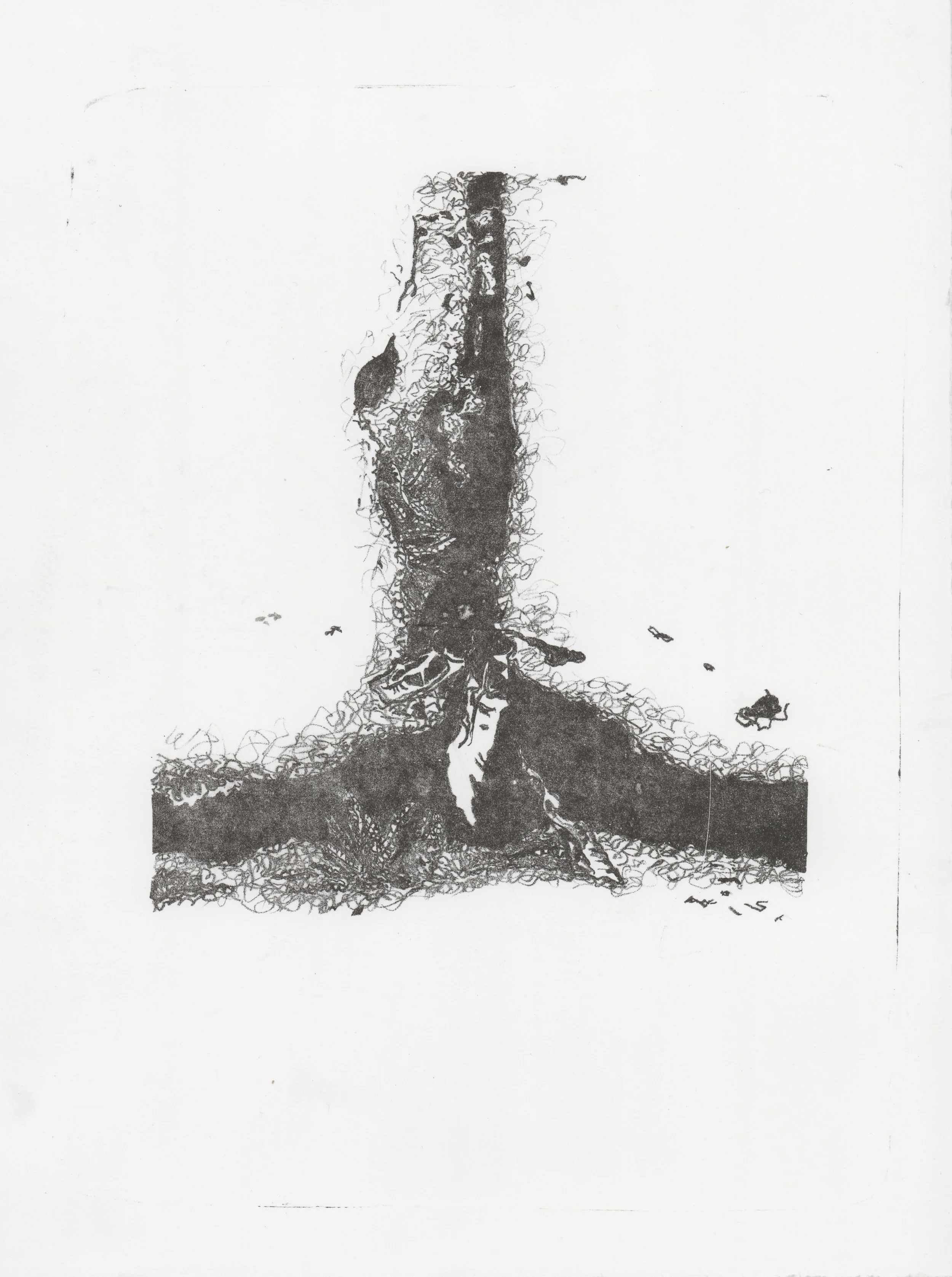
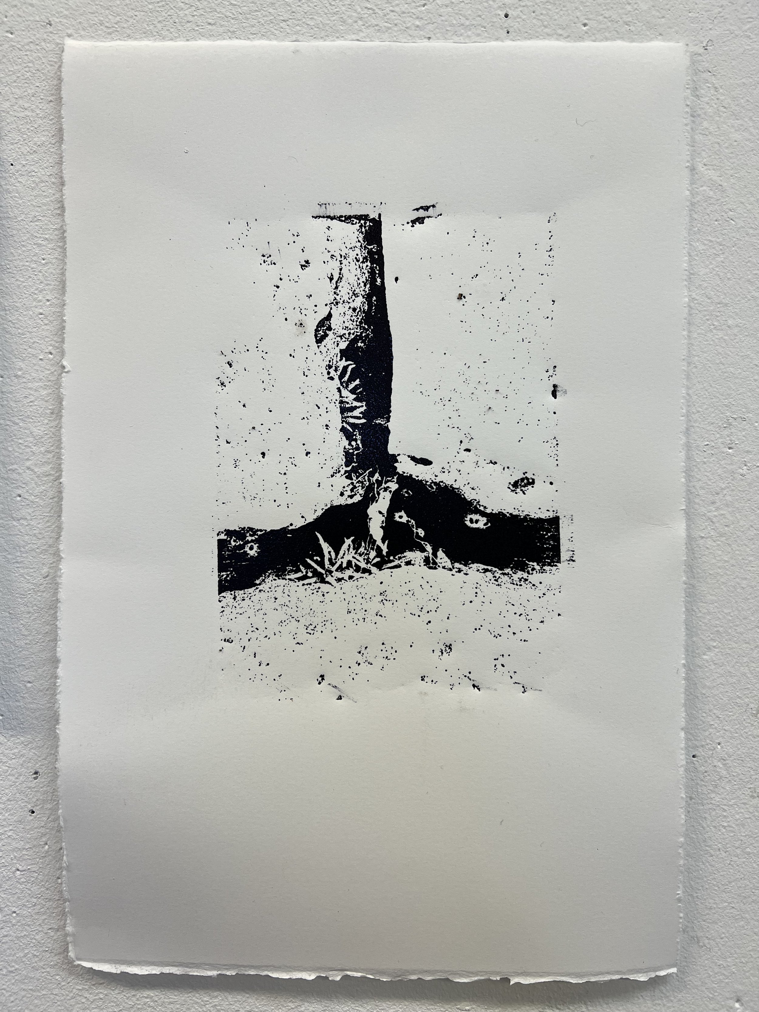
I felt quite demoralised after my first attempt and wasn’t at all impressed with the translation of the landscape image that I produced. But there’s an atavism about lithography – it’s physical and difficult and a little bit inexplicable, the stones are ancient and charged with age and use – so of course I was going to give it another go. This time I traced a photograph using a red sanguine conté pencil rubbed across the back of an image. Much happier with these results and with my efforts to create variation in texture and depth of blackness. This image of ferns growing in the grykes between limestone clints captures that sense of something largely unseen or often overlooked, a more intimate depiction of limestone pavement.
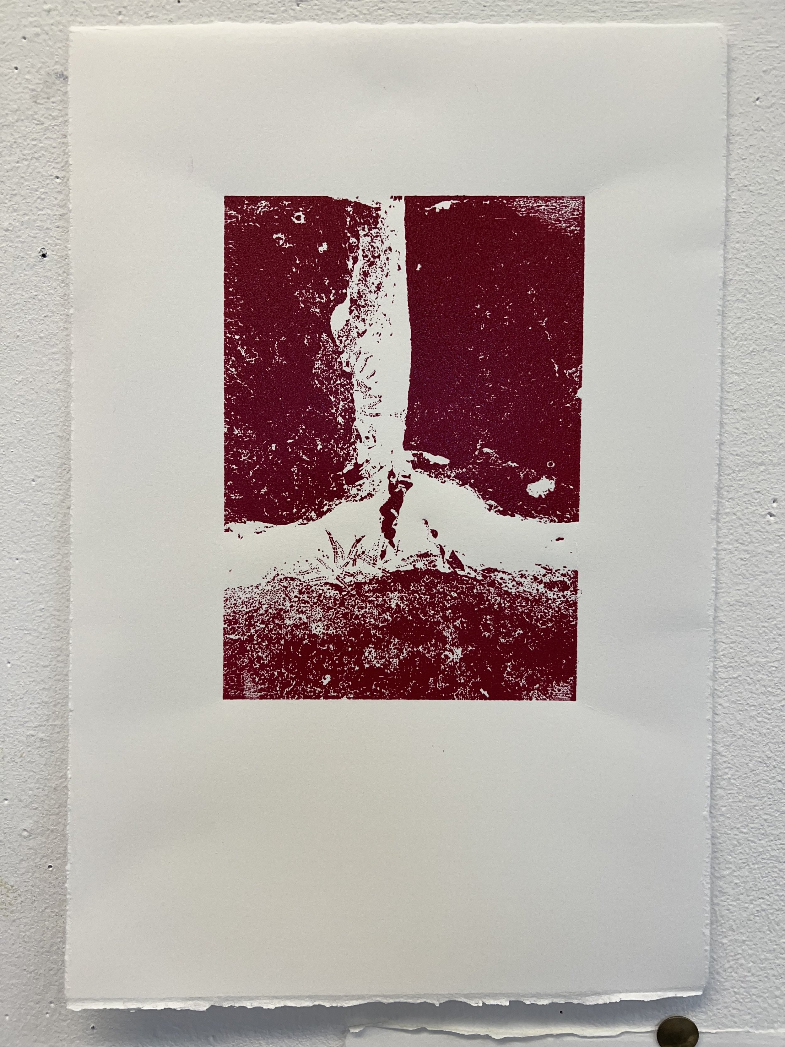
After discussing with Pete, and with his help, I did a photo transfer of the same image onto a stone – it worked really well, though we had to put the stone and photocopy through the press 4 or 5 times to get a clear result. We used an acid free gum for the first etch and it printed really clearly, once I dampened the paper before printing. The ink filled in quite quickly though – clearly a problem with the way I’m inking up and I think ultimately a function of me not keeping the stone damp enough.
key words: materiality, geology
relief printing


I laser etched the wood blocks with the intention of casting them or making clay impressions, but I thought I should also try making relief prints with them. I found it quite unsatisfying – none of the richness of the blocks themselves translated into the prints, which were quite sparse. The blocks were so deeply etched that, in reality, there was only minimal surface left for relief printing. The wood cuts of the ferns, clints and grykes image worked much better, particularly when I did a two colour print using the positive and negative blocks together – though registration was an issue.