Resolved Works
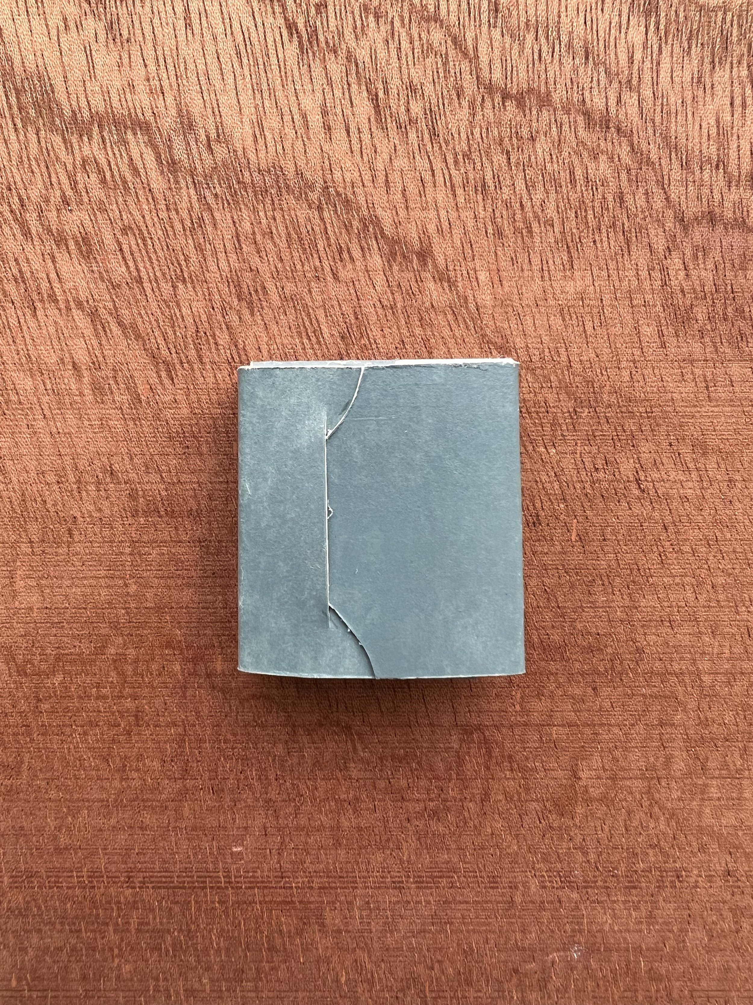
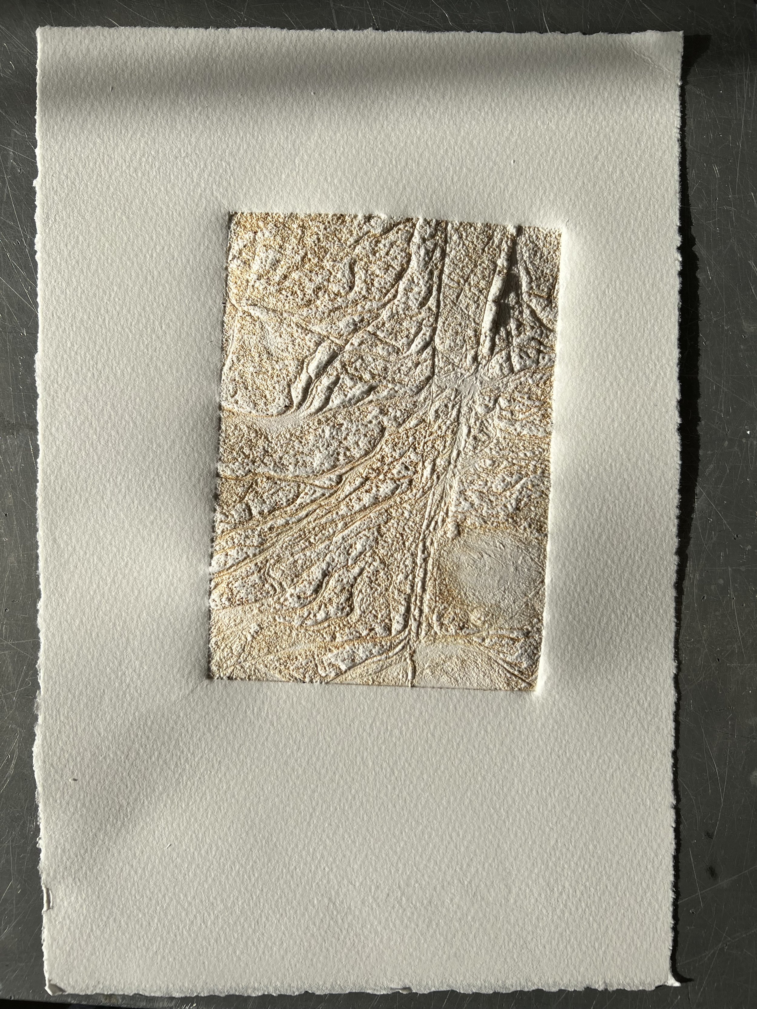
Last Walk with Dad II (2023)
intaglio print on Hahnemuhle sumi-e paper, air-drying clay and screen-print on Canelletto Velino paper with acrylic paint
3x4cm closed; 10x15cm unfolded
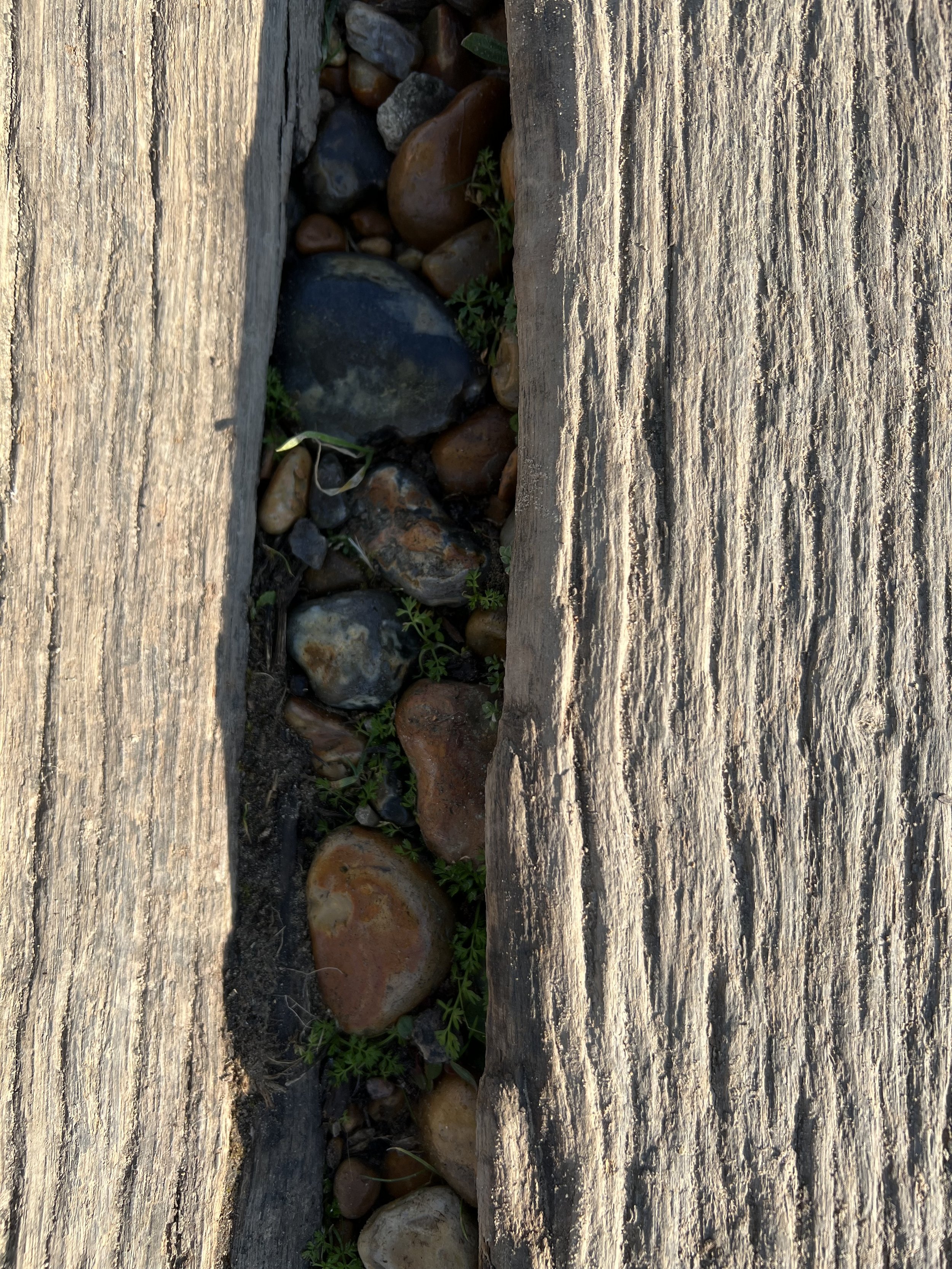
A Couple of Hours on a Wednesday in February at the South Coast with the Sunshine and a Rising Tide (2023)
laser etched woodcut print on Hahnemuhle Sumi-e paper, phase box made with Canaletto Velino paper, seaweed and shell
7x10x3cm
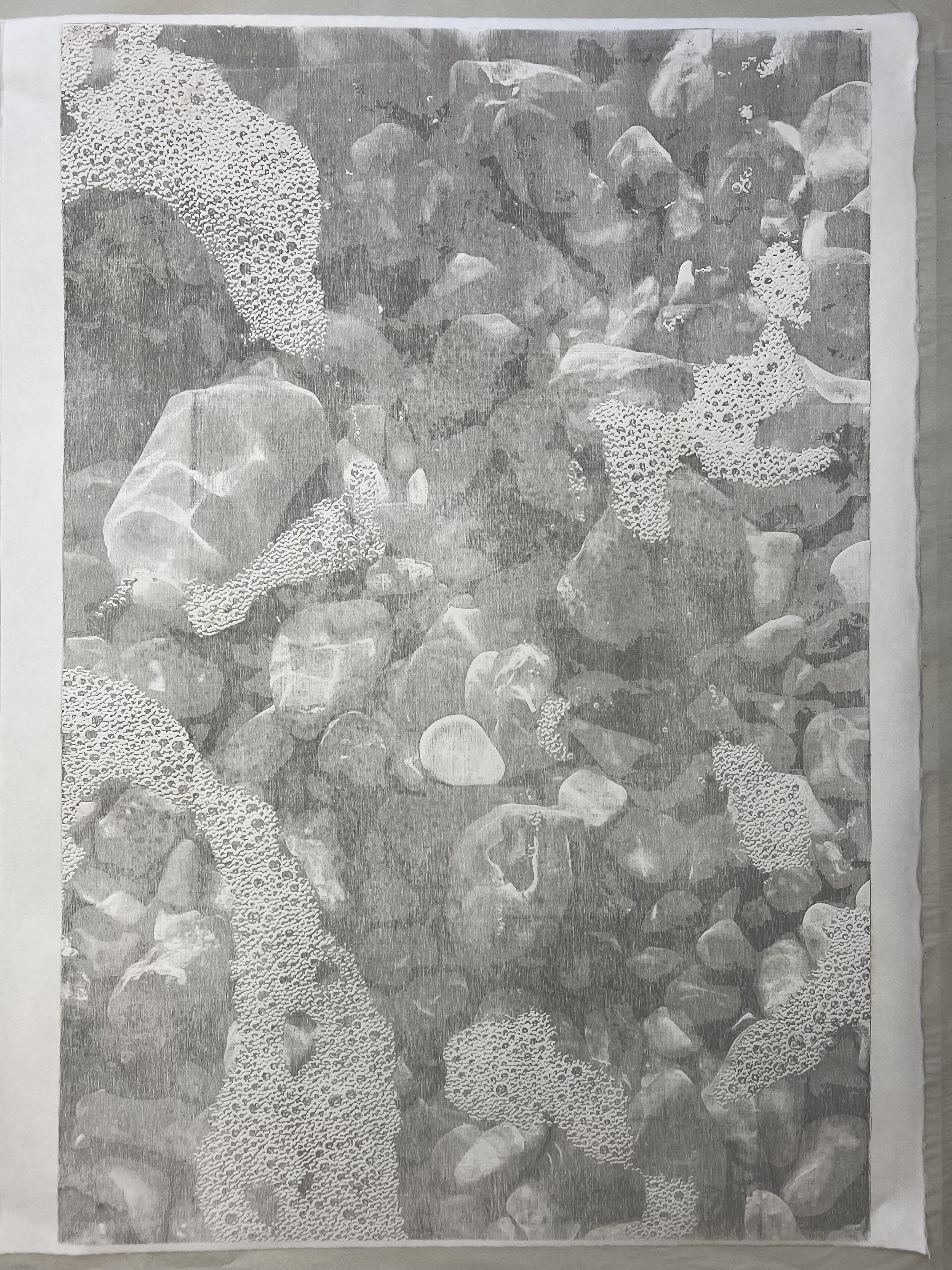
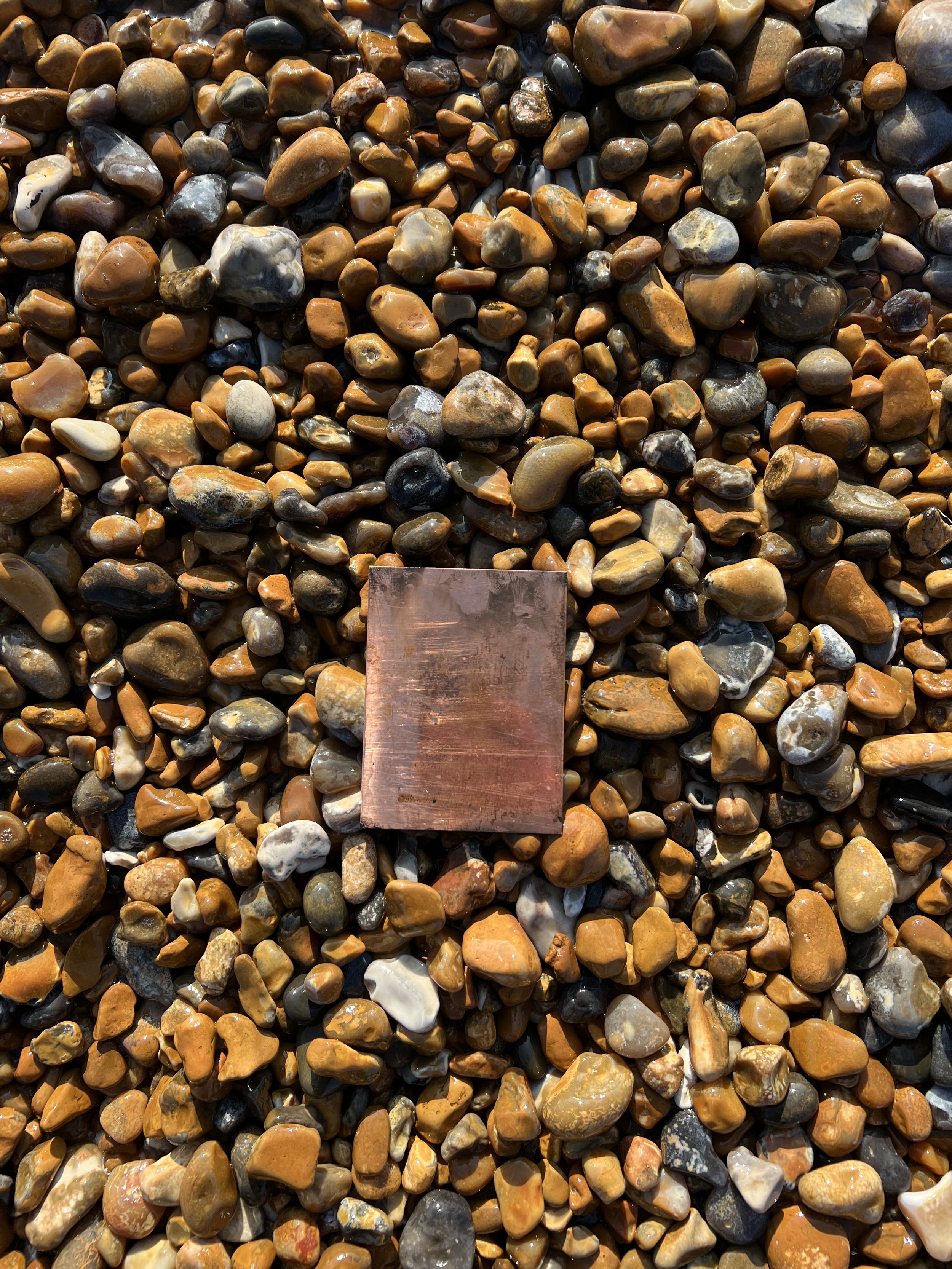
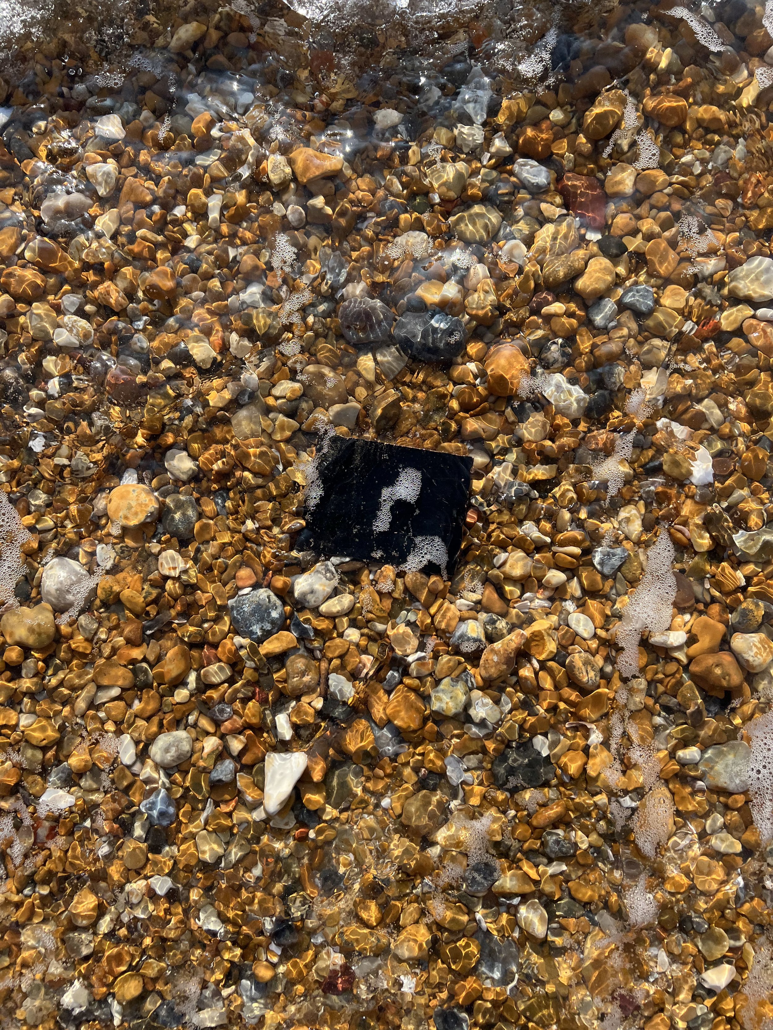
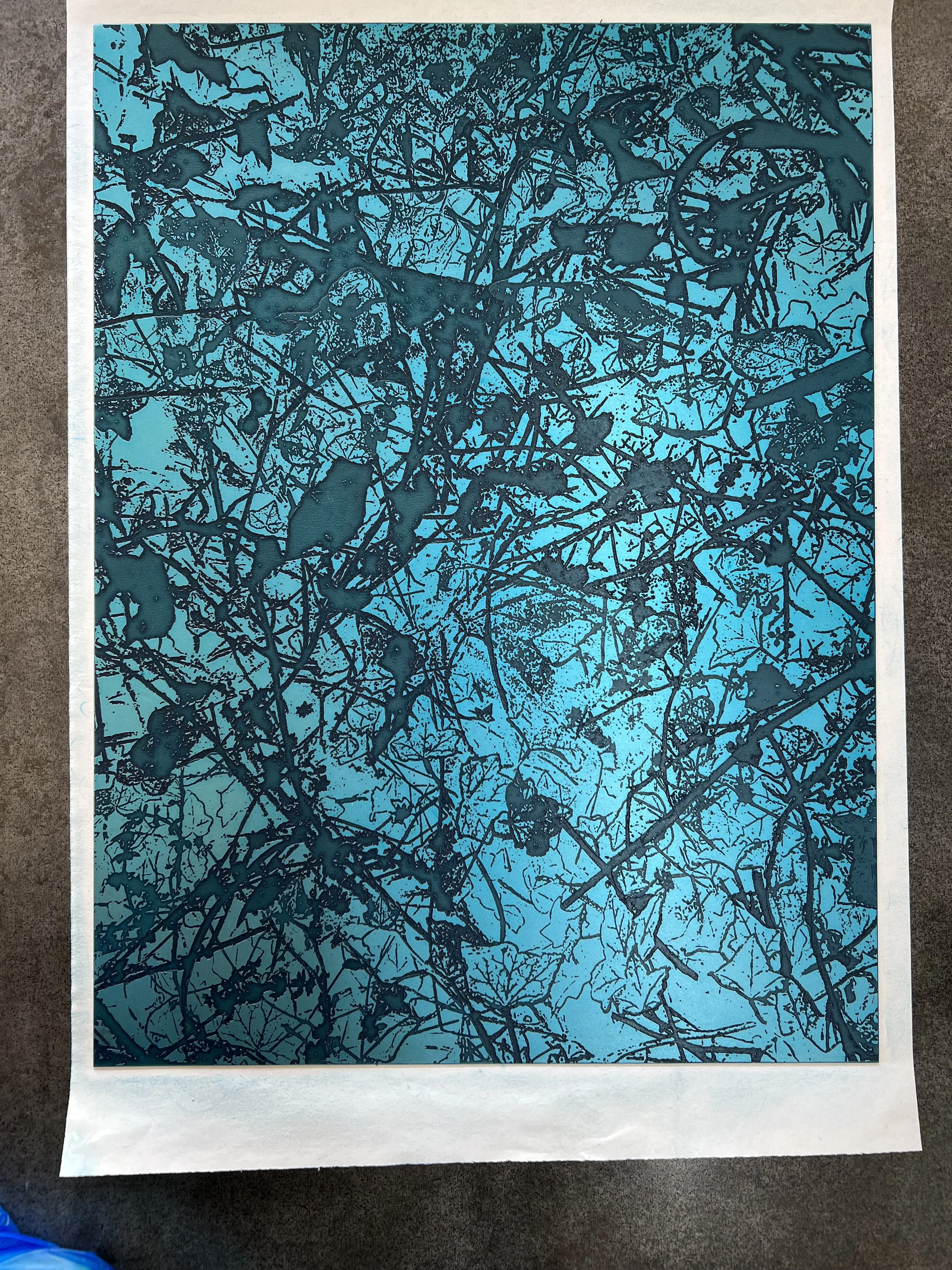
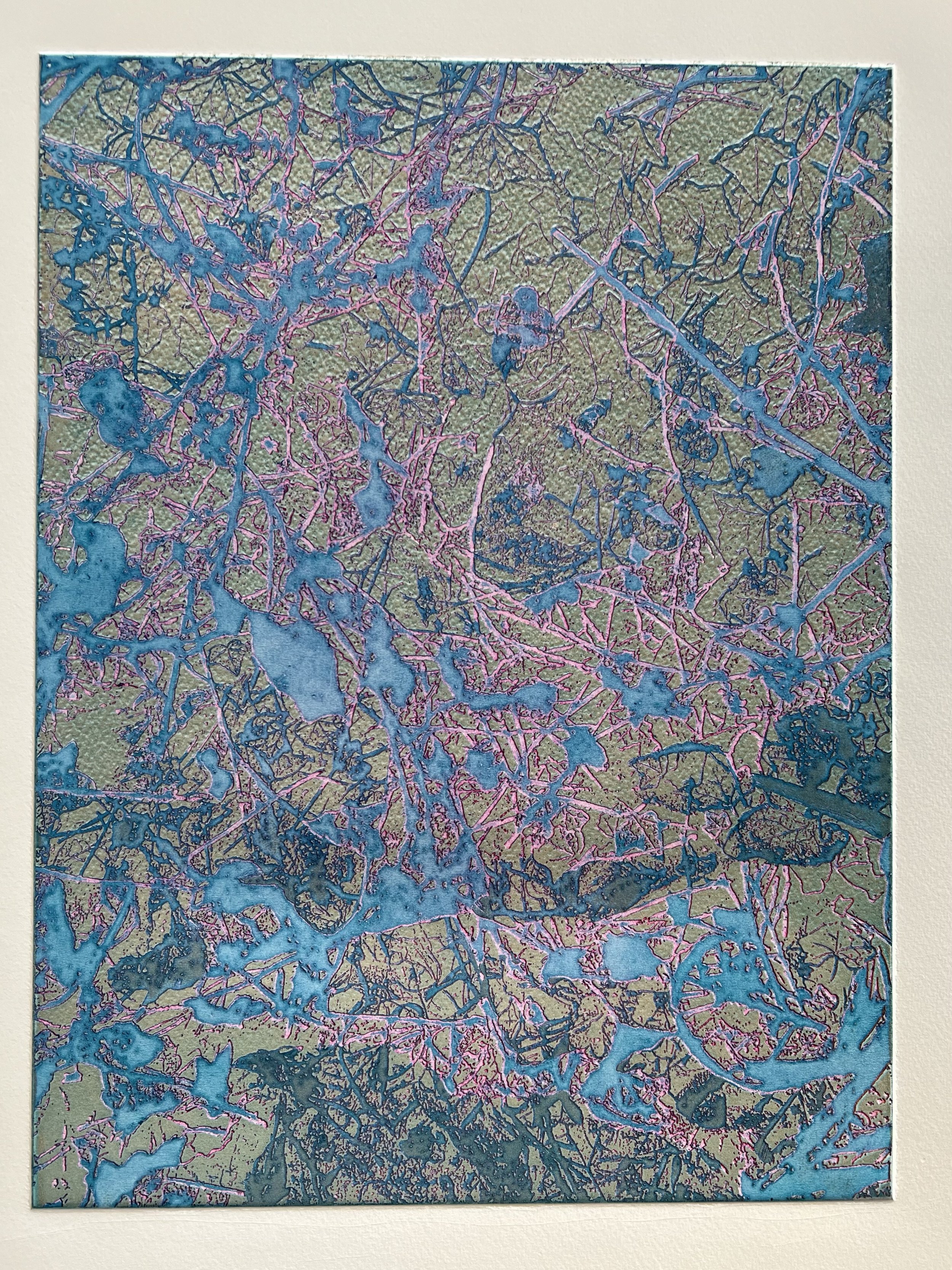
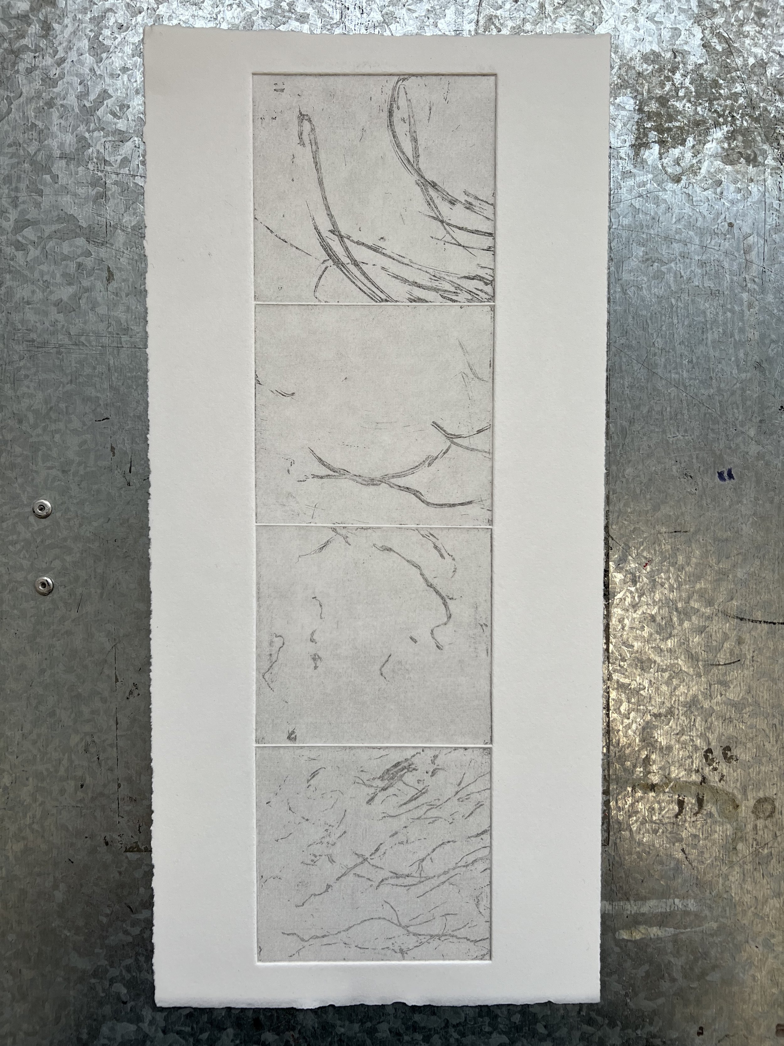
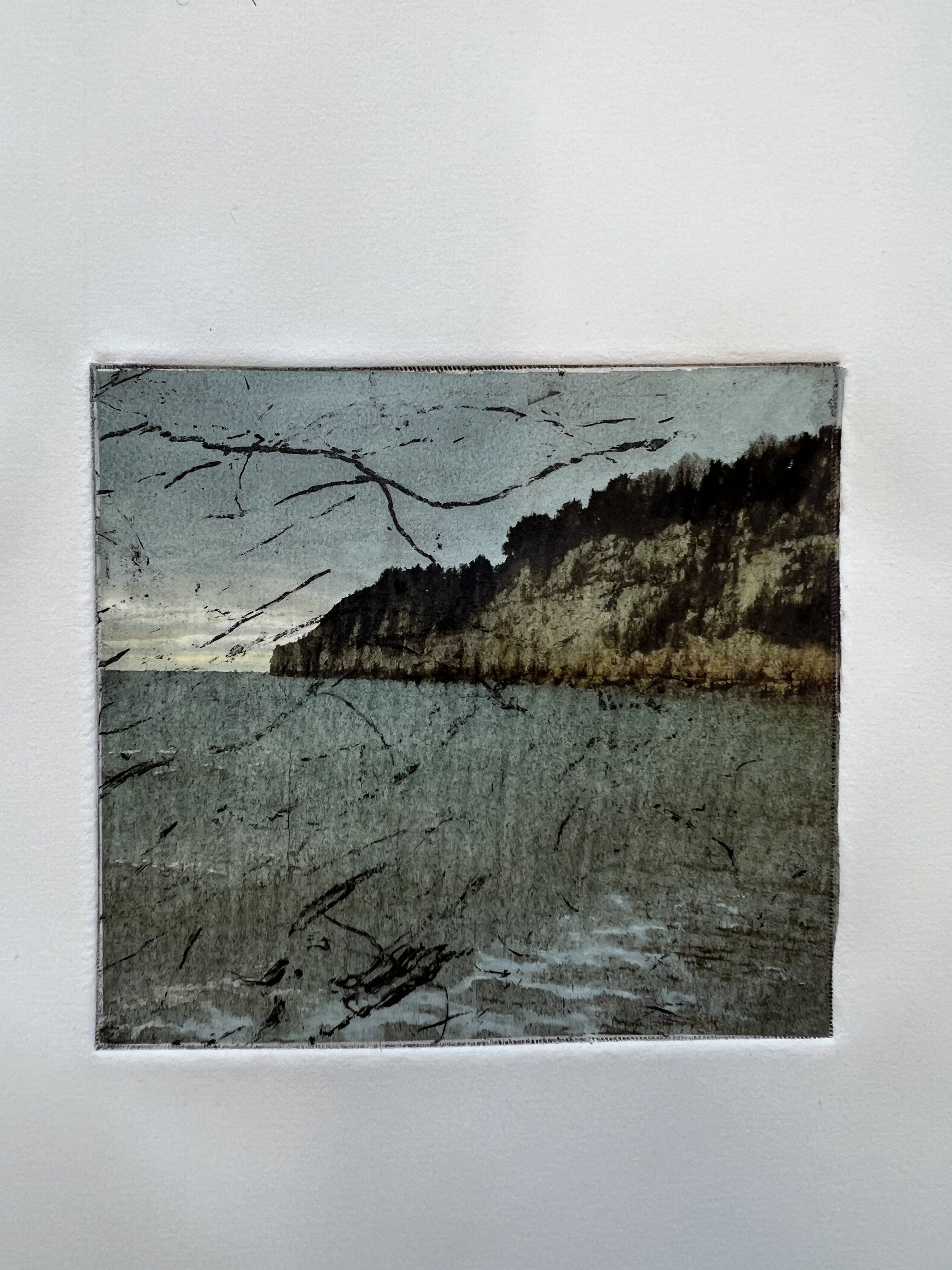
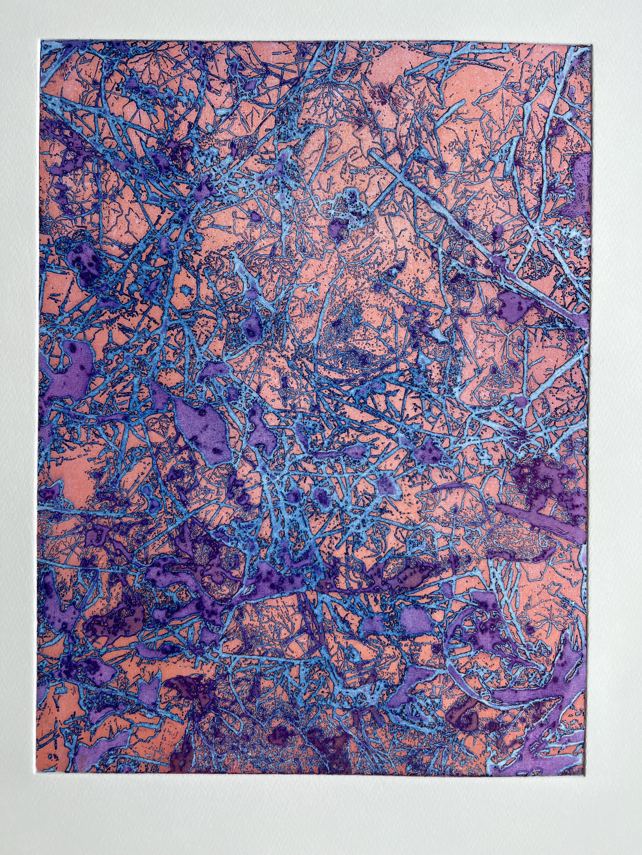
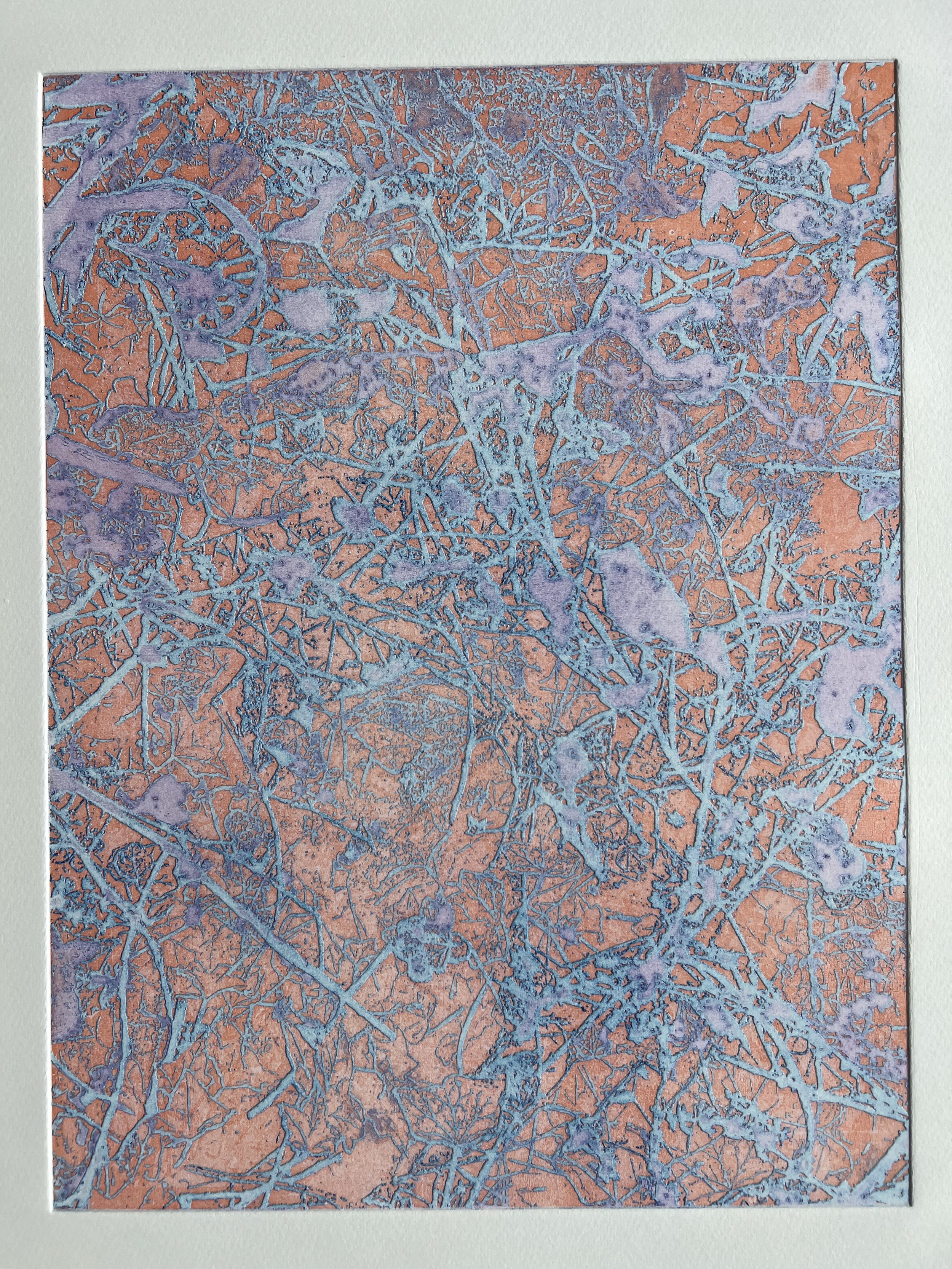
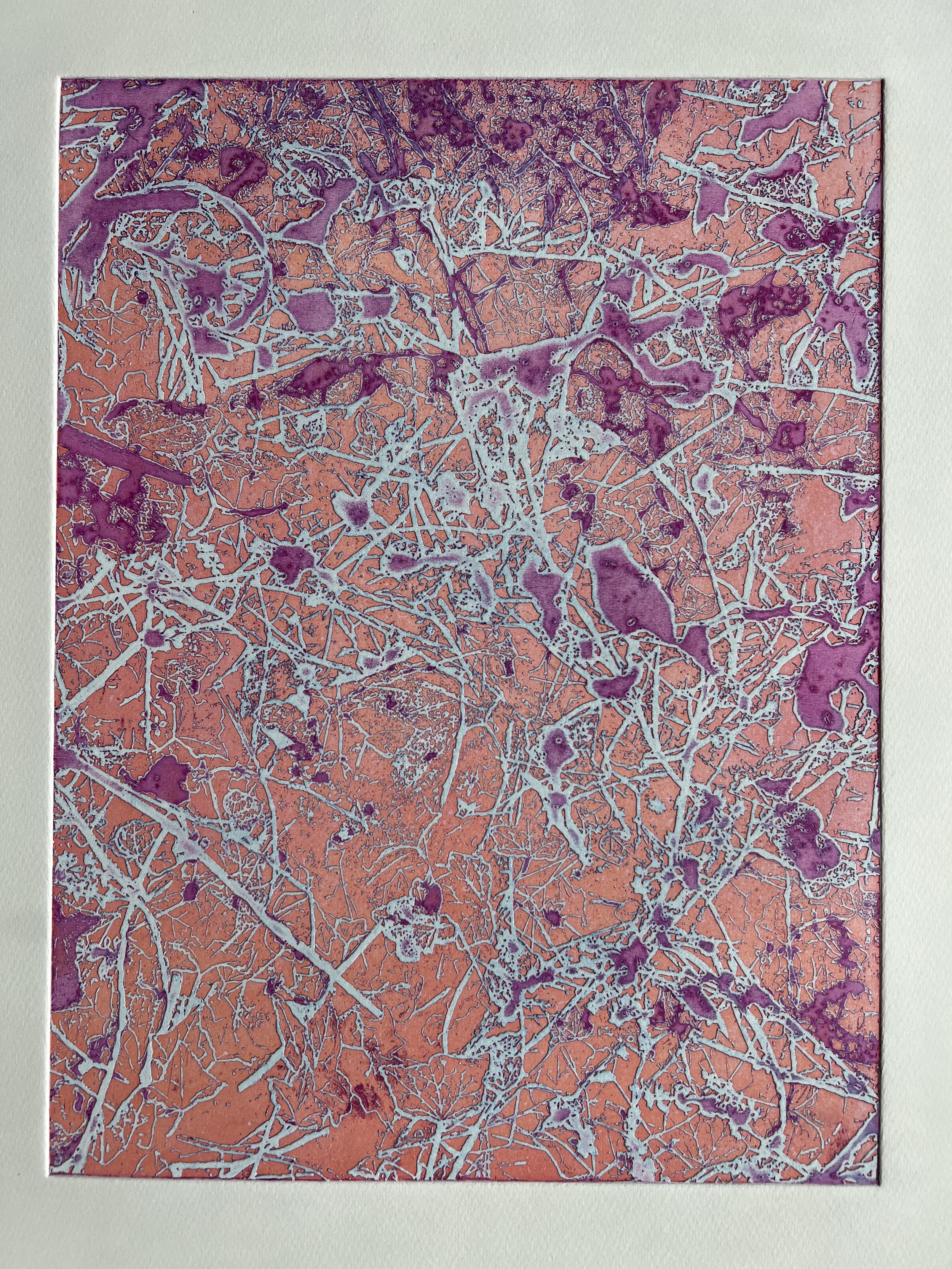
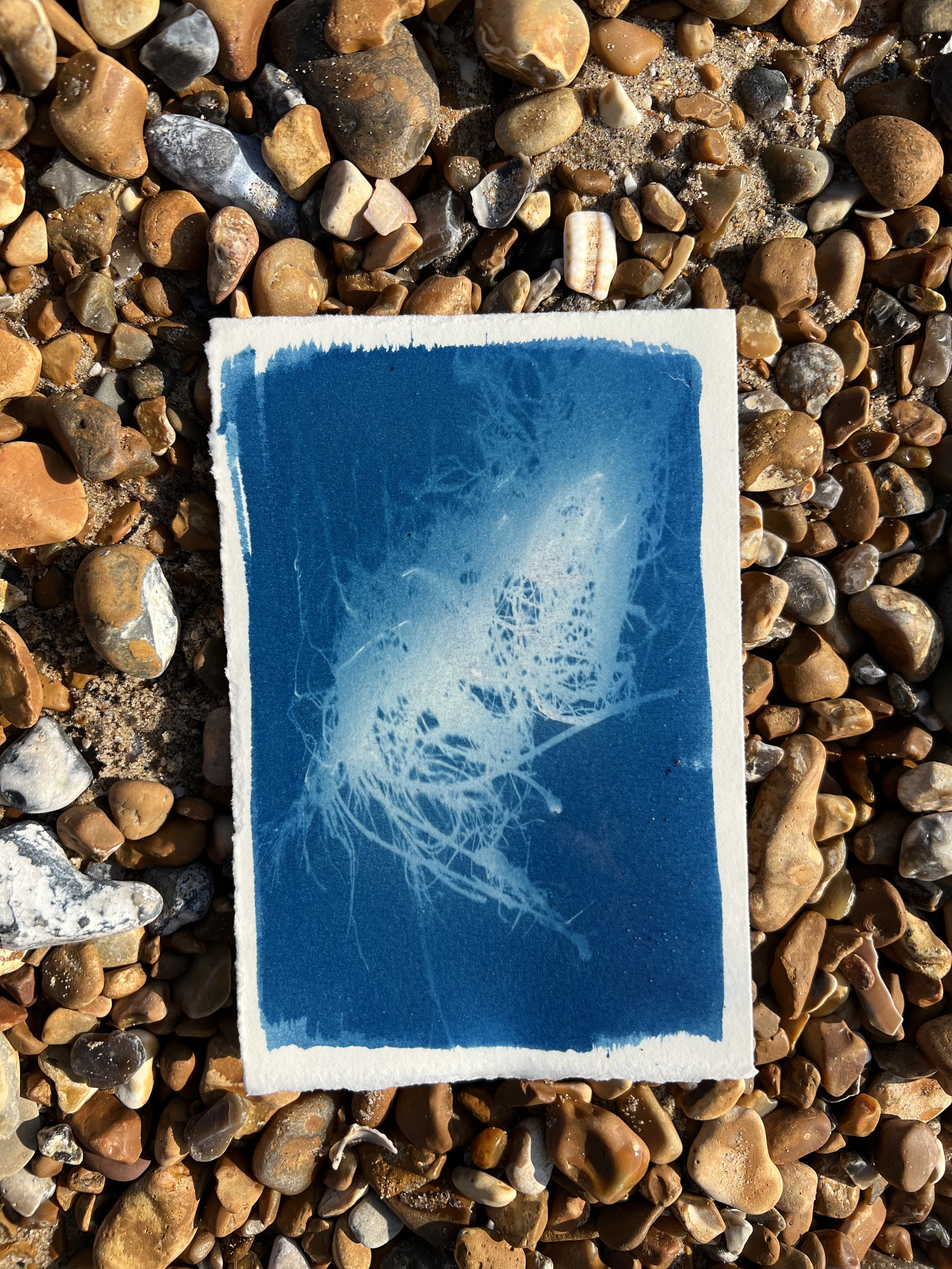
50° 55' 33”, 0° 45' 56” 08.02.23 (2023)
laser etched woodcut print on Awagami Hosho
105x156 cm
Resolve to Infinity (2023)
film with card, relief print, found object and mdf
30x20x15cm
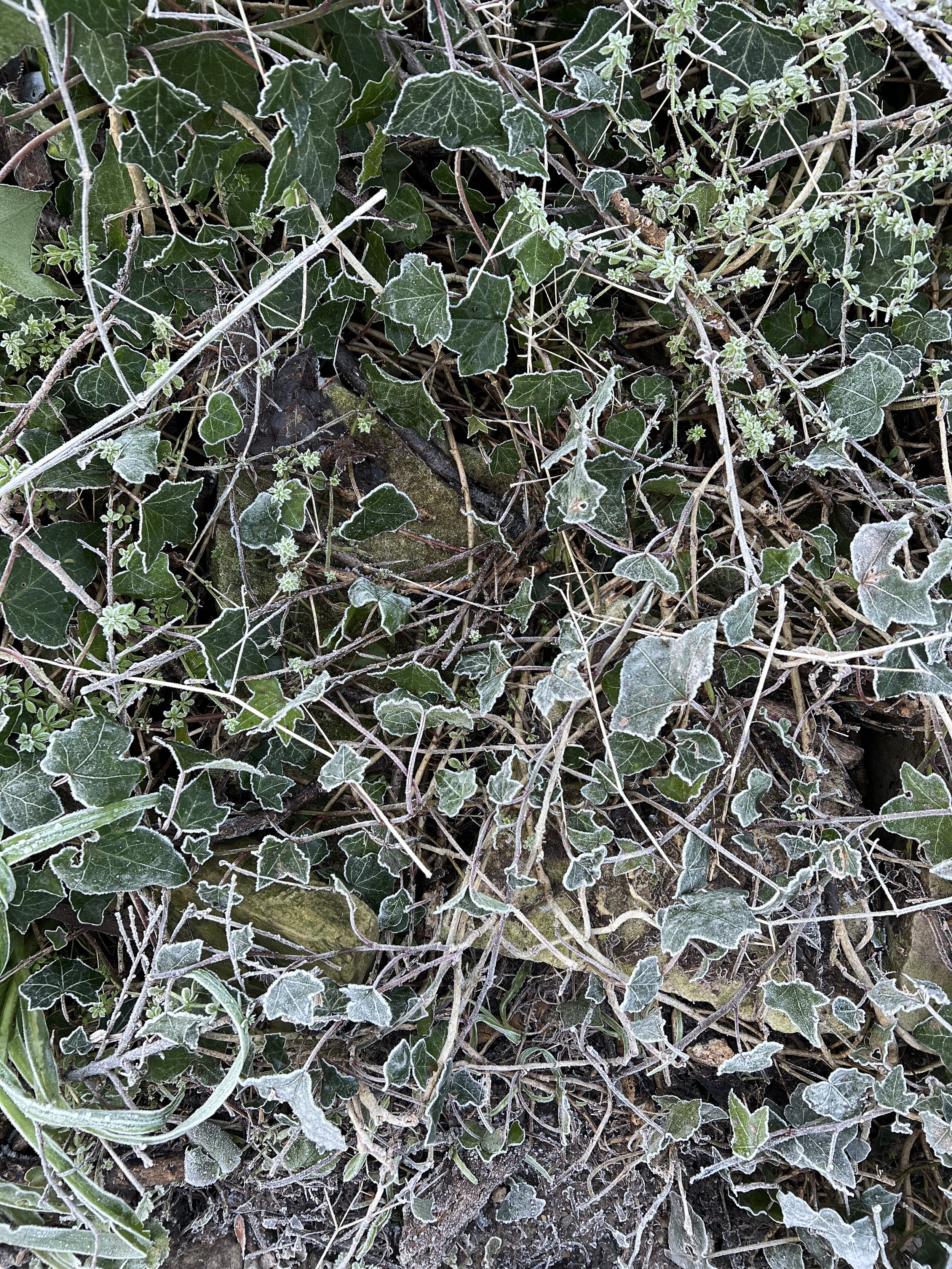
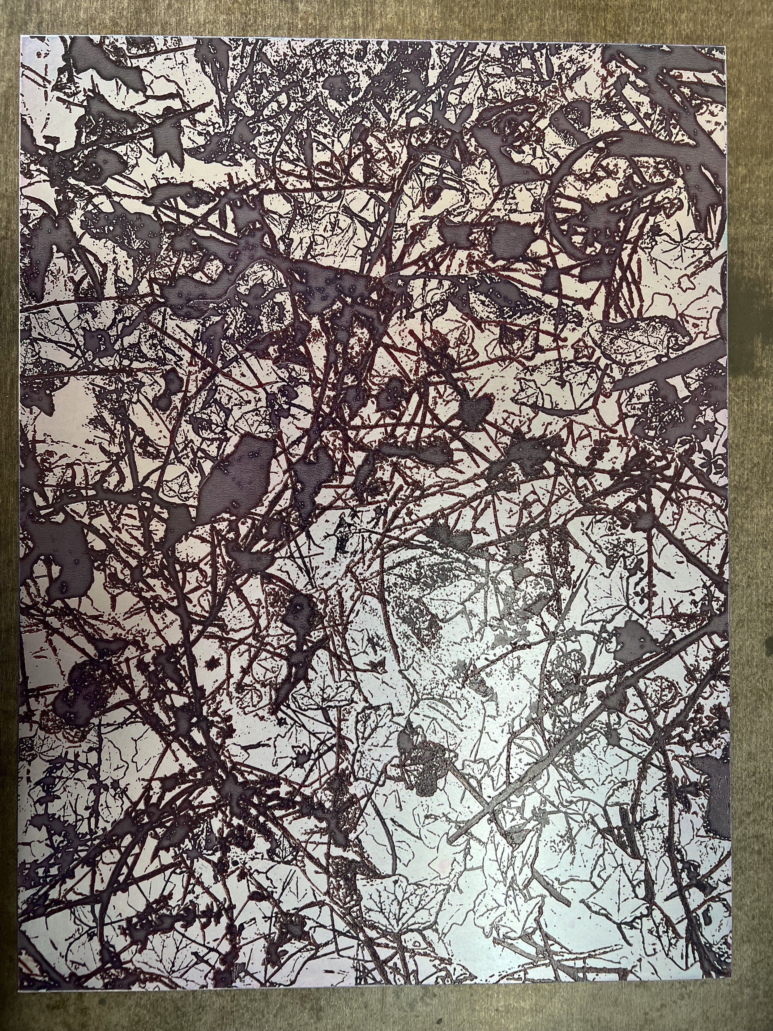
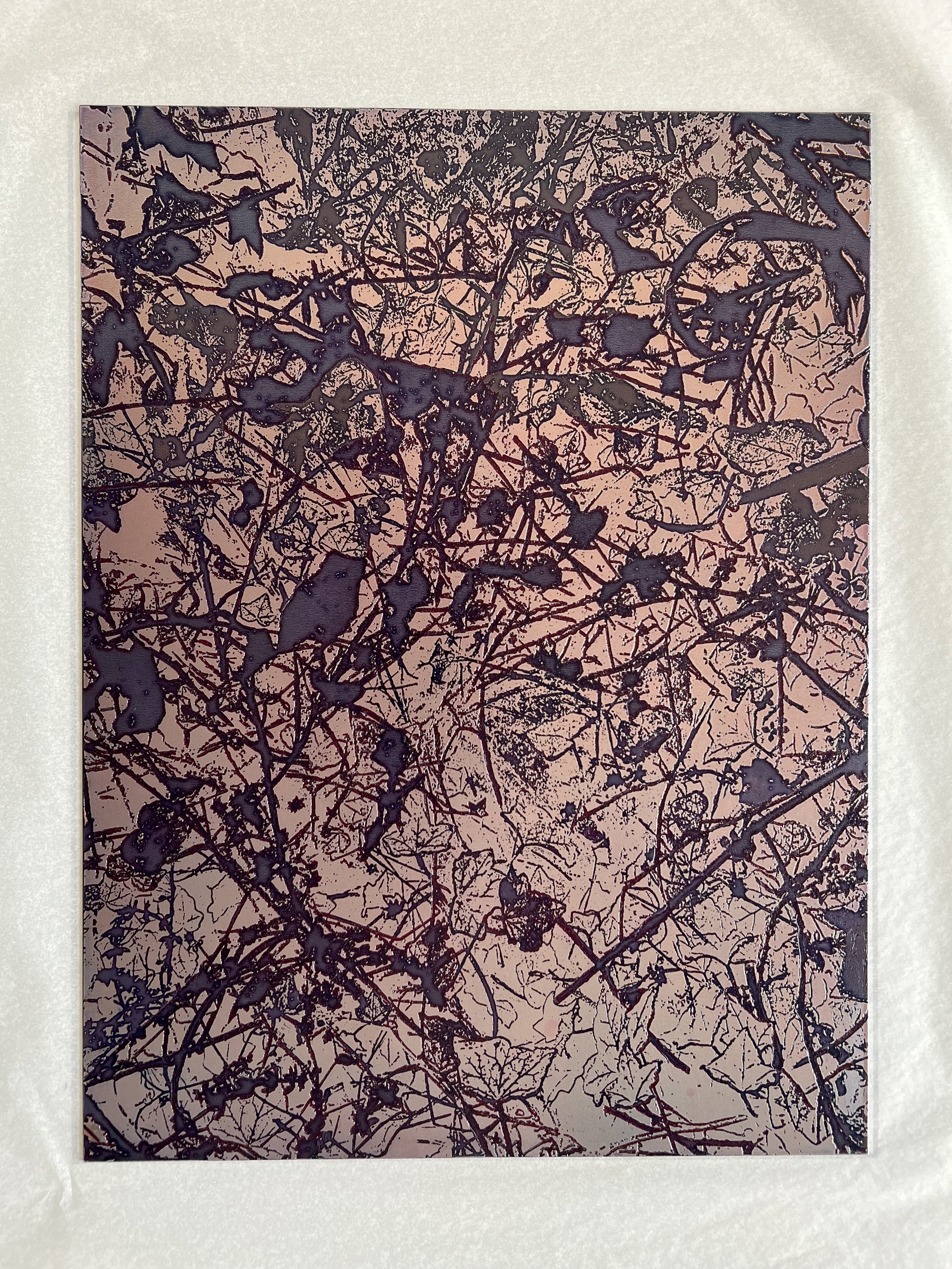
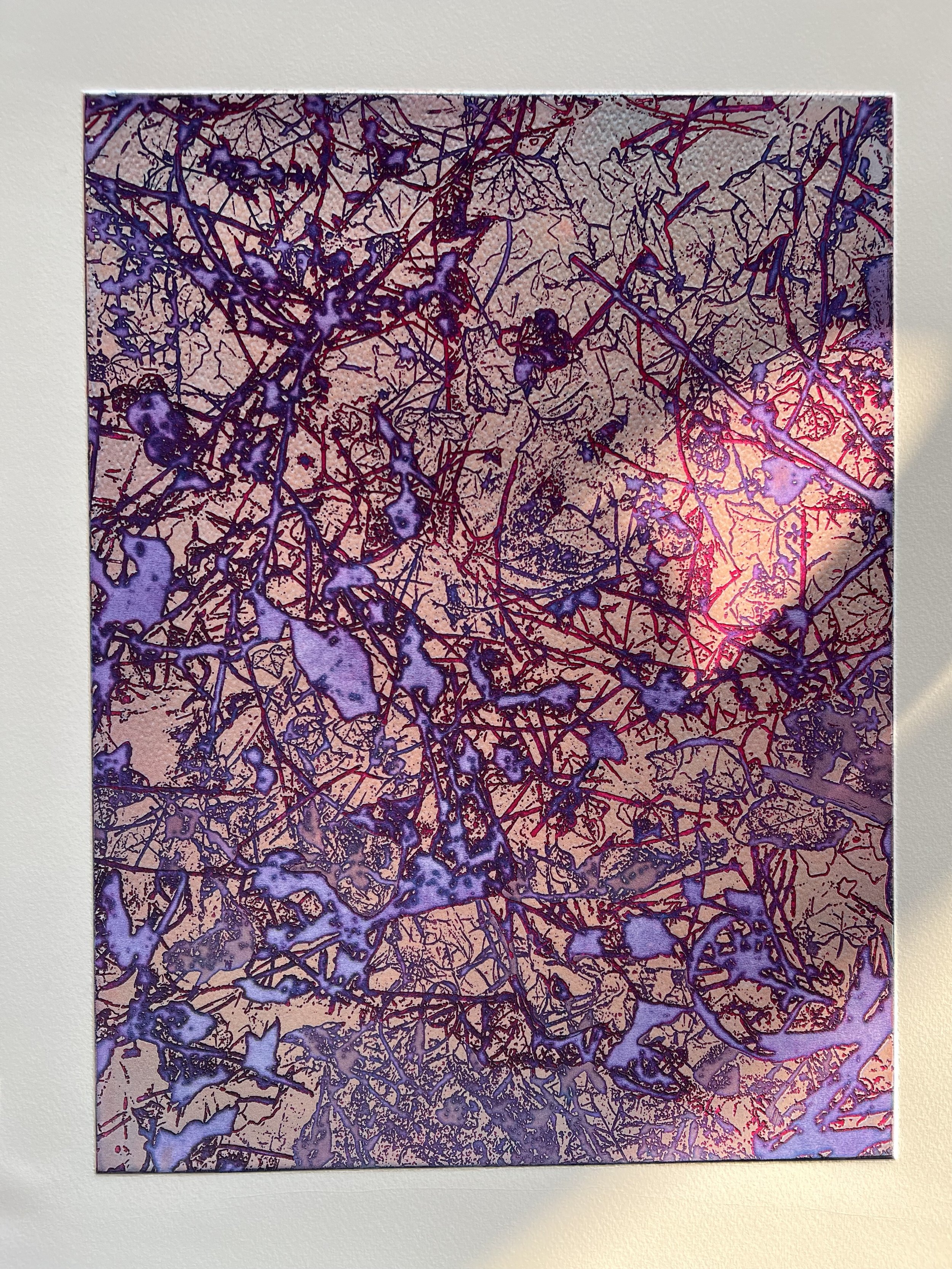
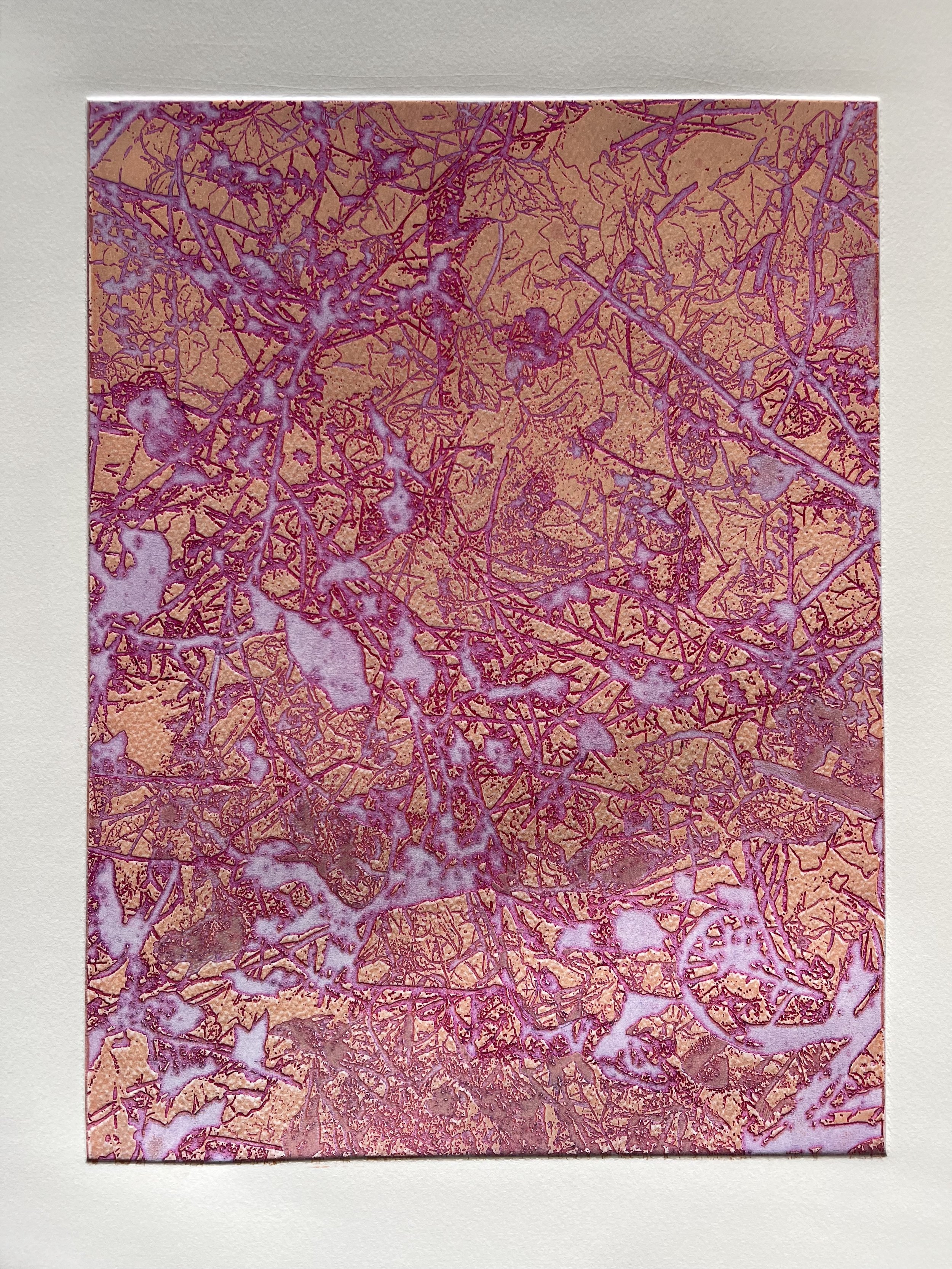
Nunhead Ivy (2023)
open edition
viscosity prints on Somerset Satin paper 38x57cm
Forces of the Small

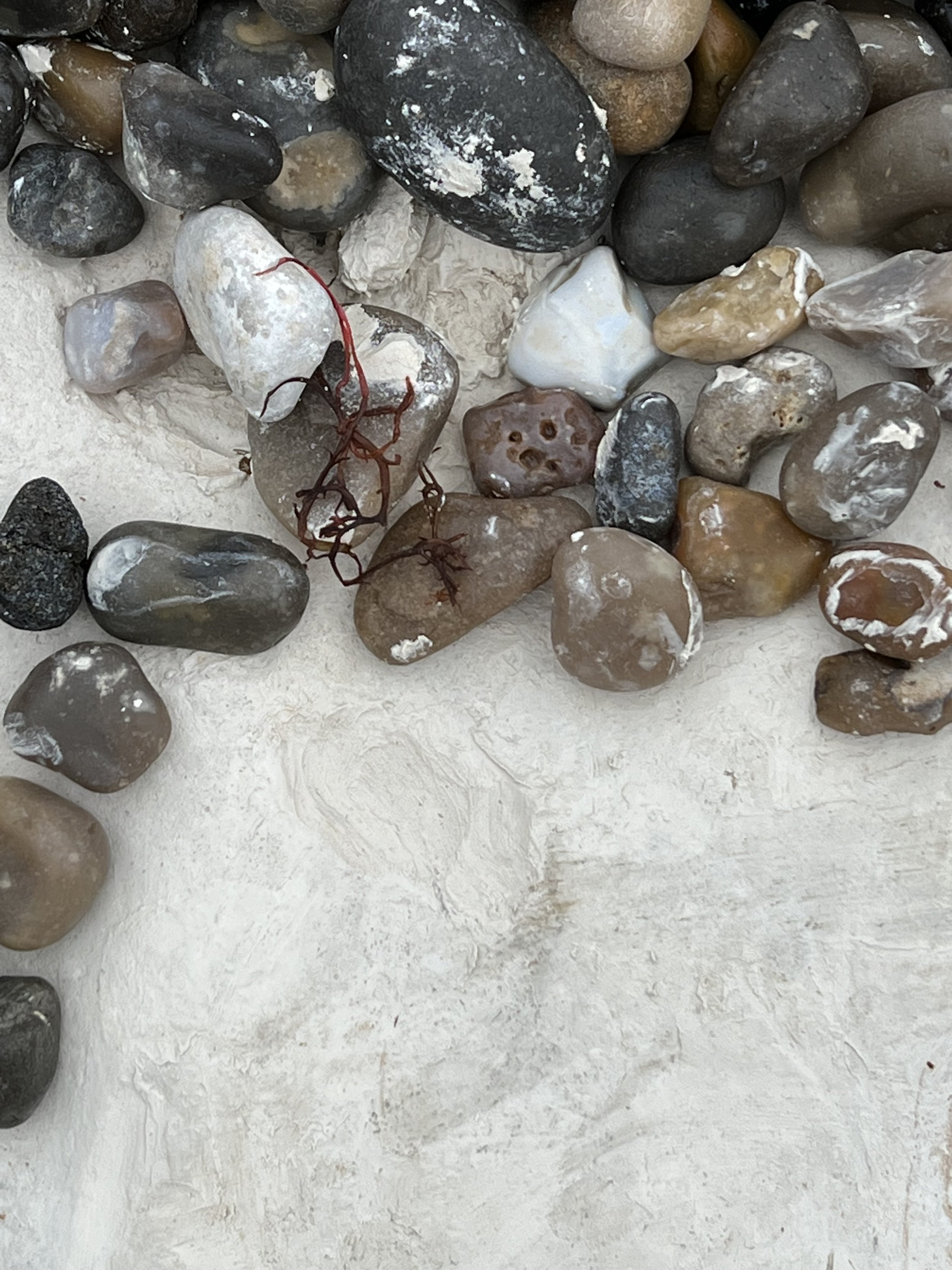
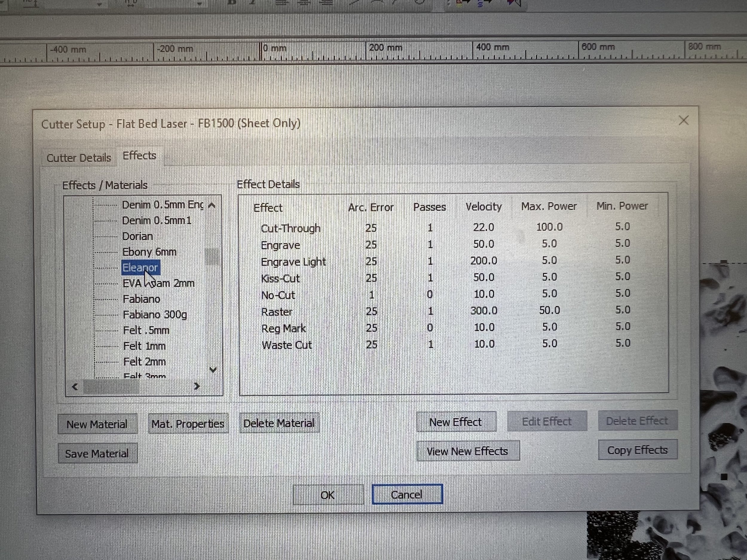
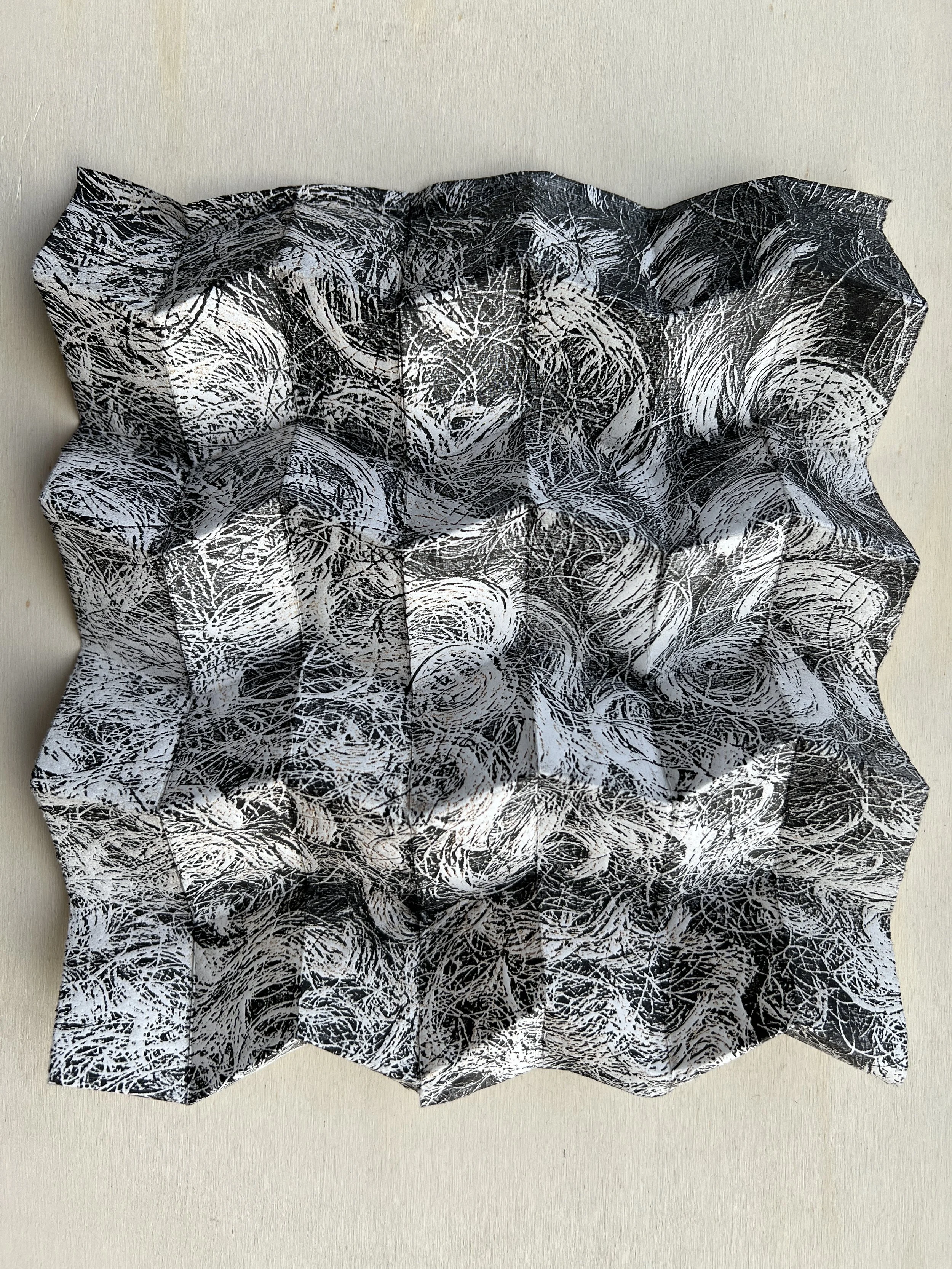
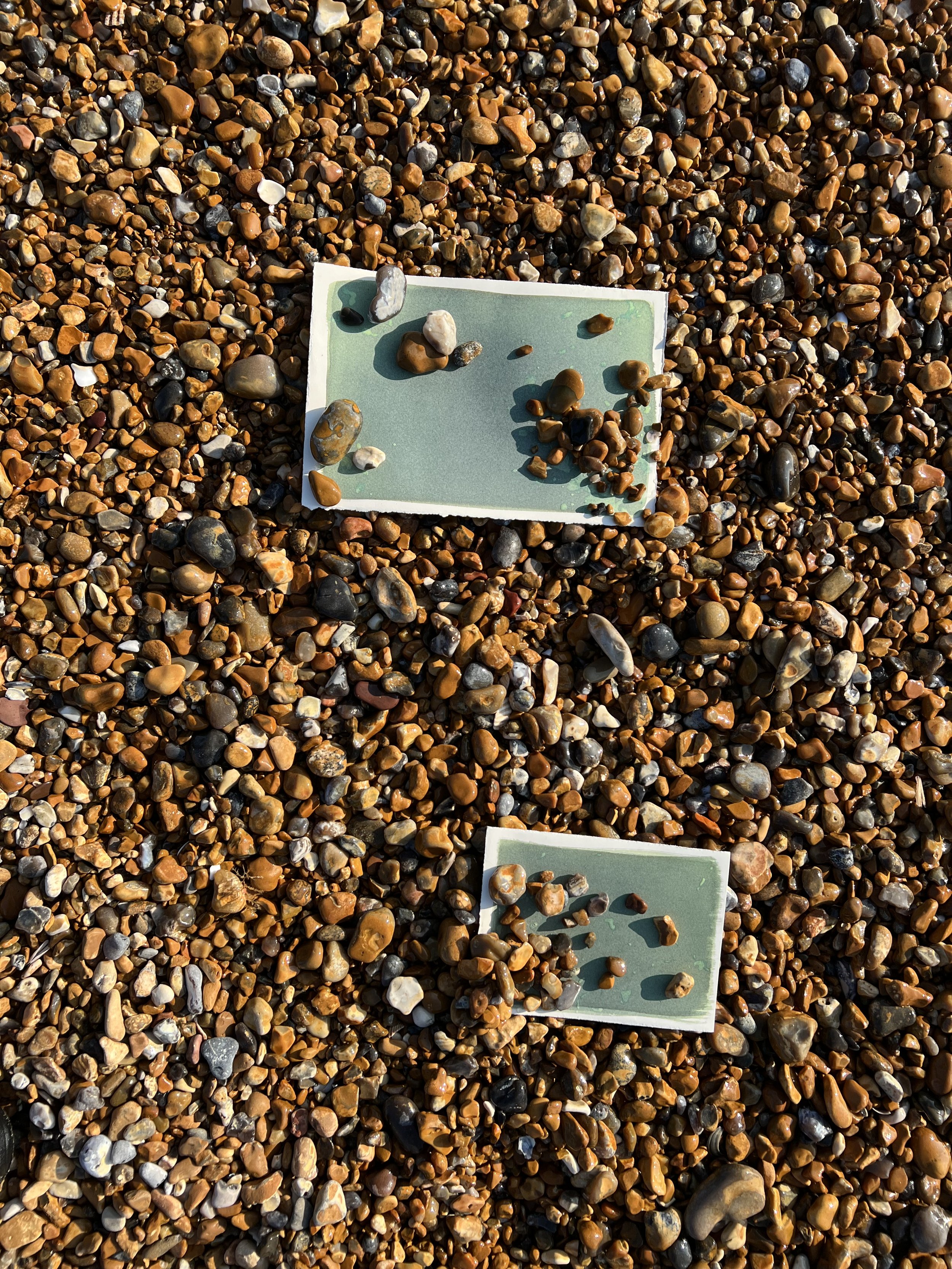
Curated by Peter Suchin, the Forces of the Small exhibition at the Filet Gallery imposed a 7x10cm constraint on works included. I wanted to create another phase box containing a print, but decided to keep the overall dimensions of the print within the allowance. I laser etched an image of the sea taken during my trip to Rye Harbour beach into plywood and relief printed it; and included two small souvenirs of the day. Because I was already working at a small scale and thinking about folding prints to make them portable, this was not a brief that I struggled with - indeed it gave me an opportunity to try a more lighthearted subject and incorporate souvenirs and transitional objects that I had collected on site.


testing how to fold the print within the phase box

resolved work


submitted works

private view

installation view
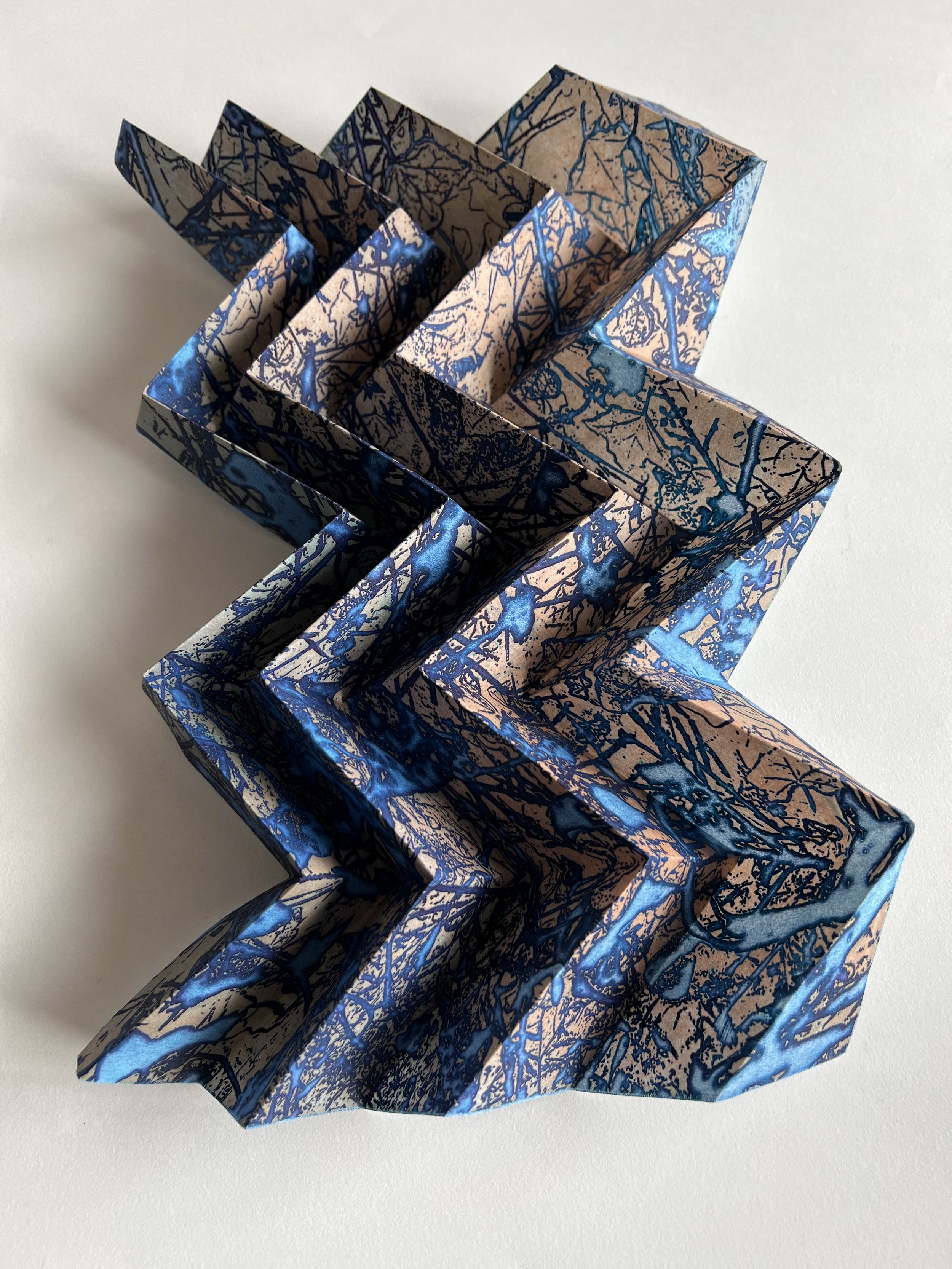
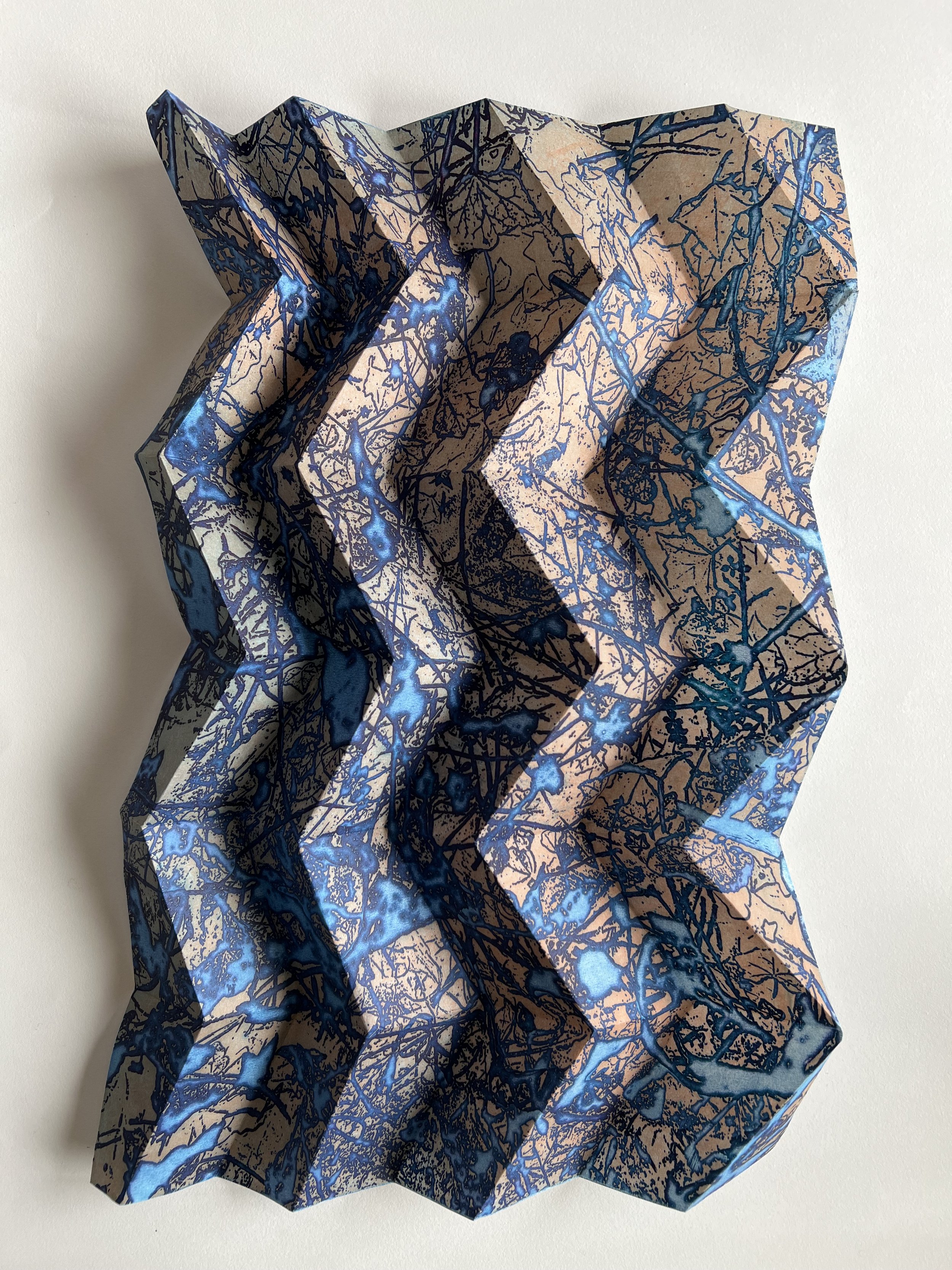
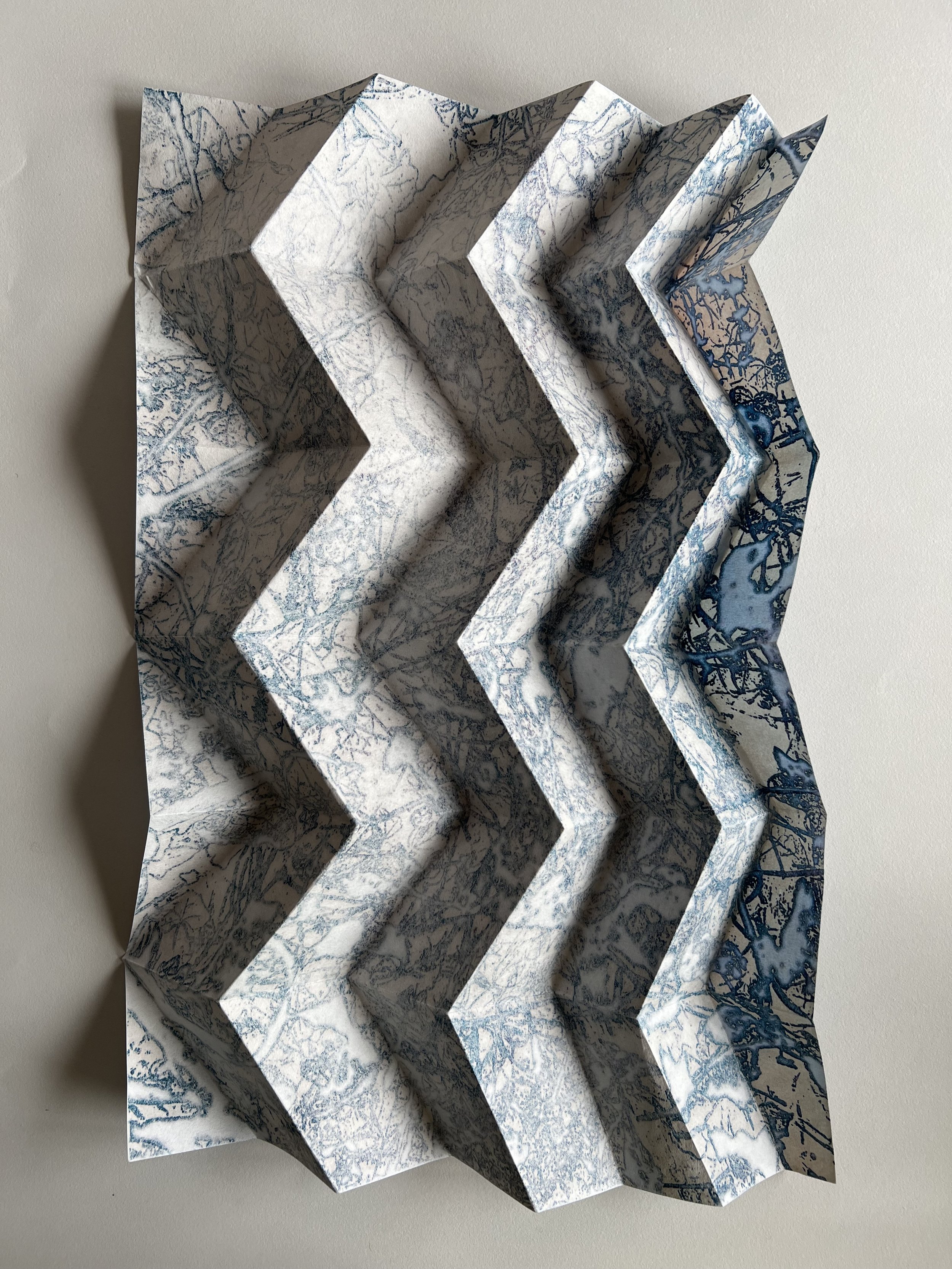
Spectrum - Diffusion


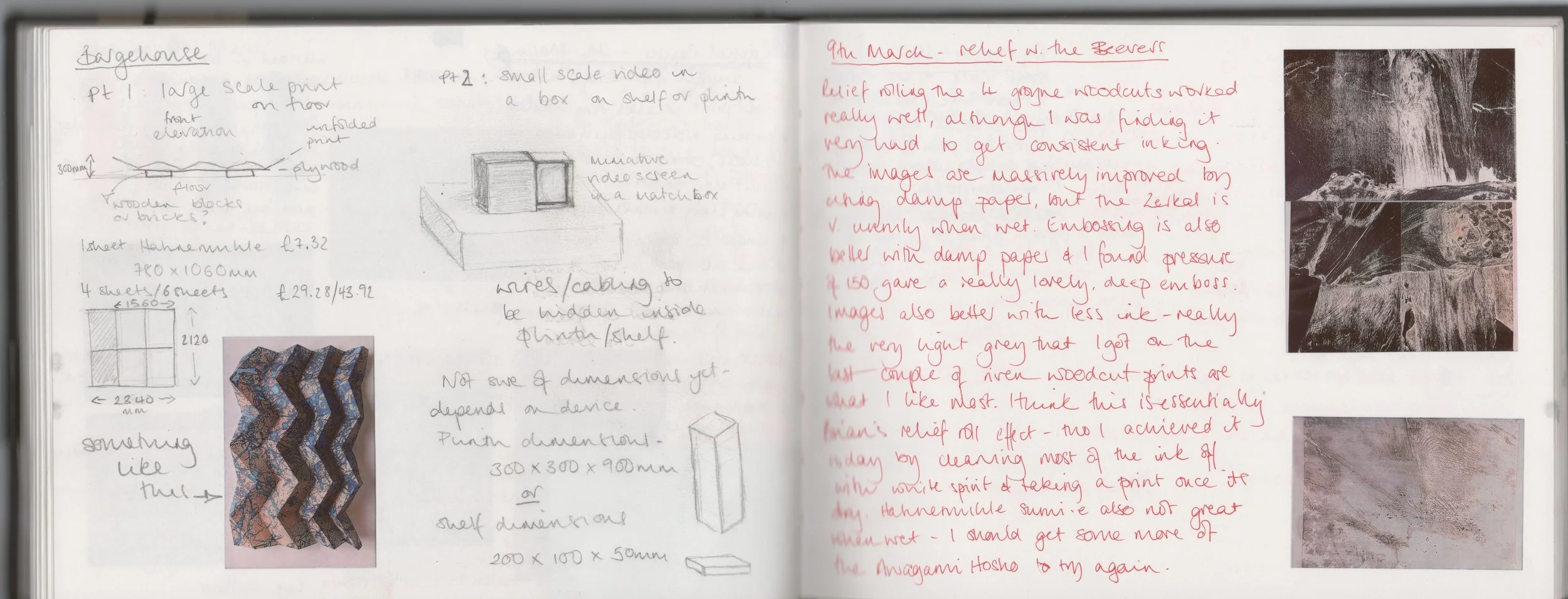
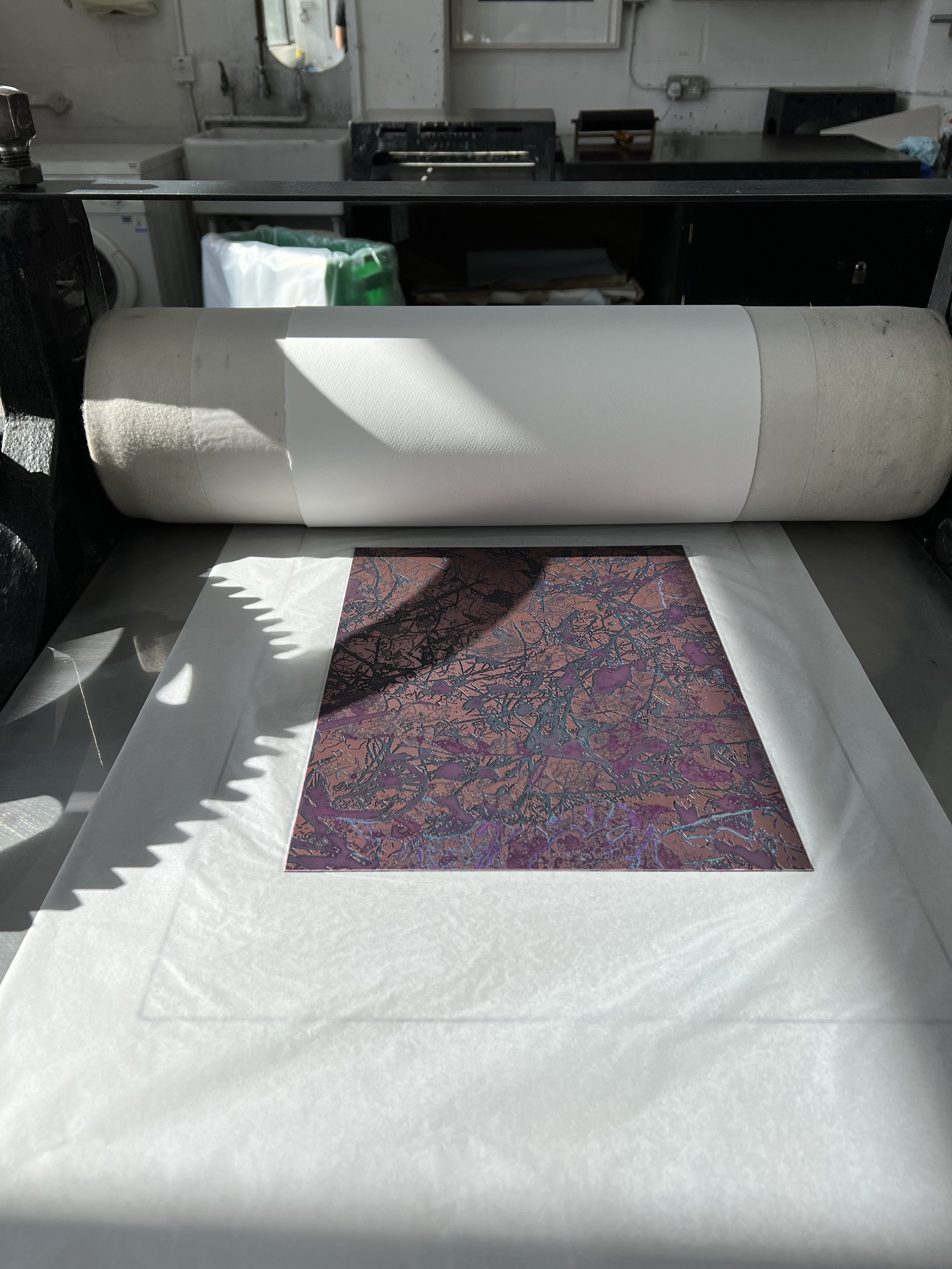
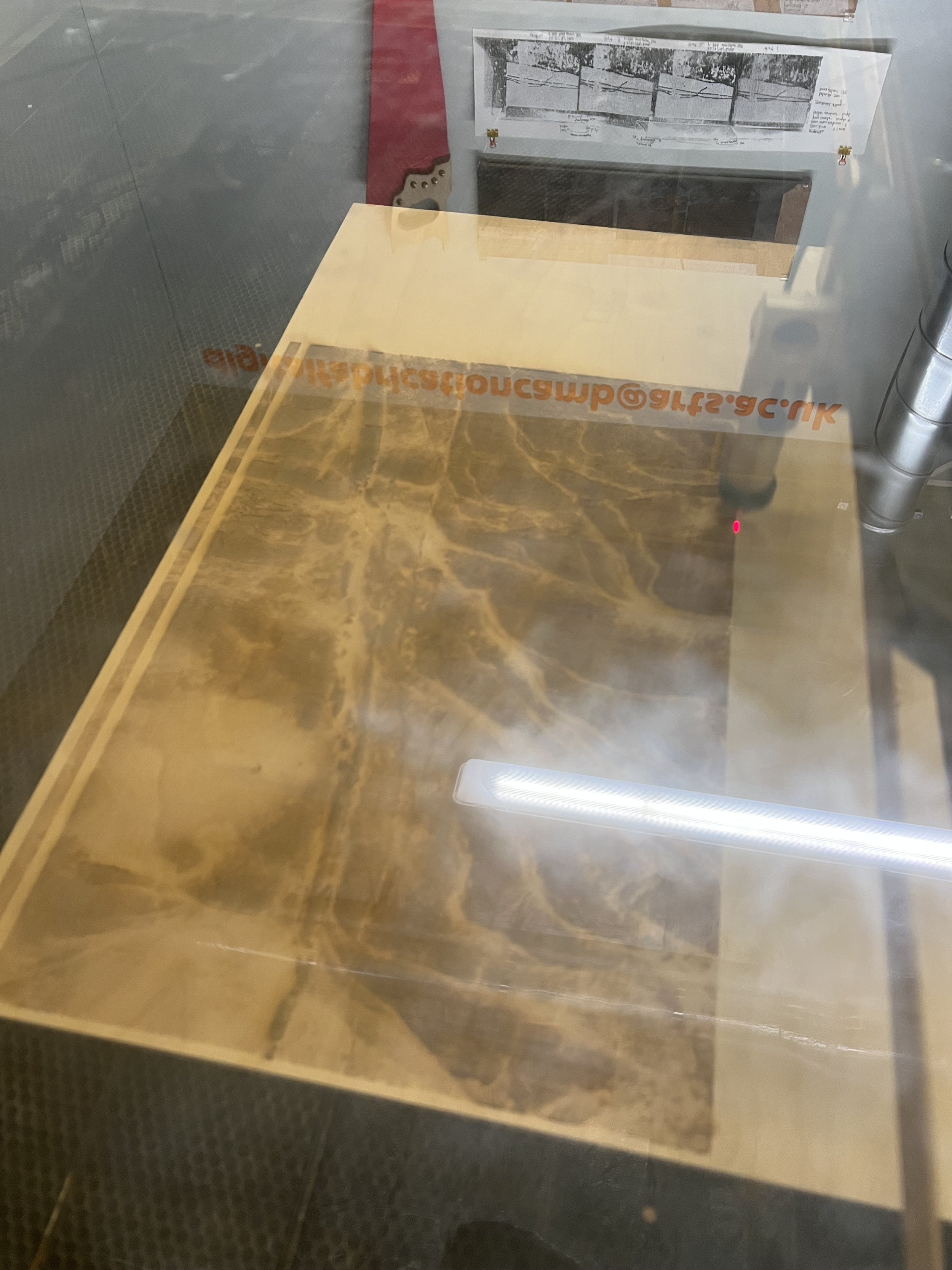
While the exhibition at Filet felt like a fun distraction, the opportunity to show at Bargehouse felt really consequential, given the scale of the show and it’s location on the South Bank. I wanted to scale up and had been thinking about ways to do this; I also wanted to push the memory box idea as far as I could and had the idea of trying to contain a film - of the sea, taken at Beer - in a box, somehow. I submitted a proposal for two works: a small box on a plinth or shelf and a floor-based print piece that was nearly 5m square. Feedback on the proposal was that I would need to allow for at least 1m space each side of my floor piece - in a room that was 4m wide; but I had already been working out the logistics of time and access to the laser cutter to make the printing plates and it was clear that, unless I included repetition in the print piece, I would not be able to go as large as I had hoped. Both pieces were practically complex: for the print piece I had to scale up the original photograph and divide it into 4 A1 size images to etch into plywood. The scaling up meant that the depressions in the plate were less pronounced than in smaller scale versions, so I couldn’t get the clarity and sharpness of emboss that I was hoping for; and the time available on the cutter meant that I had to scan at 0.2 which means the image is a little more degraded and digital looking. I had to work out which paper would work best folded at scale and could be attached to other prints as seamlessly as possible and which type of fold would best suggest and unfolded map. The method for gluing the prints together was new to me - using very fine kozo paper and heat-activated adhesive so as to avoid getting the prints wet.
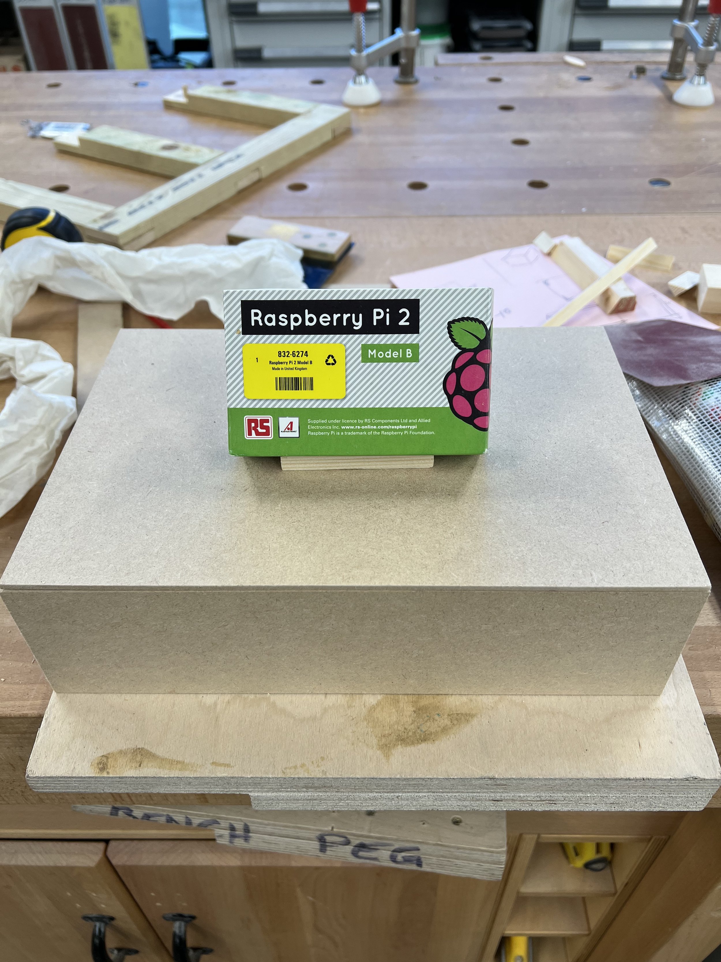
For the video, I found a small screen with a high resolution that was designed to work with a Raspberry Pi computer. Although I had instructions for programming a Raspberry Pi to act as a media player, I felt this was really well beyond my technical ability - so I tested the screen with multi media players from the loan store, but they worked only inconsistently. However the loan store also had a pre-programmed Raspberry Pi that would loop a single mp4 file from a usb stick and this worked well. There was also an issue around the screen’s orientation, which was portrait: I had thought this would work with the film, since I had taken it on my iphone, but the software I was using could only edit in landscape and then the screen compressed the film into a narrow strip down the centre. I eventually found an aspect ratio that worked with this set up, then had to make the box that housed the screen and a shelf for it to sit on and to house the media player and wires.
So, this was a really challenging exhibition - in that I experimented quite radically with the presentation of my pieces and had to learn new processes, with the support of quite a few different technicians. I have learned a lot from the experience and would do a few things differently, but ultimately I was pleased with both pieces and felt I did realise my aims for them.

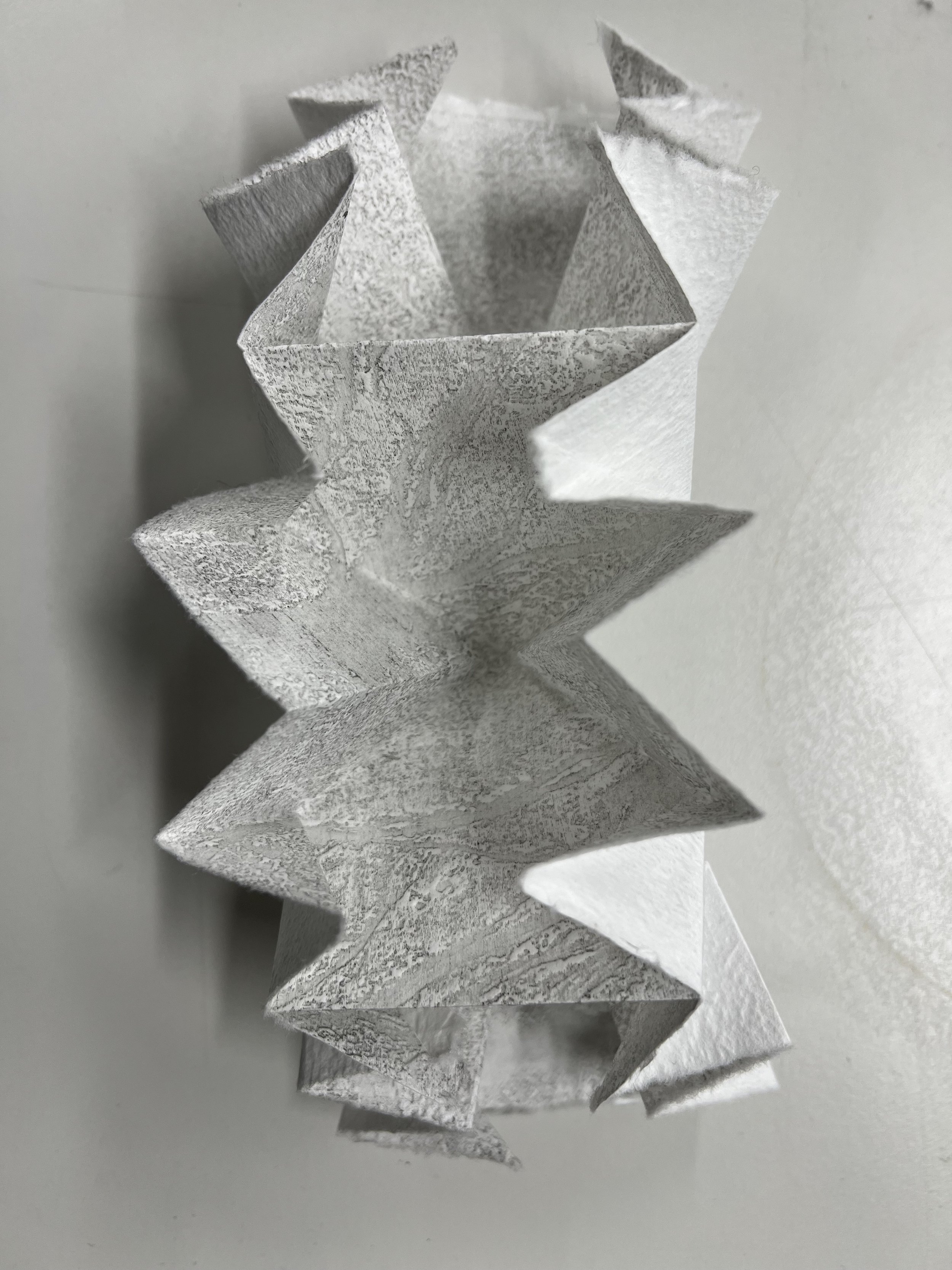
testing folds: a traditional OS map fold

Turkish map fold

Miura map fold

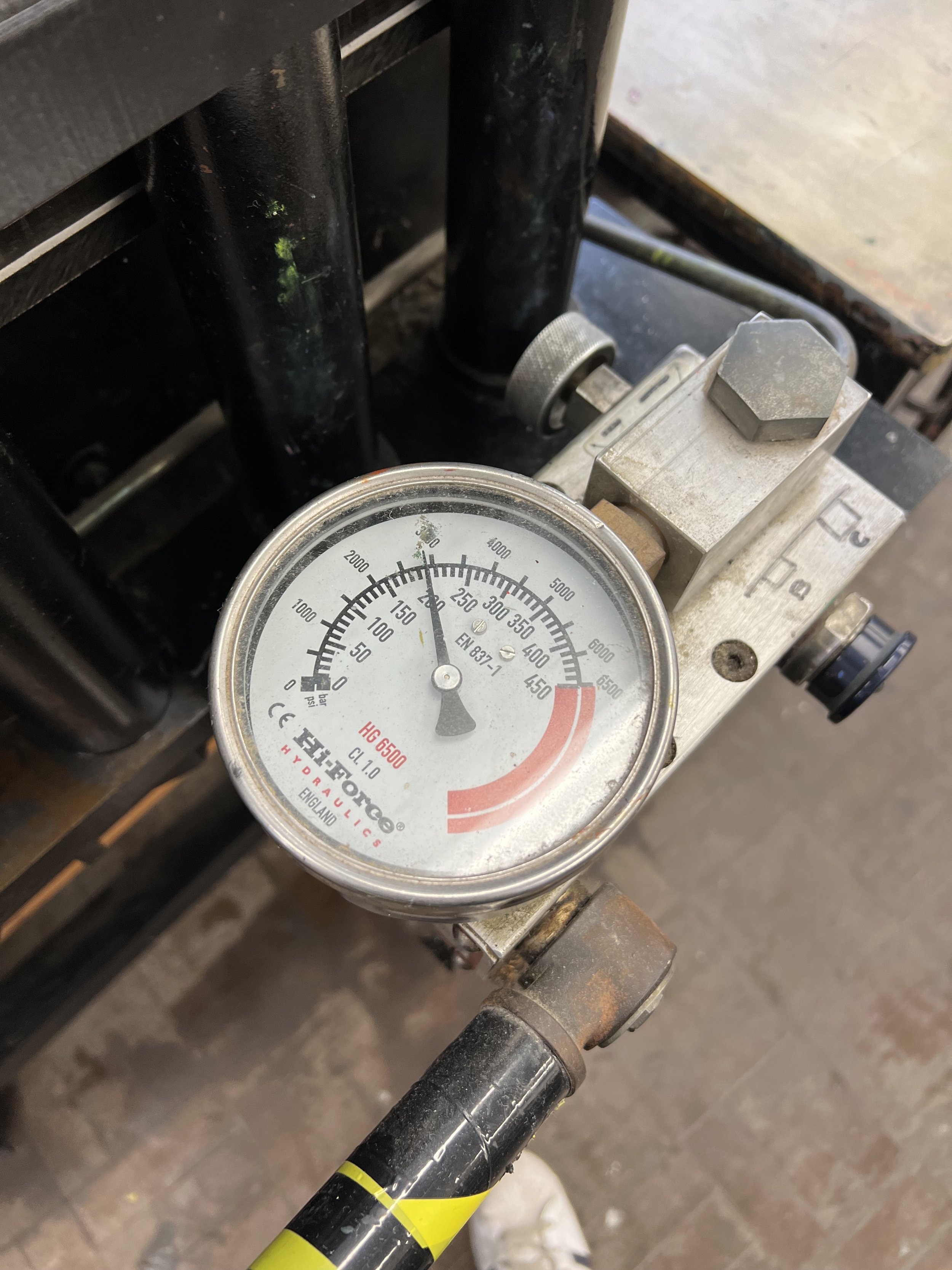
pressure level on the Beevers press

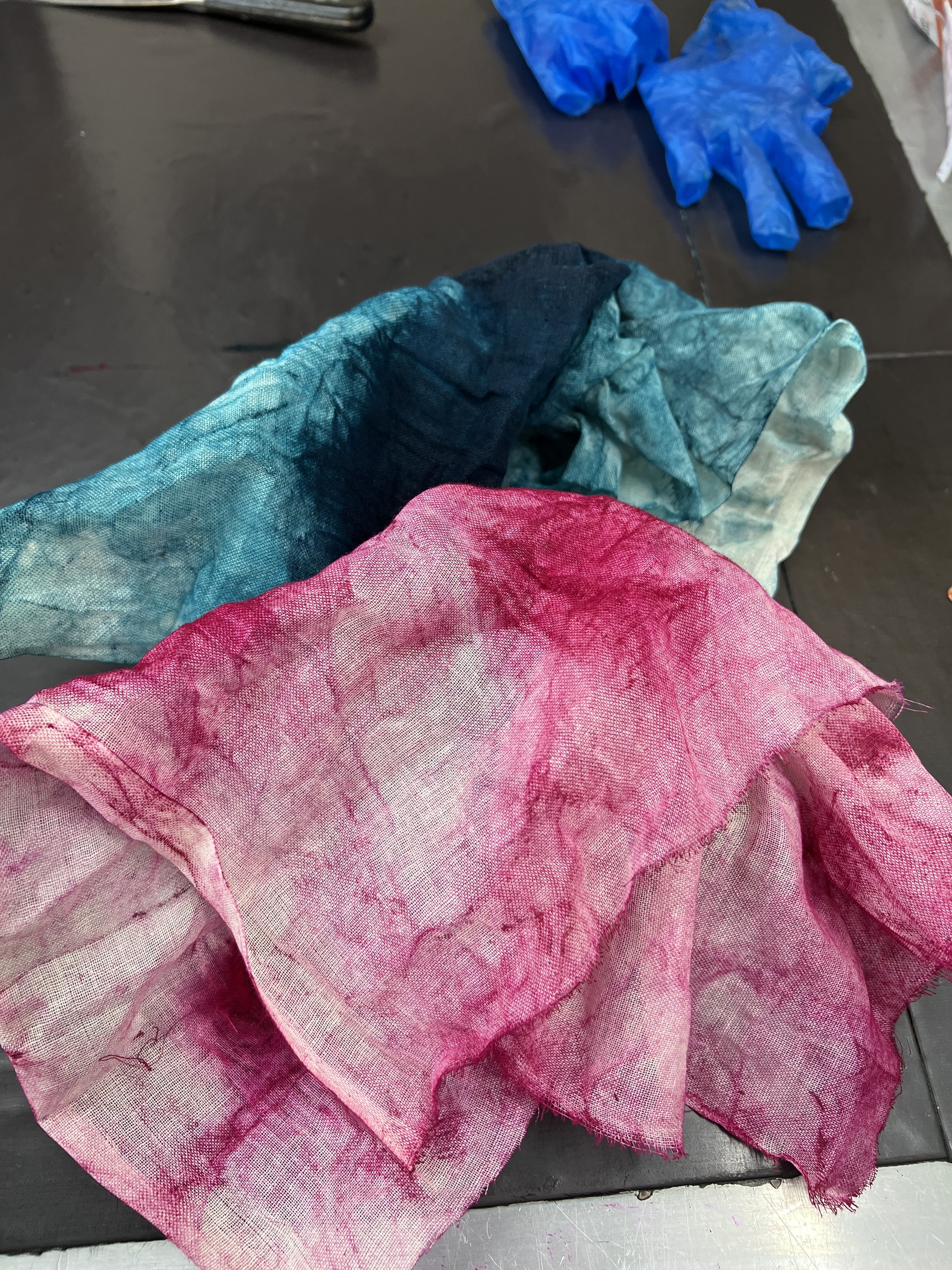
colour tests

maquettes for the final print


testing size and method for piecing the component parts together

first fold at this scale

folding a test version at scale


aspect ratio problems

final print in one piece

detail of overlap between elements of print, reinforced with kozo paper


T hinges - for attaching the print to a platform to elevate it from the floor and prevent movement without damaging the print itself
making the shelf

ventilation under the shelf

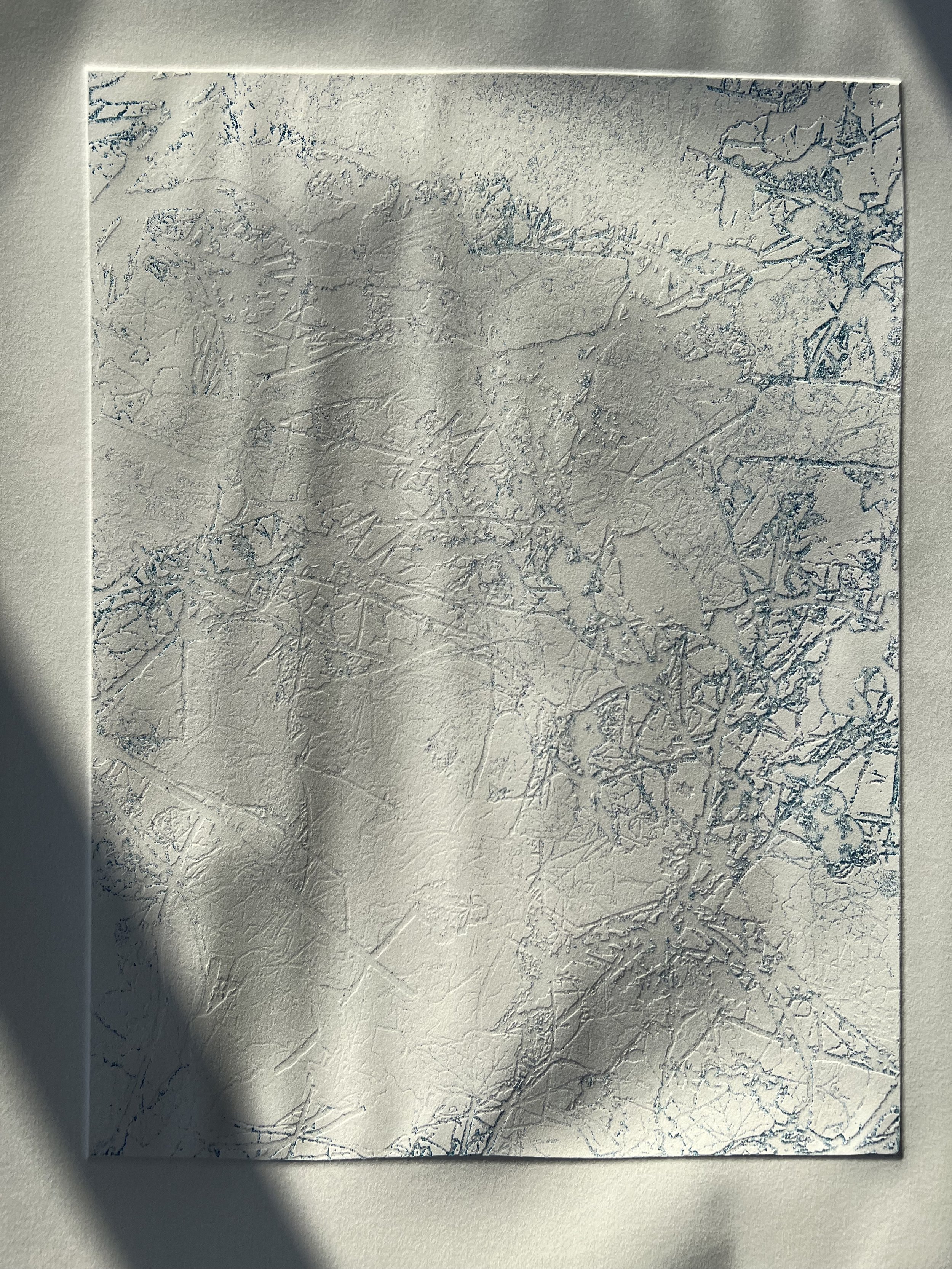
aspect ratio resolved

testing the box


print in situ


film piece in situ


primary research
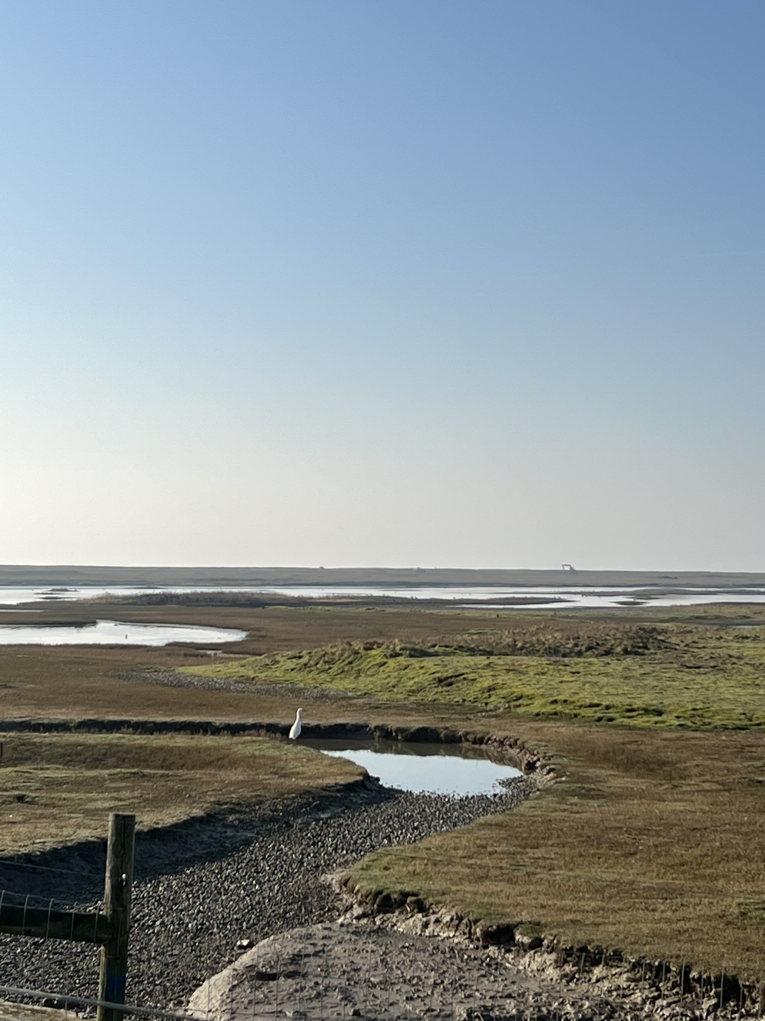
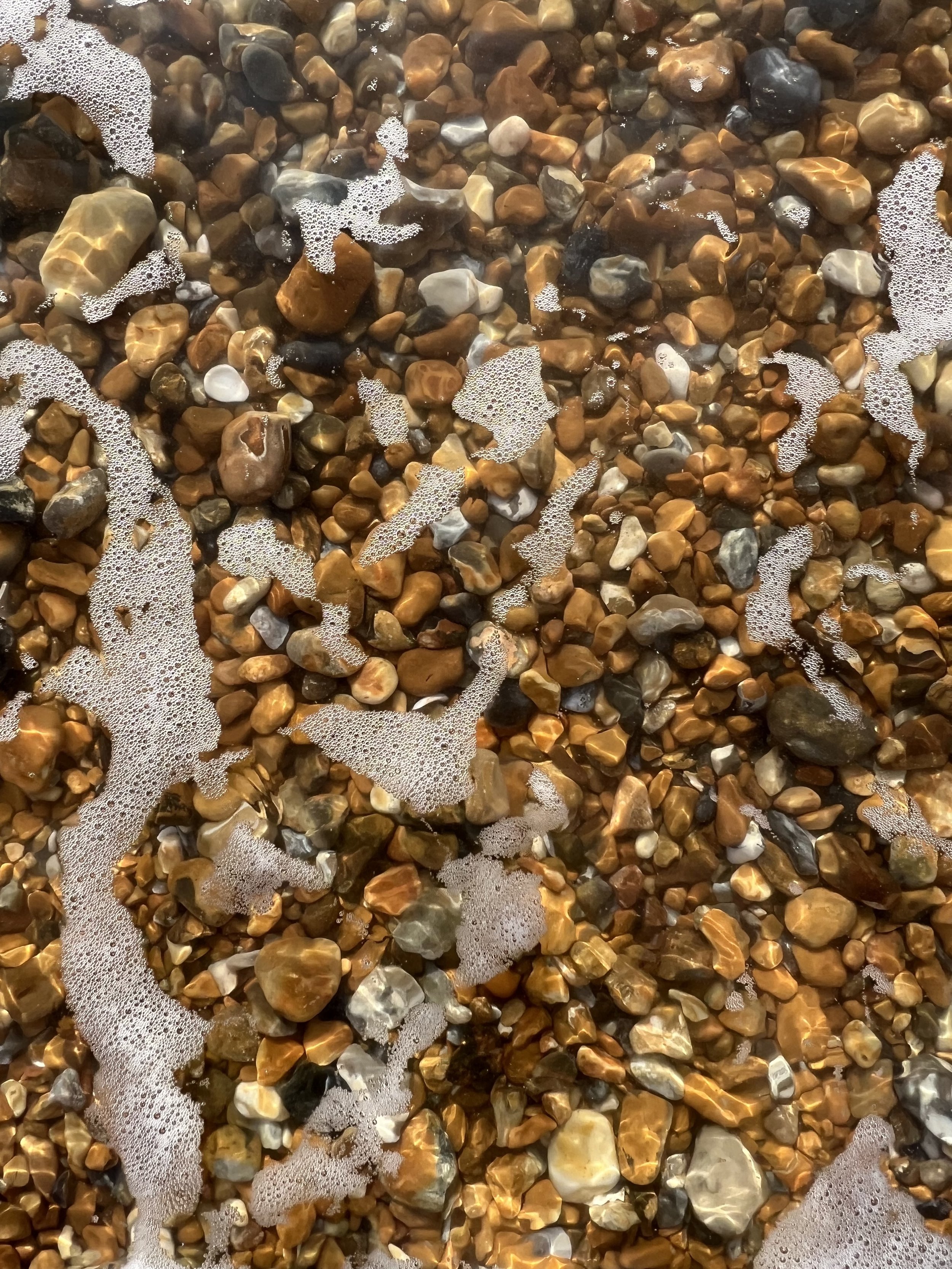
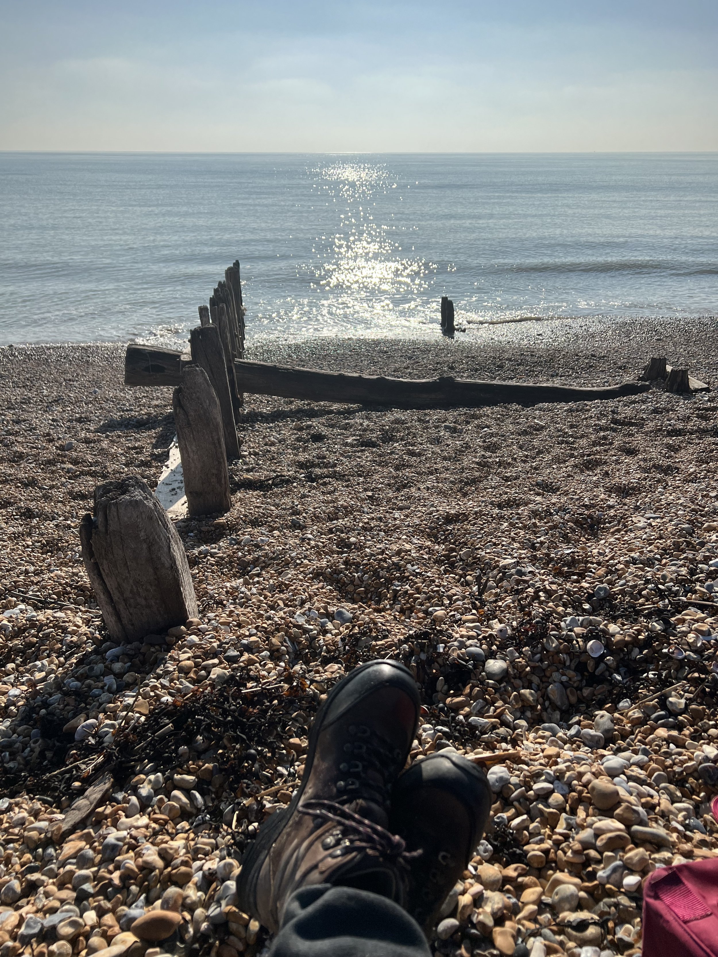
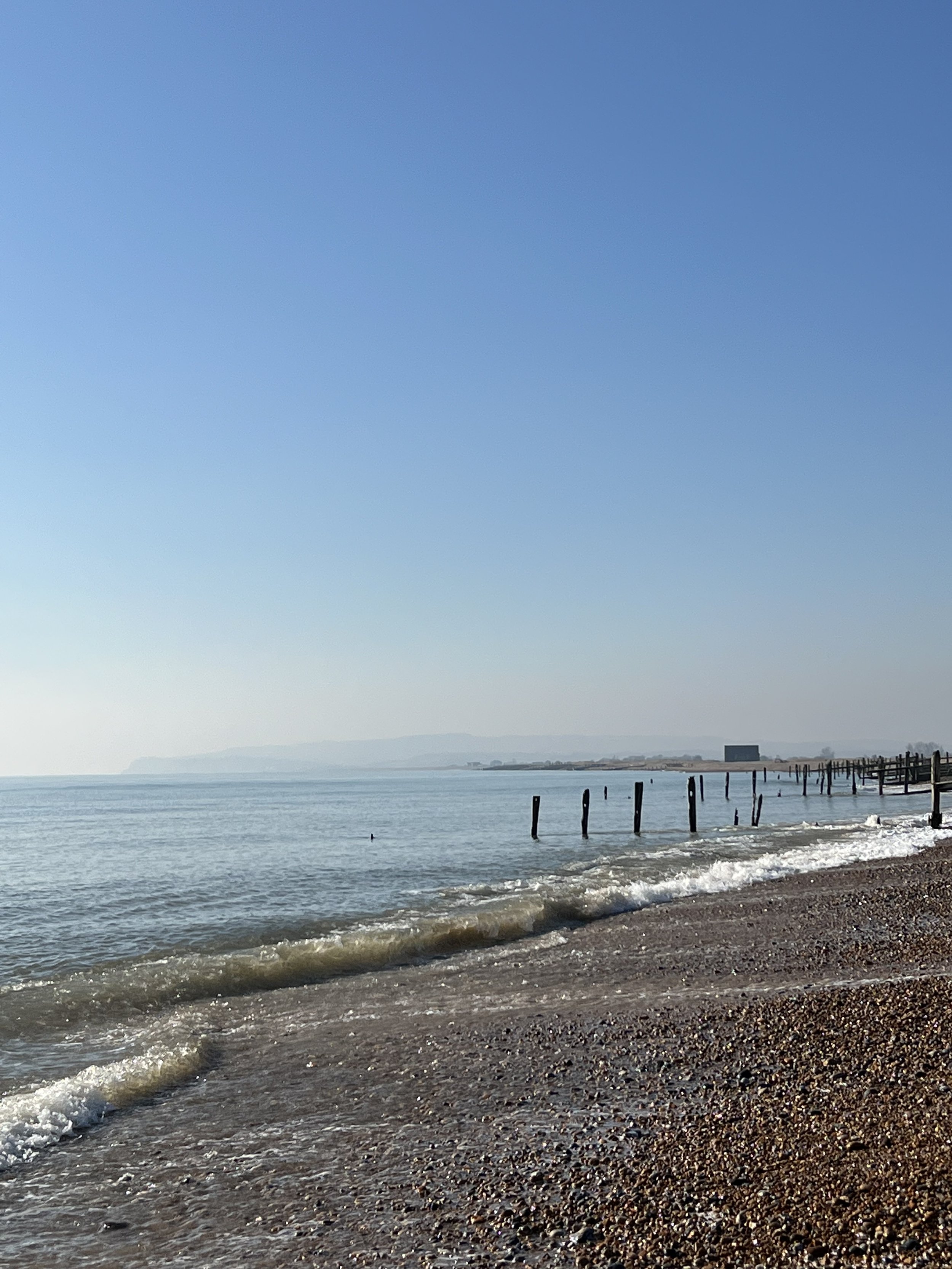
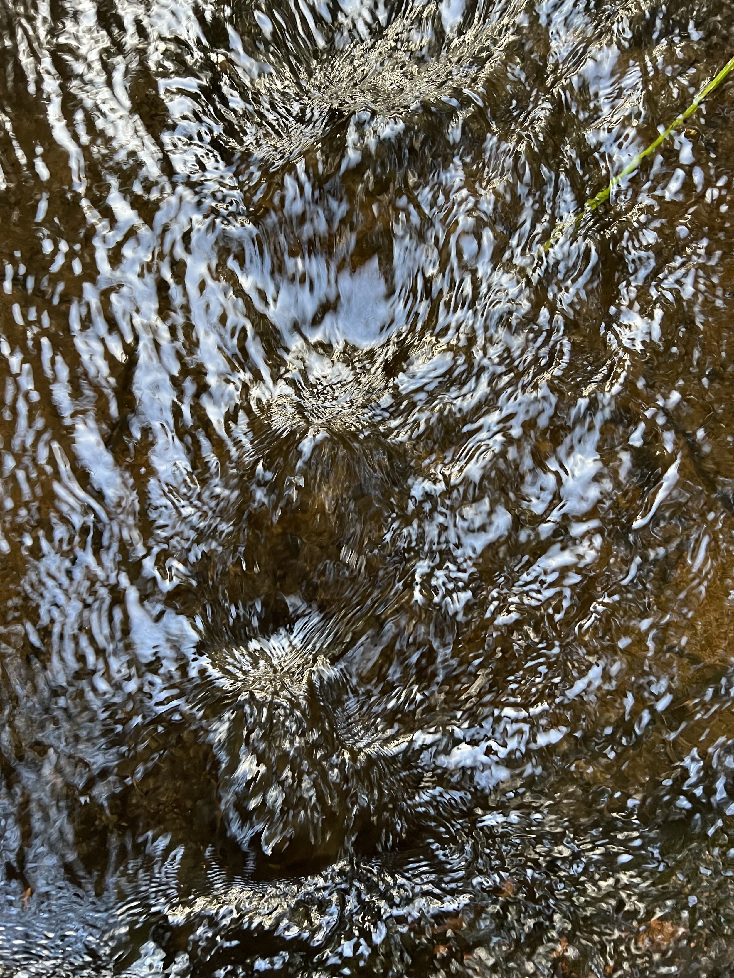
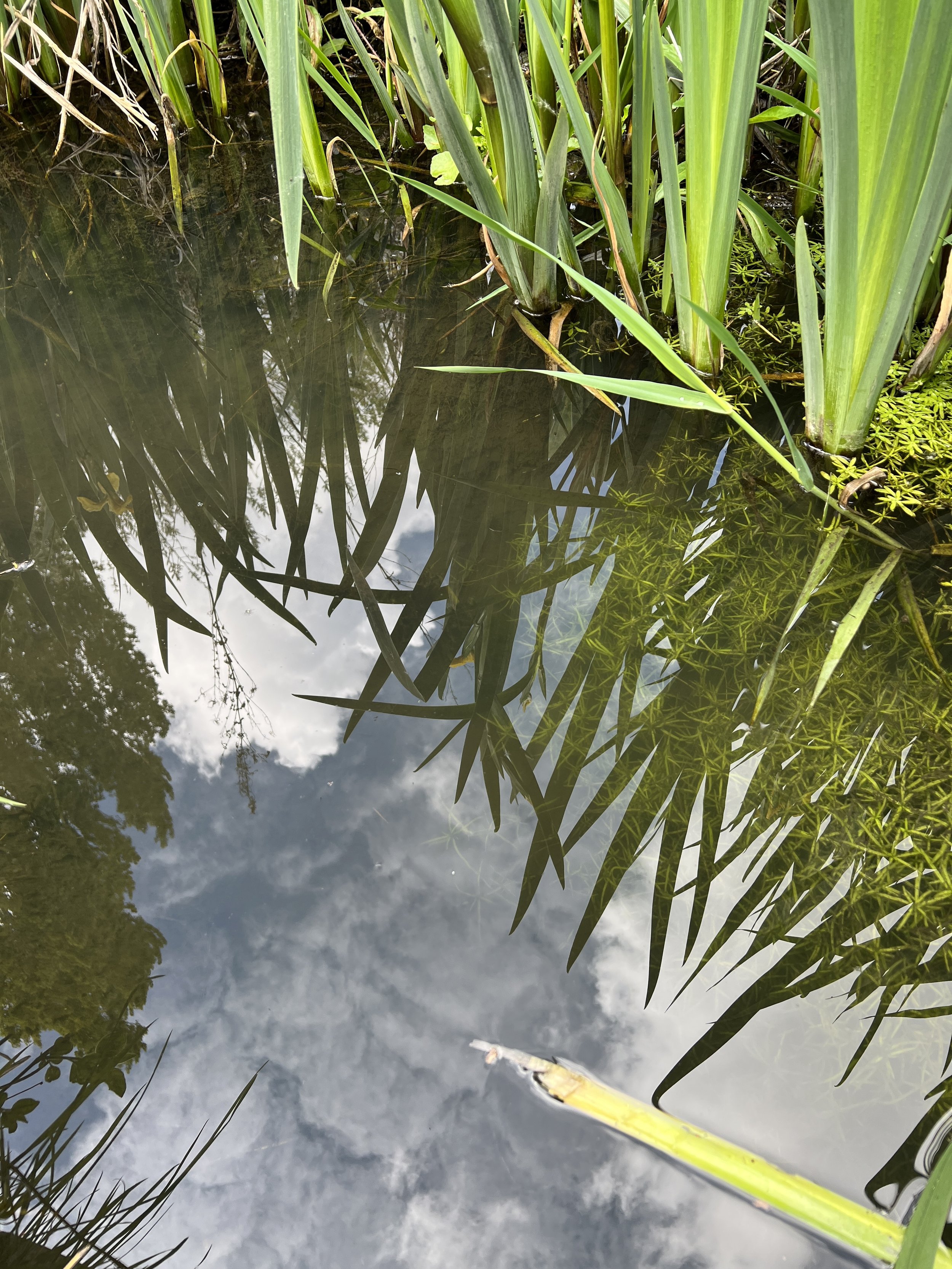
I visited Rye Harbour beach, on a surprisingly warm and sunny day in February, where I had planned to make some cyanotypes using found, natural materials and the environment to develop and process - out in nature with the sea and bright winter sunshine; oystercatchers loud and busy in the nature reserve.
Gotland sheep on Trill farmland - site of wild camping when the kids were small and a chance to revisit South Devon and fond memories of my Grandparents, including the beach at Beer with all the resonances not only of family – Grandparents, mother, our annual stop for lunch on the journey back from Cornwall - but friendship too. Layers of memory at work in Beer – some of it secondary, narrated to me by my mother, and some from my own childhood, very distant and unreliable, over-written by more recent events. Capturing traces of the shingle beach through footsteps taken using hard ground coated copper plates.
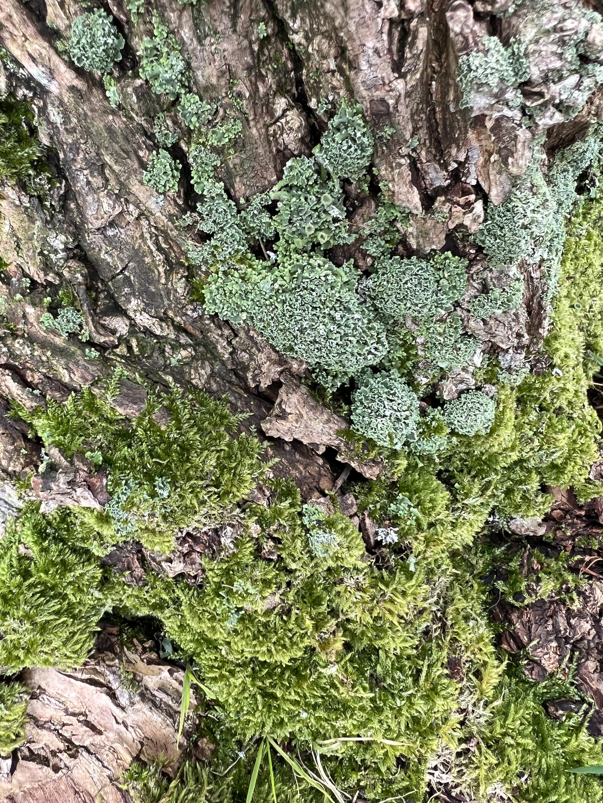
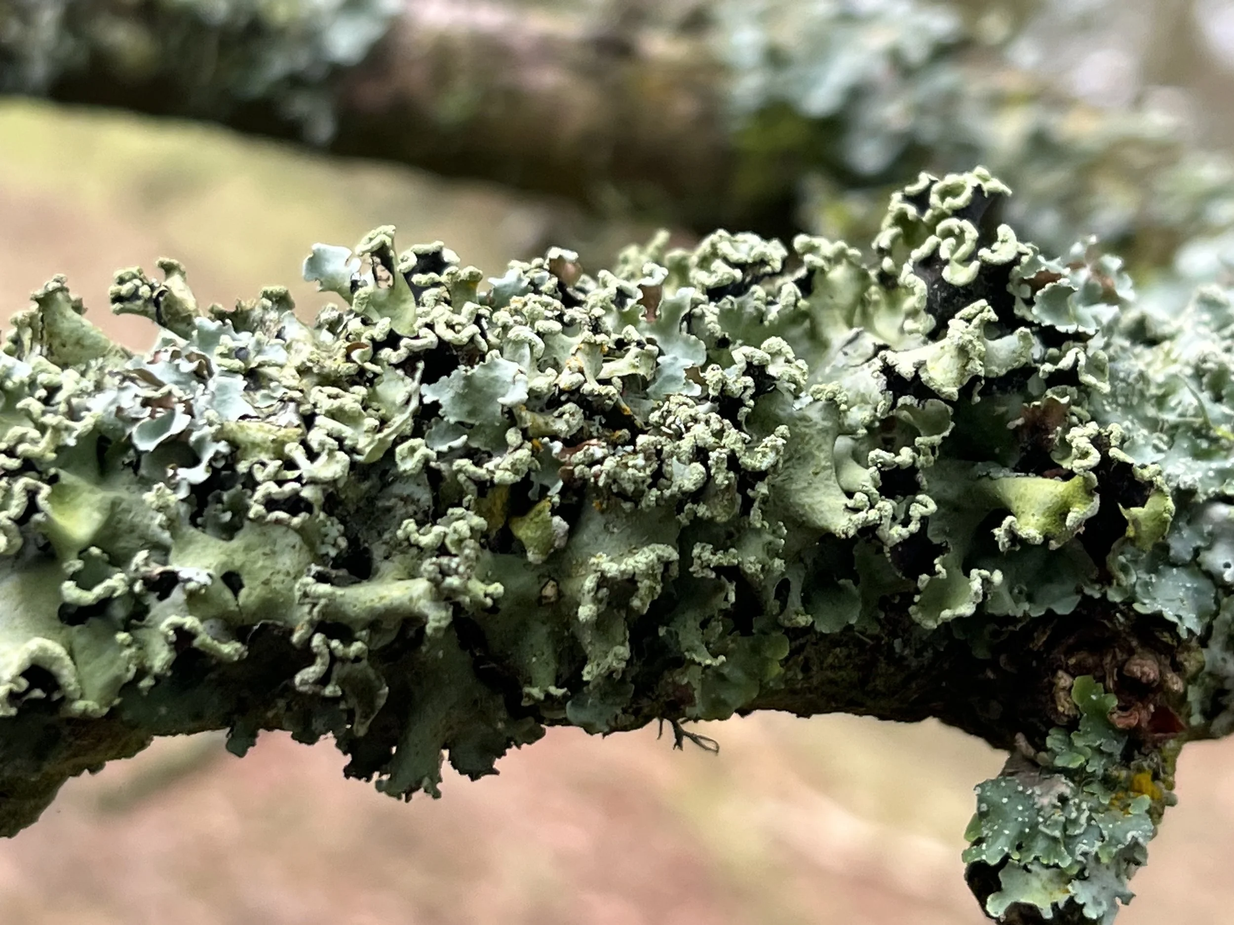
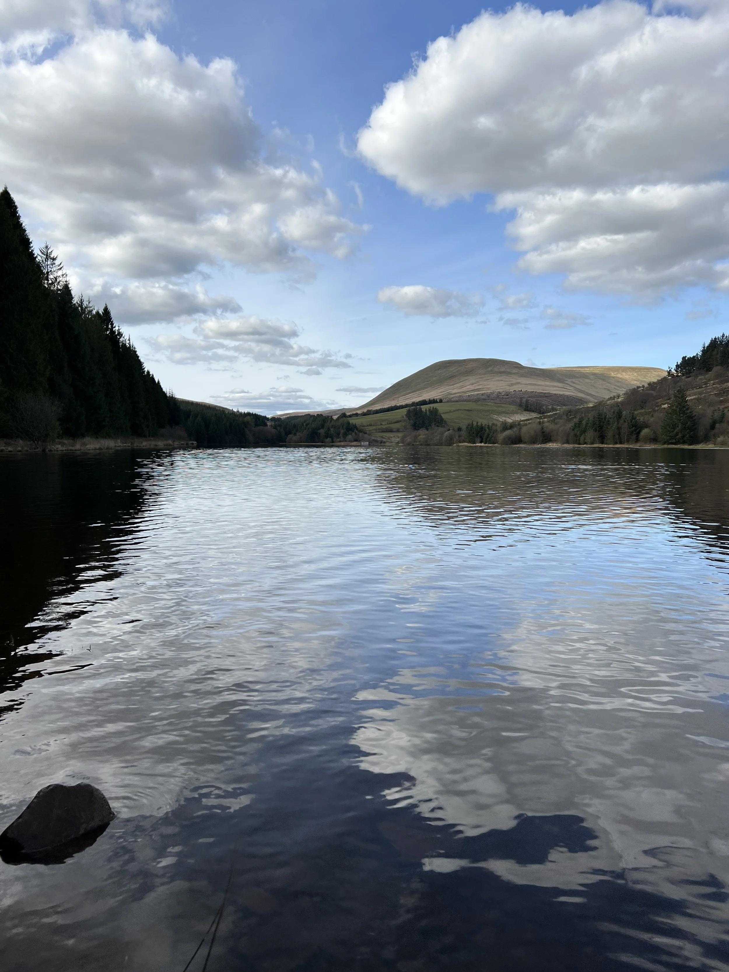
A trip to Wales with my brother and his family, including a walk in the damp and mossy woods to the edge of a reservoir where a small brook runs.
Local walks in Peckham, Sydenham and South Norwood, capturing the sights and sounds of Spring.


etching
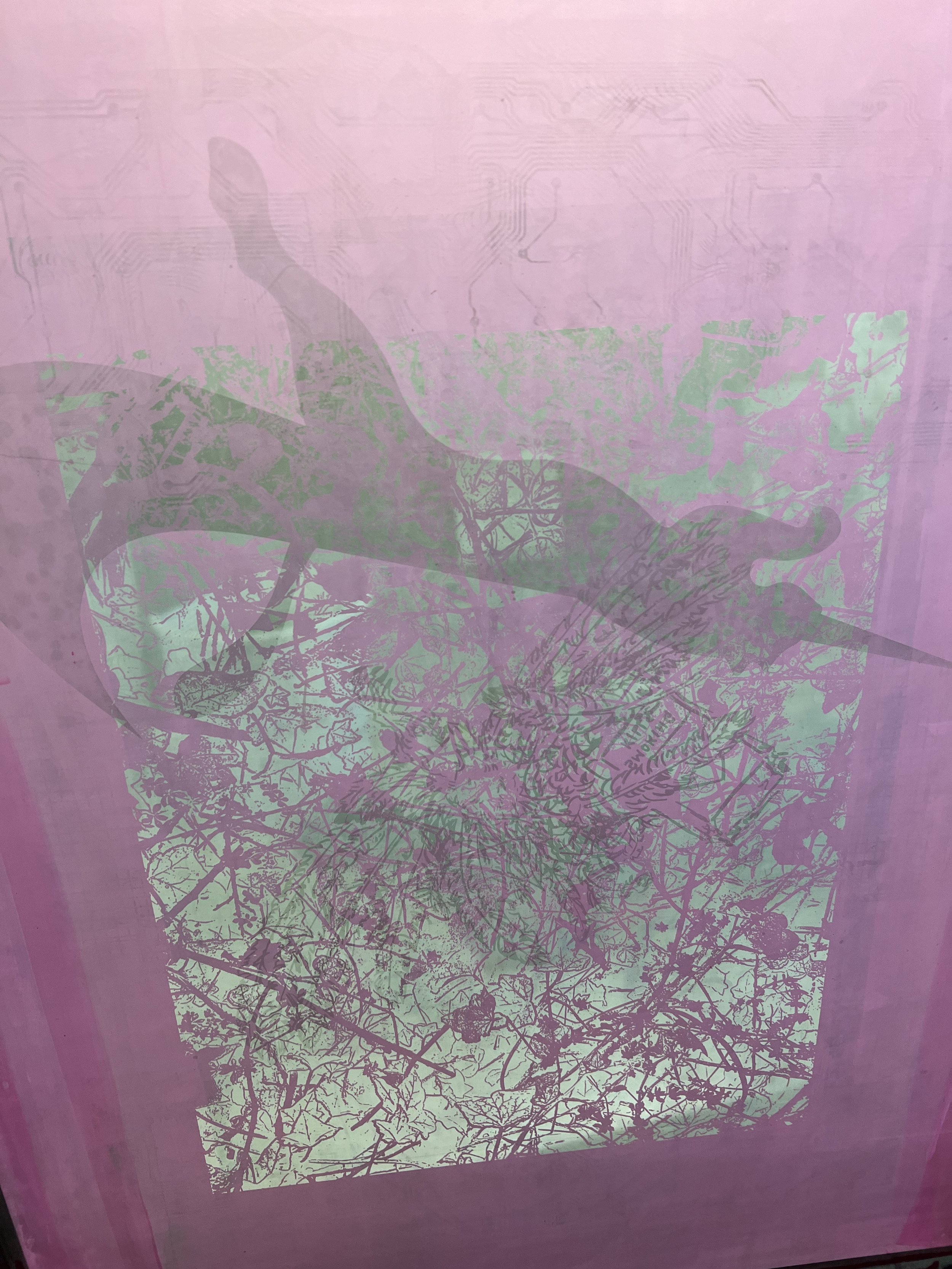
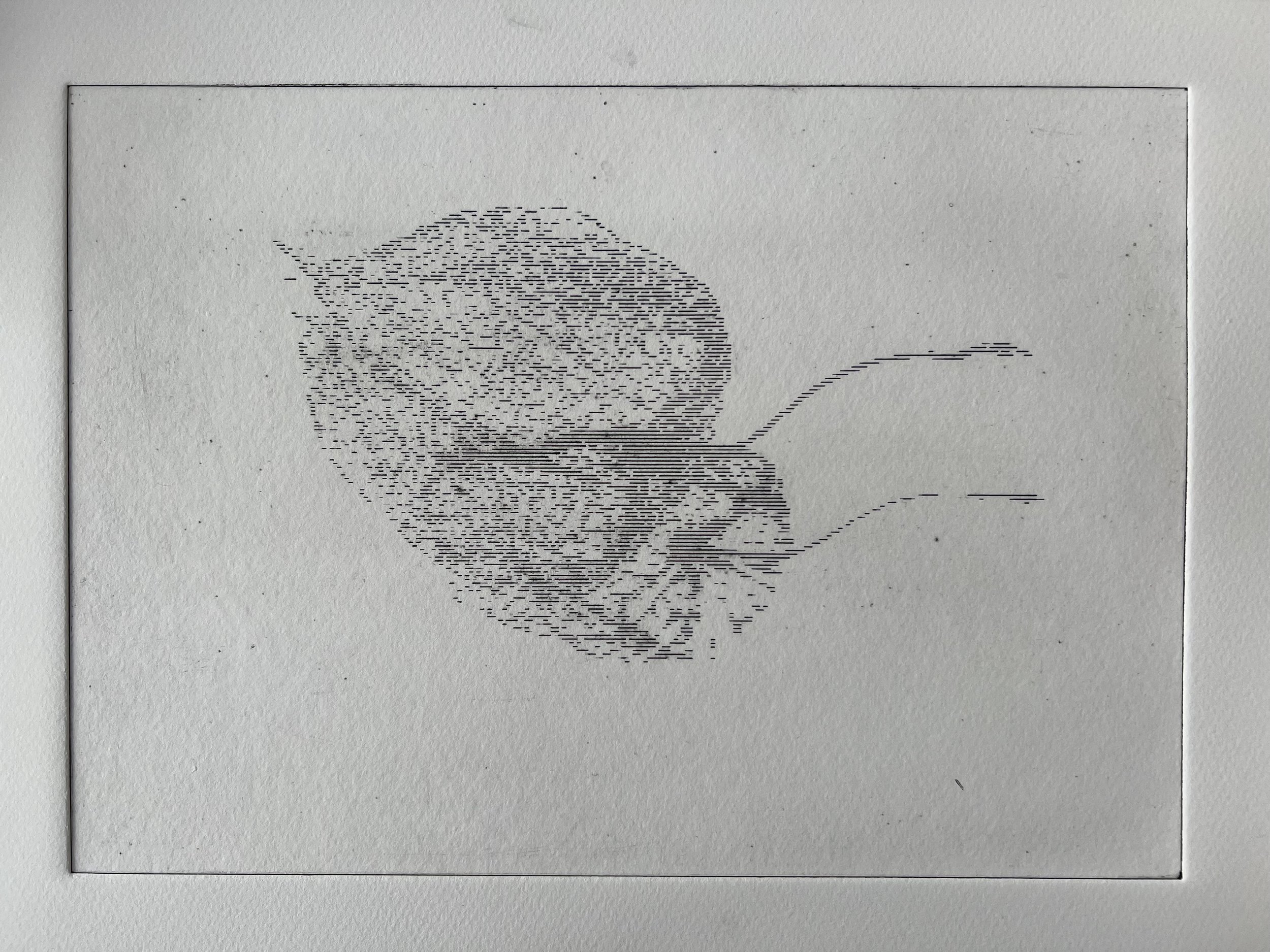
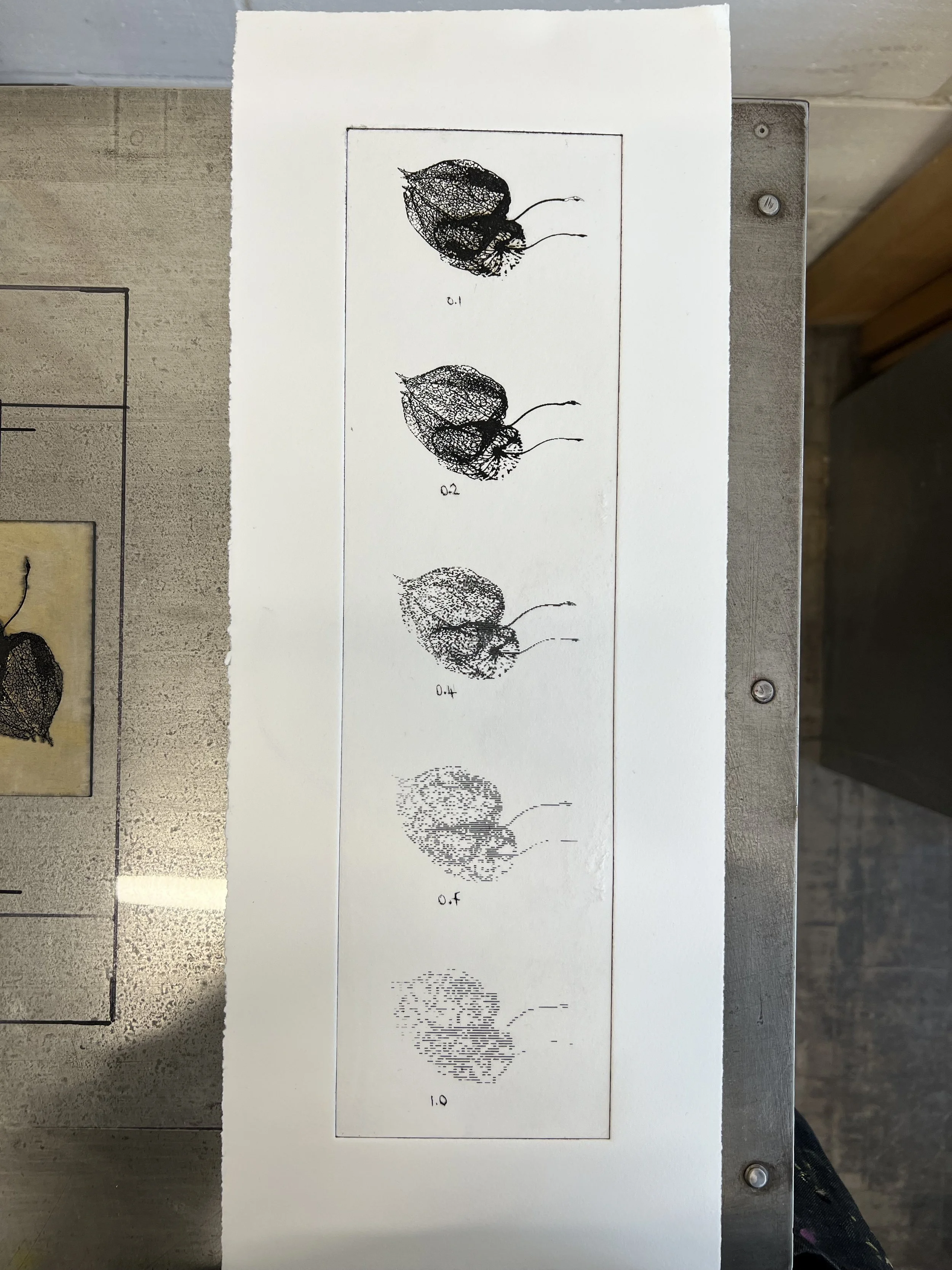
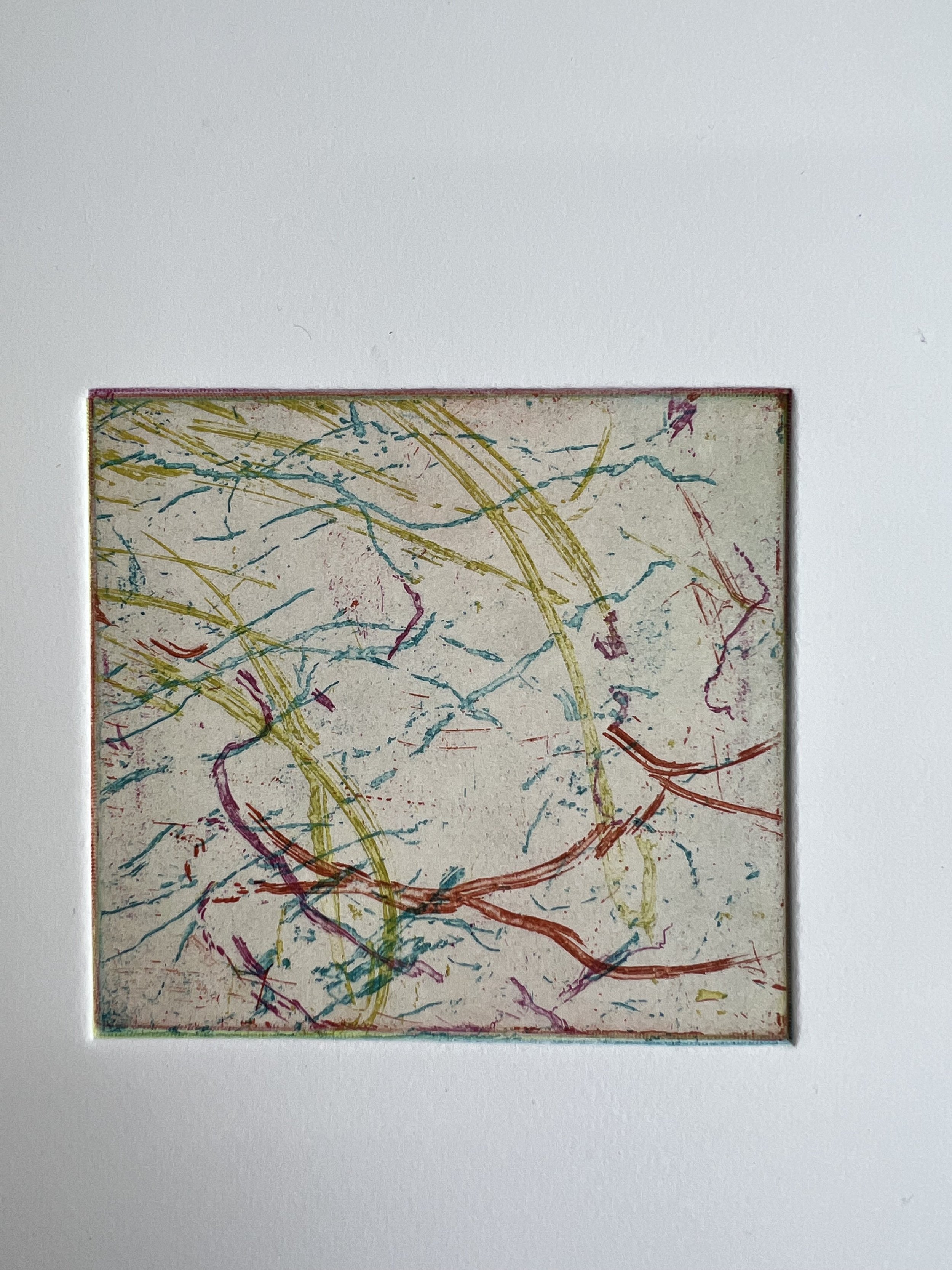
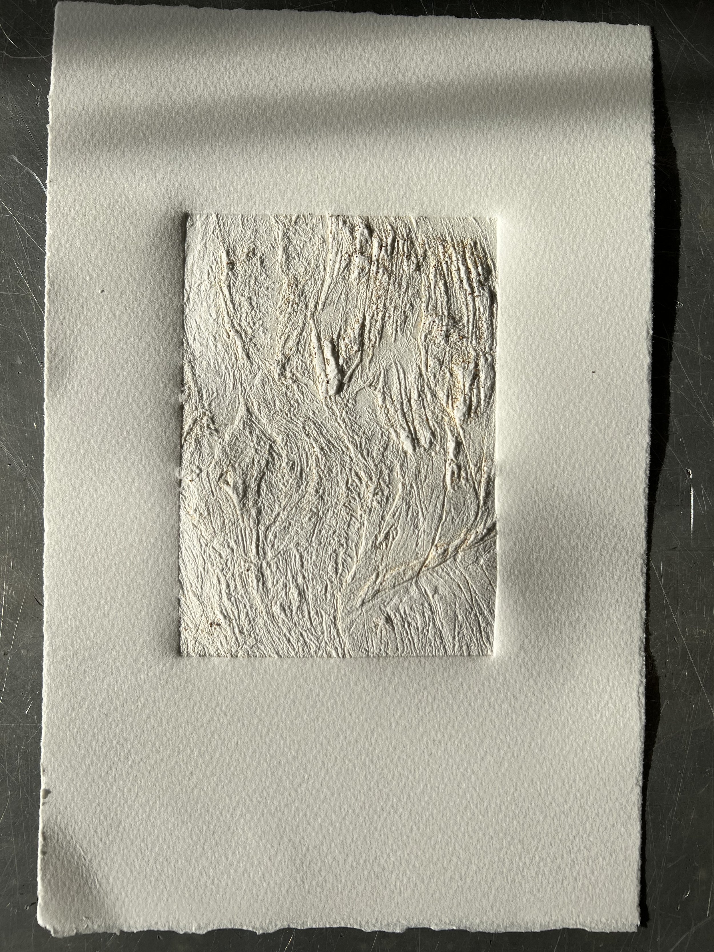
I wanted to get a handle on viscosity printing as a process. I had tried it before but I was very unhappy with the half tone dot in the image that the screen printing process required. To obviate the need for a dot, I put the image through the threshold adjustment in photoshop, which converts it to a binary black and white, rather than greyscale. You can then adjust the threshold so that more or less of the detail in the image appears. I also inverted it because I wanted the white elements in the original image - the frost on the leaves - to be capable of being printed in colour. I also polished the steel before carrying out the screen etch resist process to try to achieve as clean and white a plate as steel allows. I loved the process and the results with this image of ground frost from Nunhead cemetery; the way that the three colours combine differently with each print - and how different the print looks to the plate that made it - is fascinating and gives added impact to that printmaking moment of peeling back the blankets and not knowing quite what you’re going to find. I also tried two plates with more traditional seascape images - looking out, rather than down. These experiments will continue.
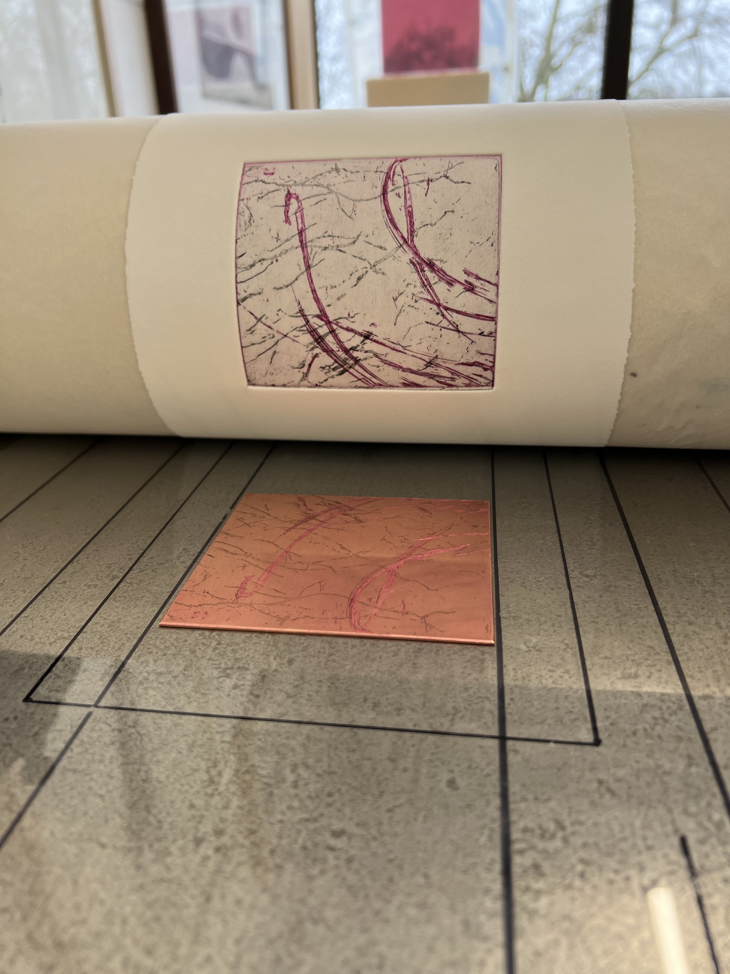
I also etched copper plates that I had covered with hard ground and taken to shingle beaches to record the traces of my steps across the beach. I was delighted with the way that these came out - quite evocative little prints that suggest movement and temporality but are pleasingly ambiguous. I spoiled one of the Rye Harbour plates by putting it face down on a jar that had some straw hat varnish in it - just the fumes sufficient to lift the ground a little and leave a circular imprint during etching. I also tried multi-plate printing with the Beer plates, which I think worked well in both colour and black and white. I also layered prints with laser cut audio visualisations of birdsong from Rye Harbour and with the waves at Beer; and tried chine collé images from Beer with the footsteps too - these didn’t work so well as I digitally printed the images on to poor quality tissue, so they bled quite badly, but I will return to the idea.
I also wanted to etch the footstep plates from Beer more deeply - to try to get stronger marks. I tried a new non-toxic ink based ground (non-toxic because it can be cleaned off with clean spirit rather than solvents) which was promising, but my fingerprints appeared during etching and have made it into the plates themselves.


relief
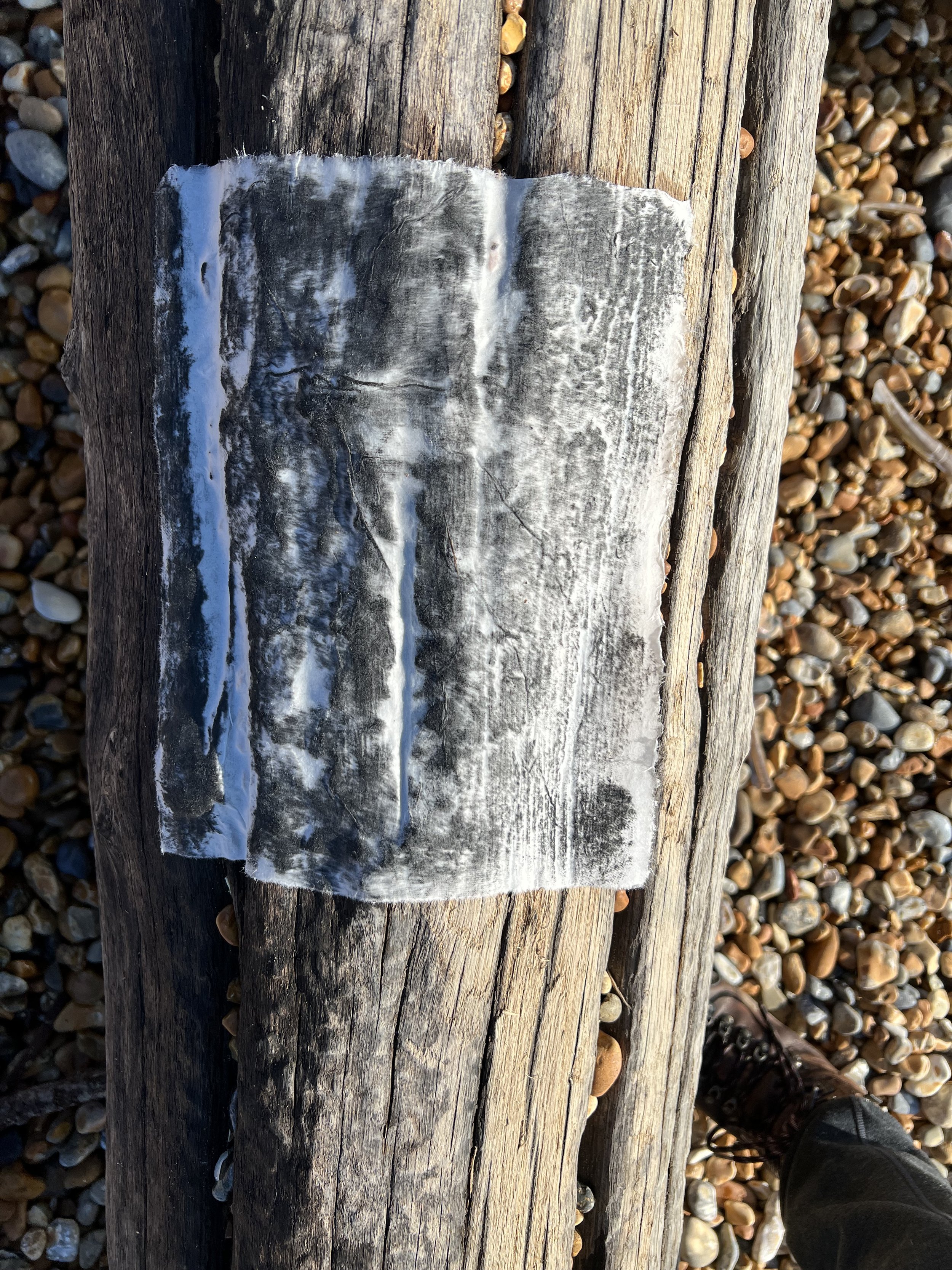
At Rye Harbour, I tried taku-hon to get a rubbing of the grain of the one of the groynes there. The dampened paper molded well to the groyne and the ink brought out the detail of the surface very clearly, but it unfortunately didn’t survive being put into a folder for the journey home. I will try this again in the studio to get a better handle on the process.
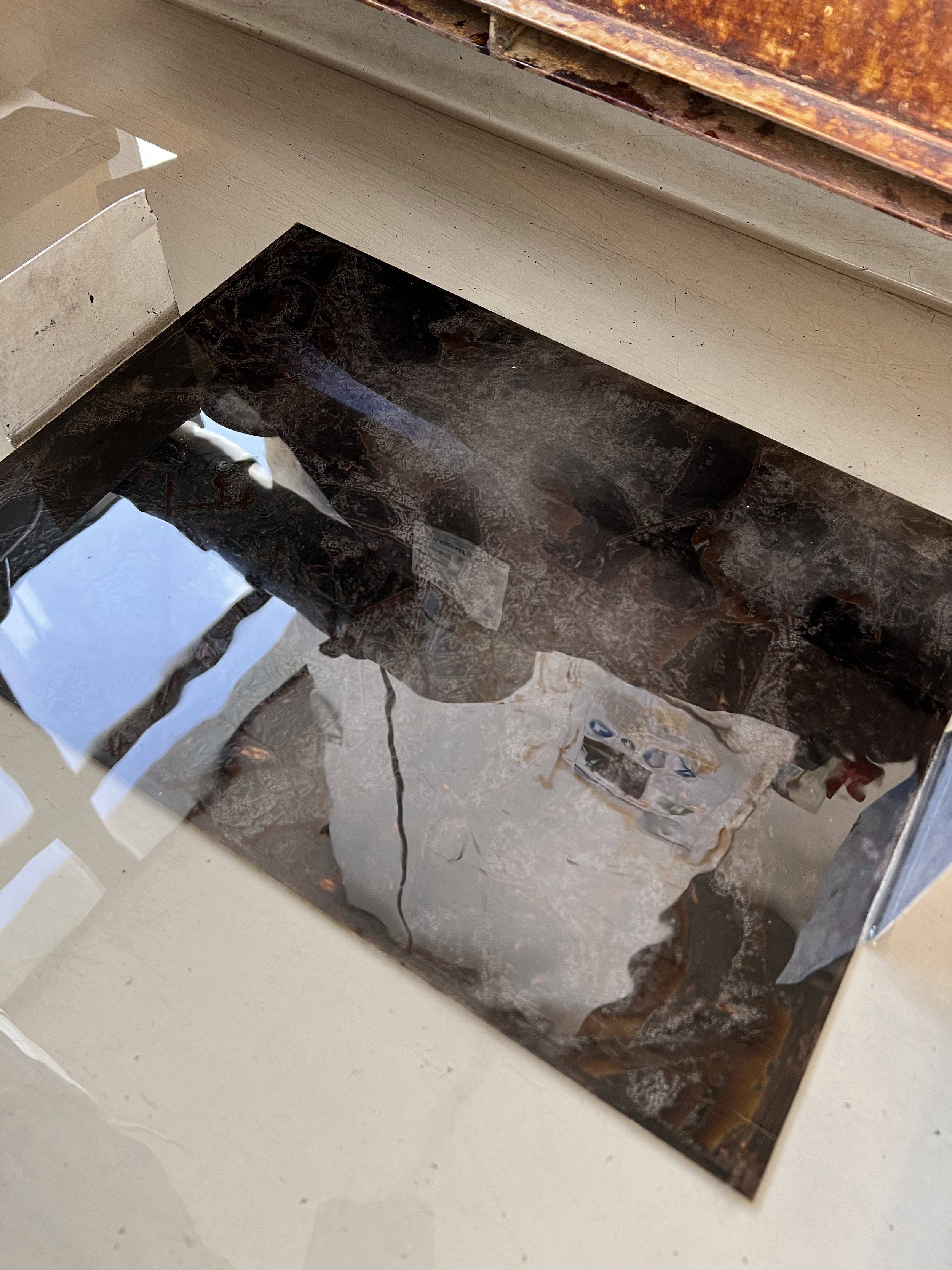
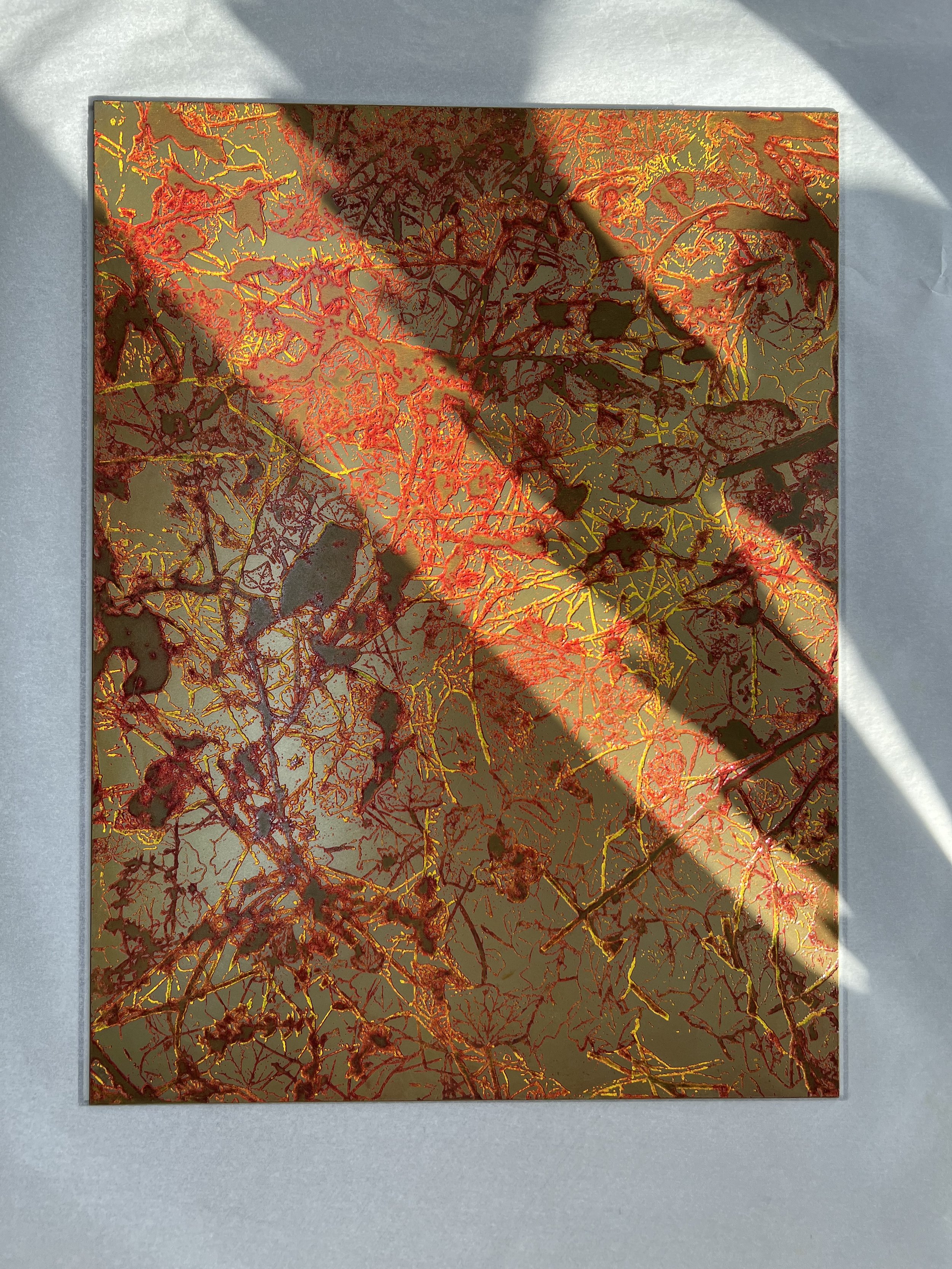
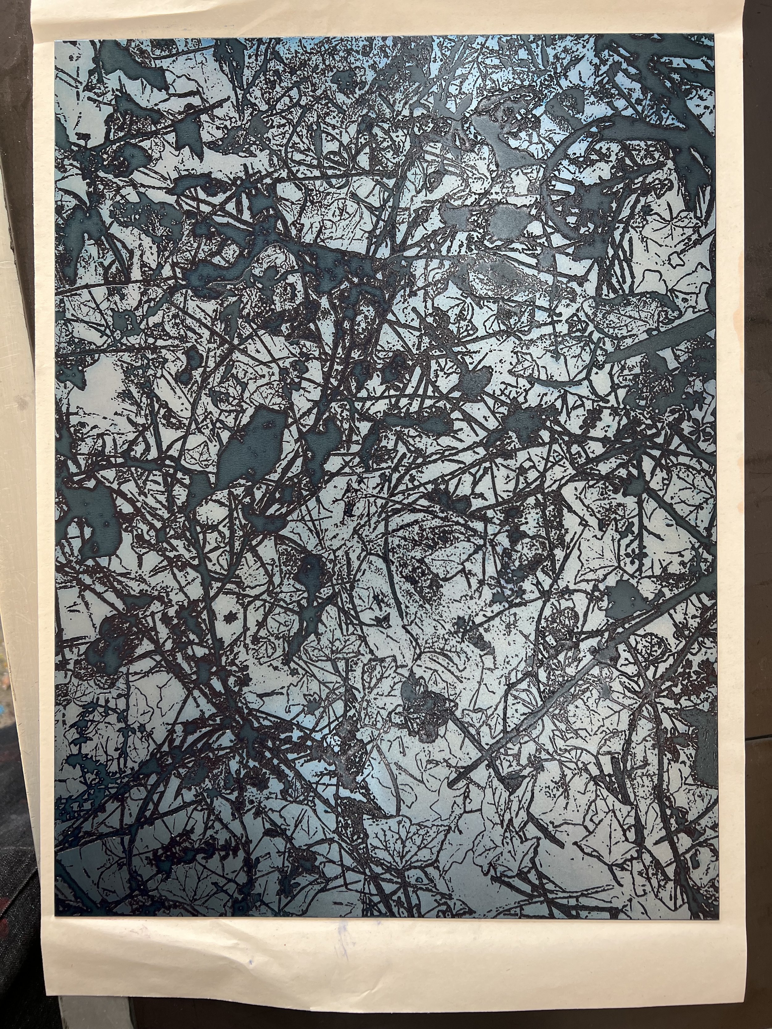
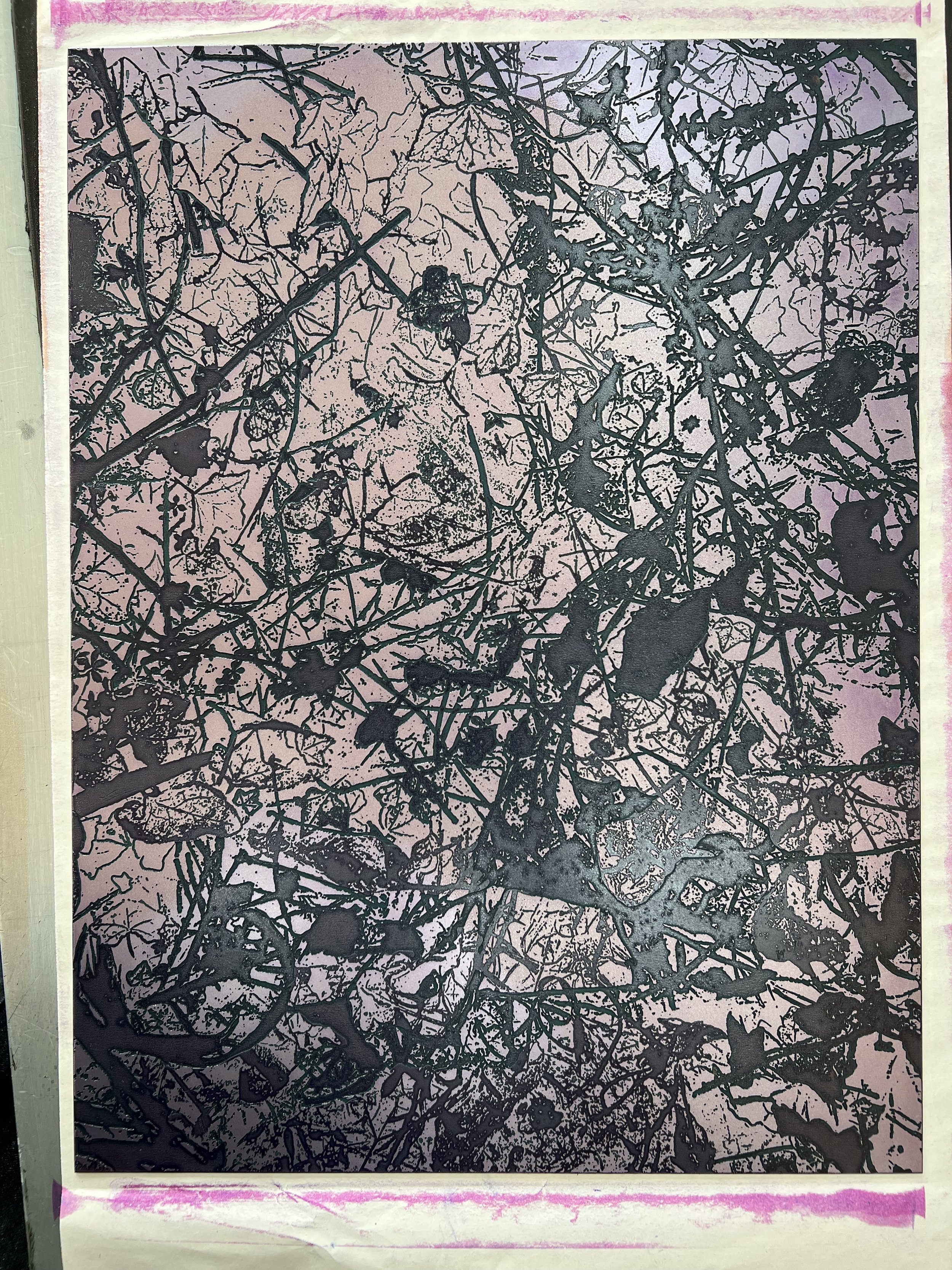
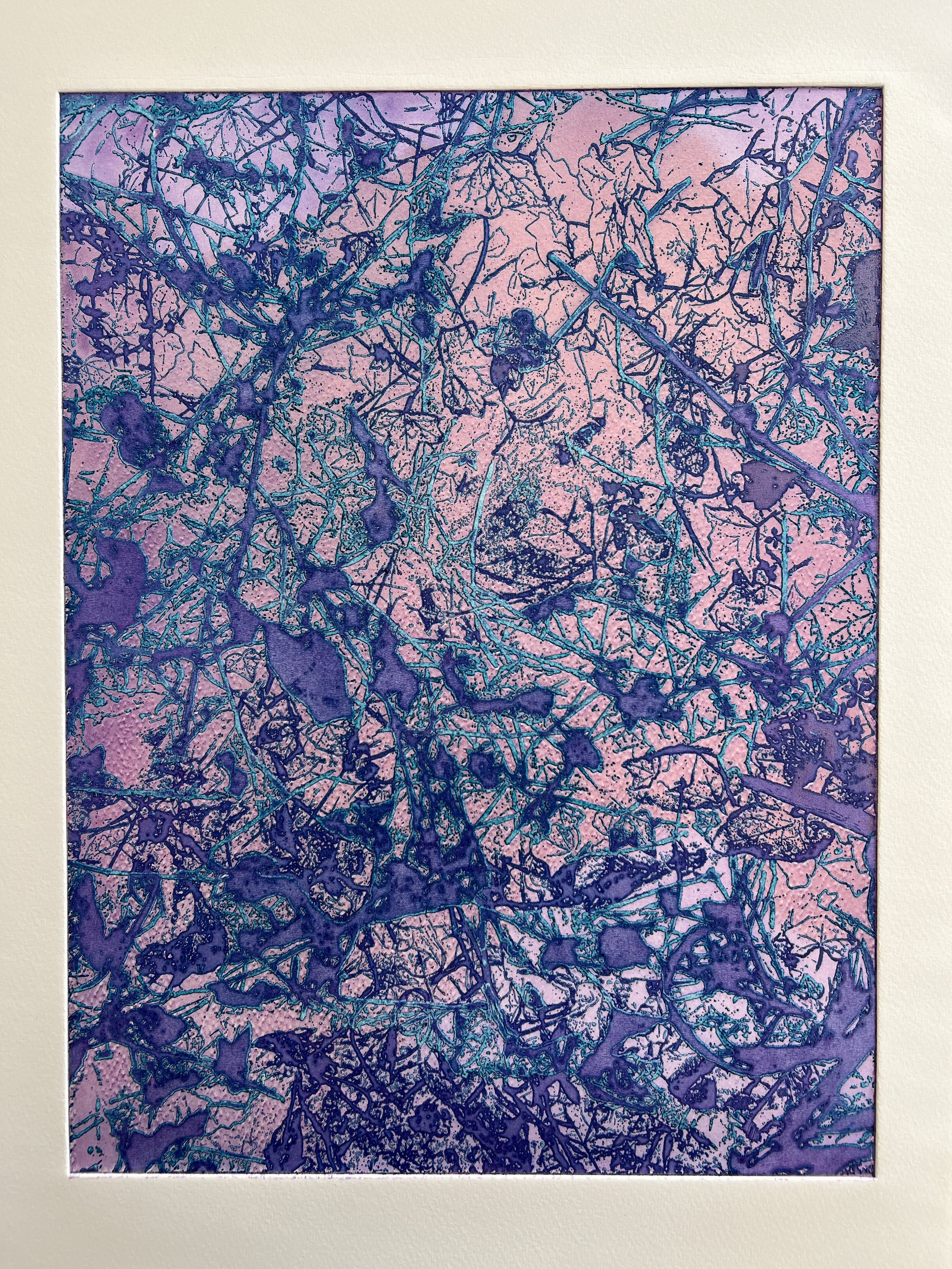
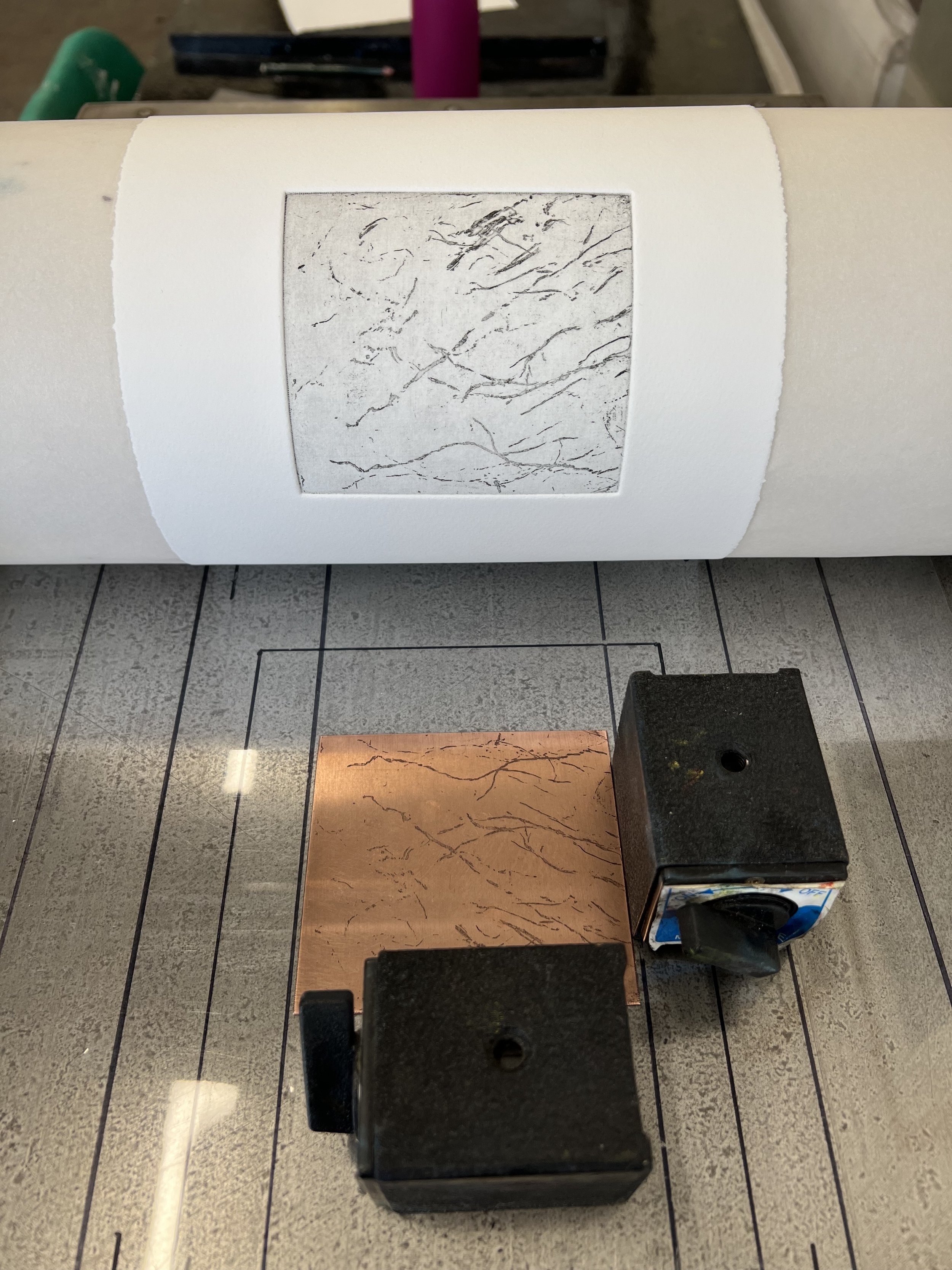
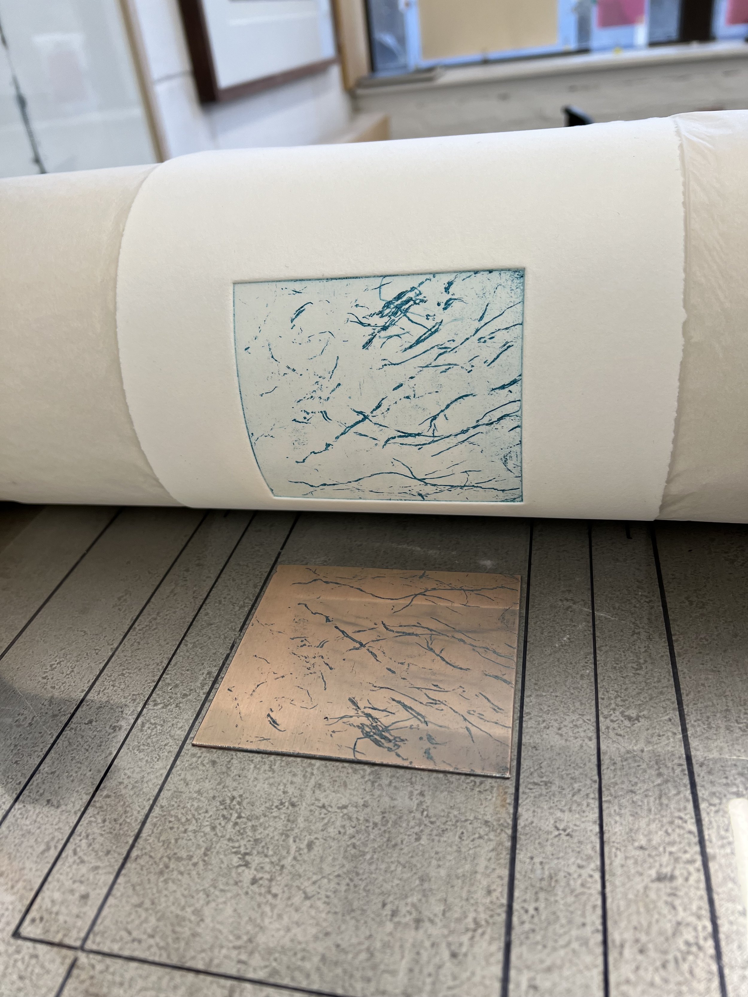
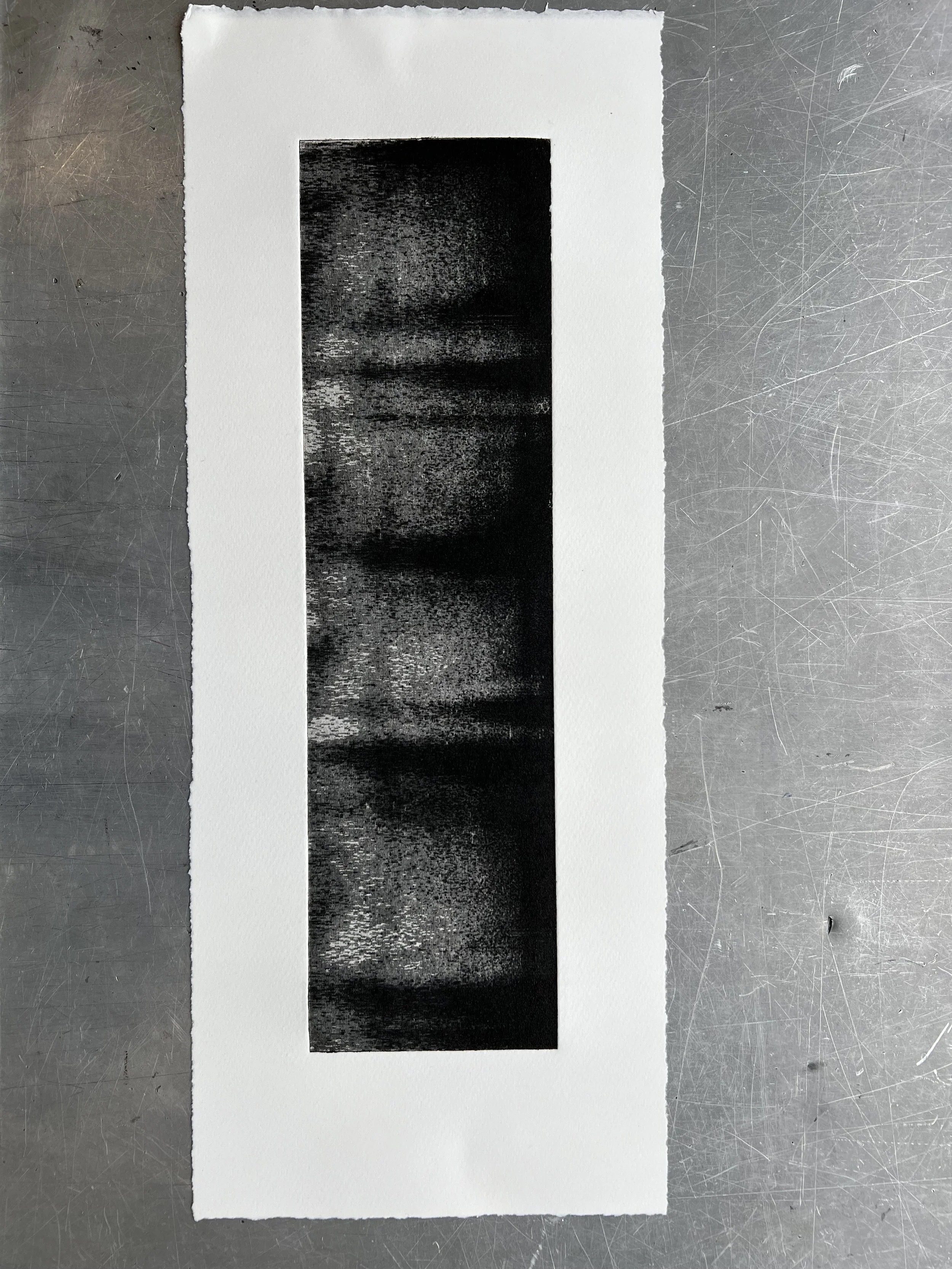
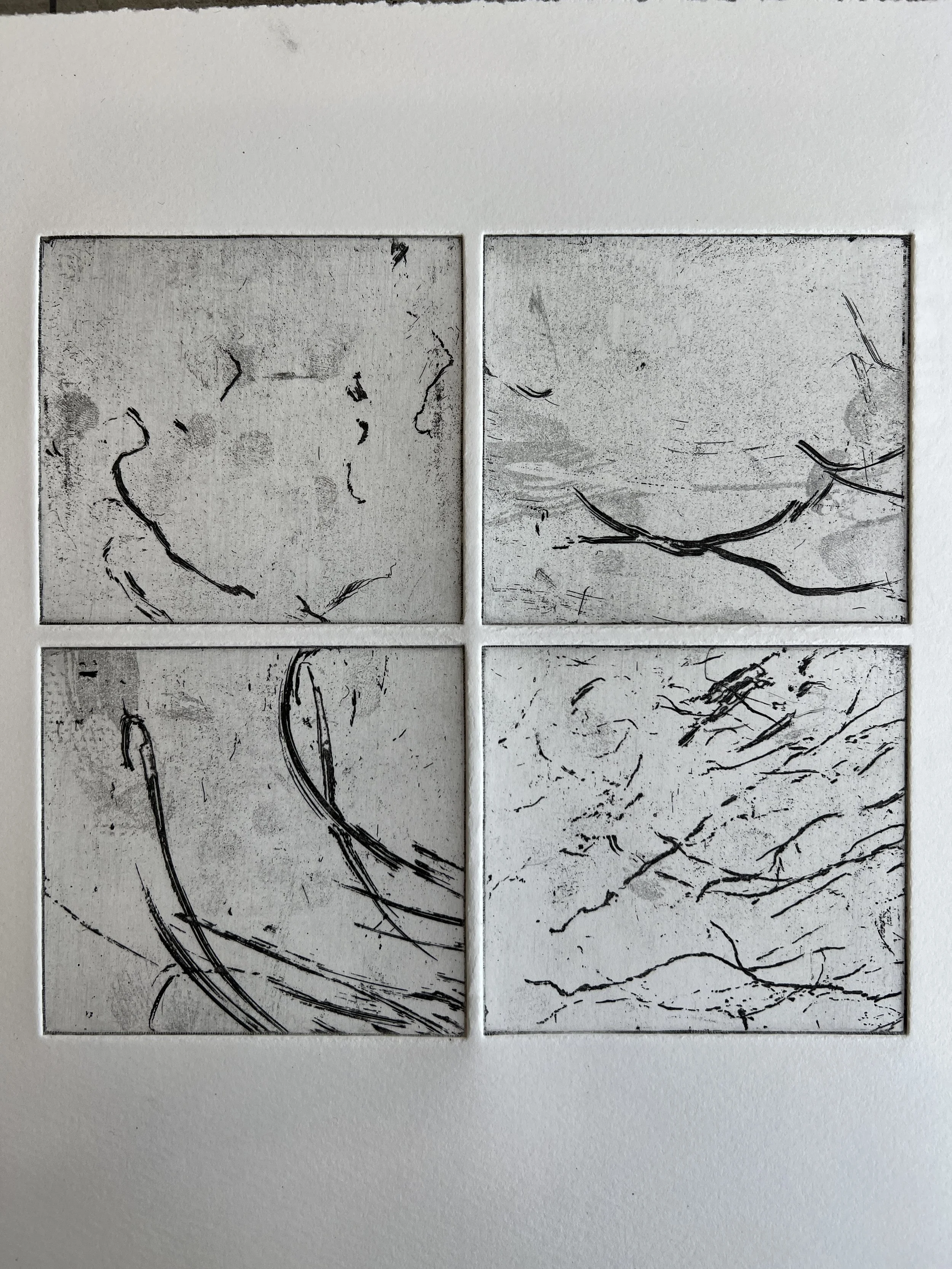
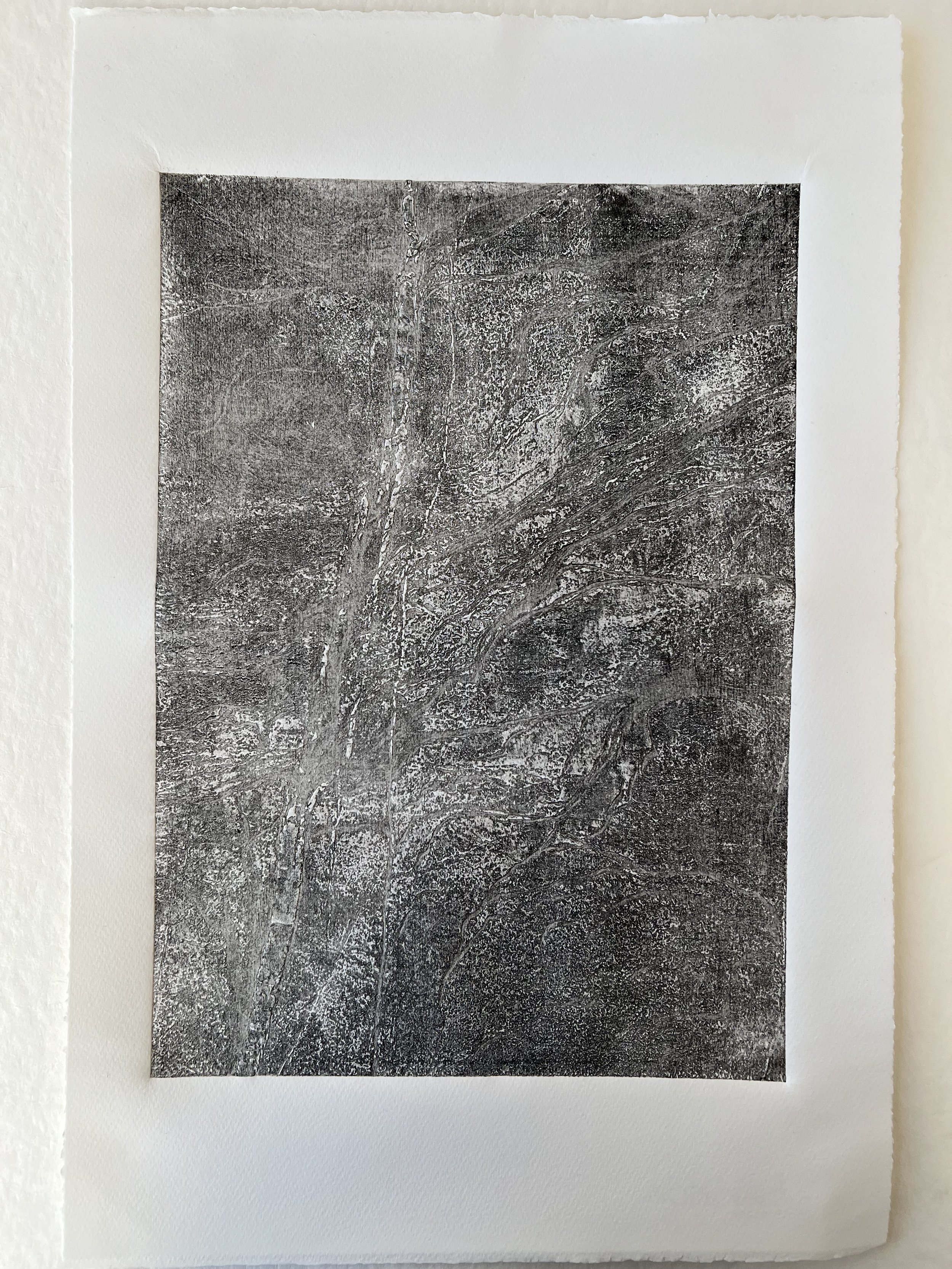
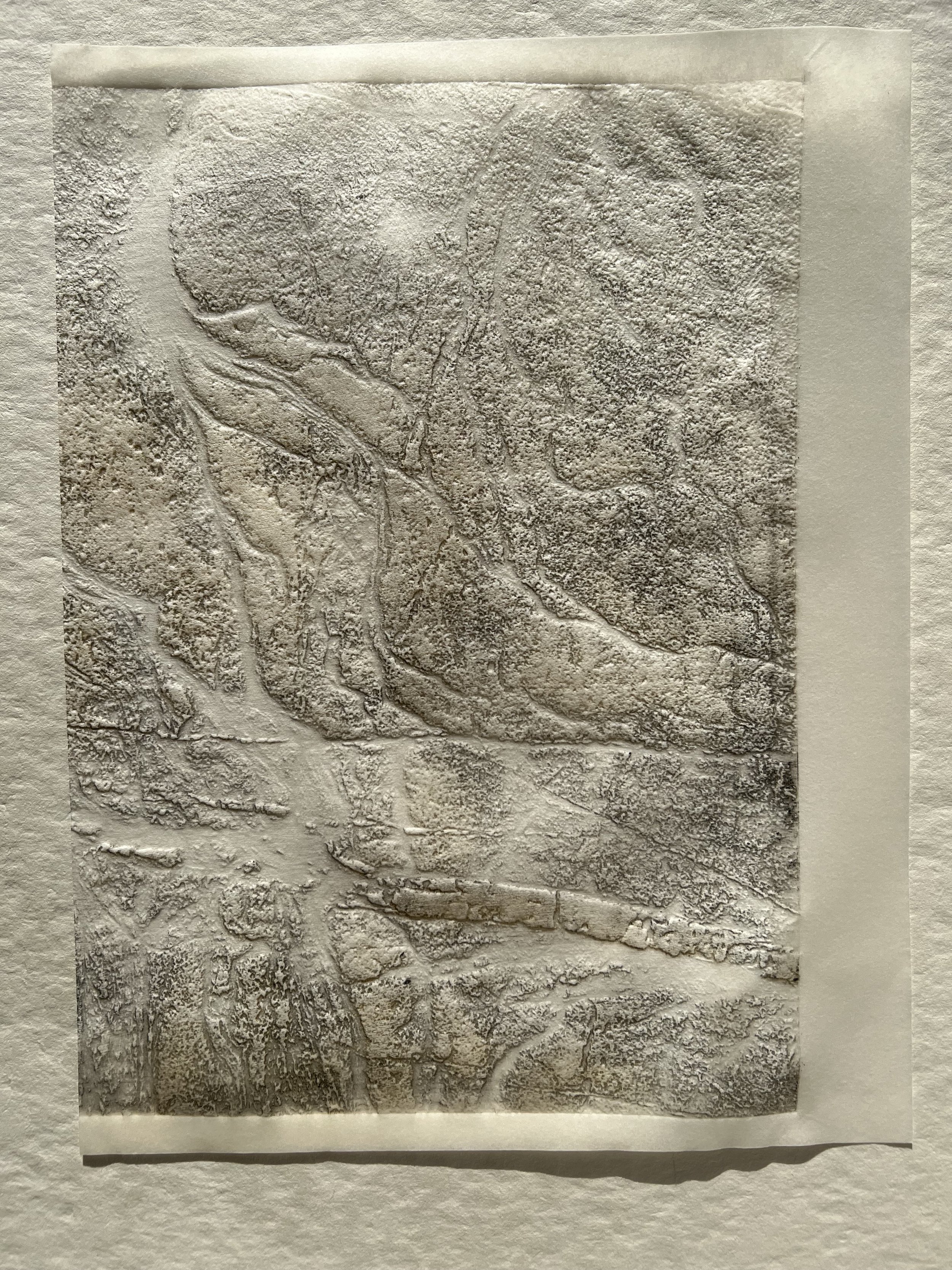
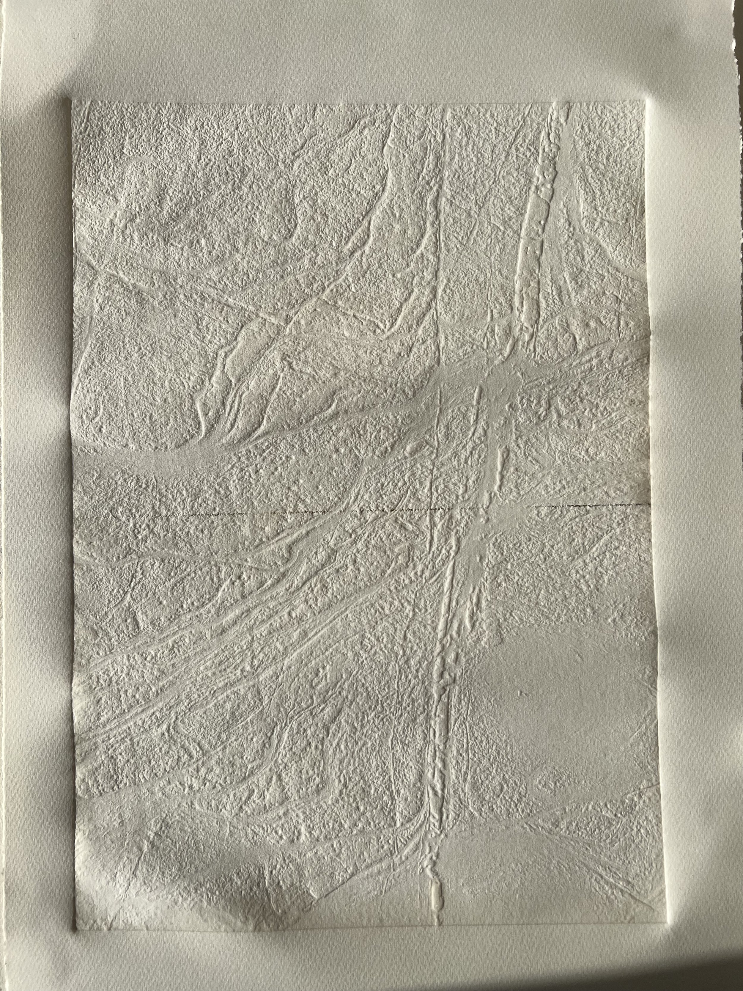
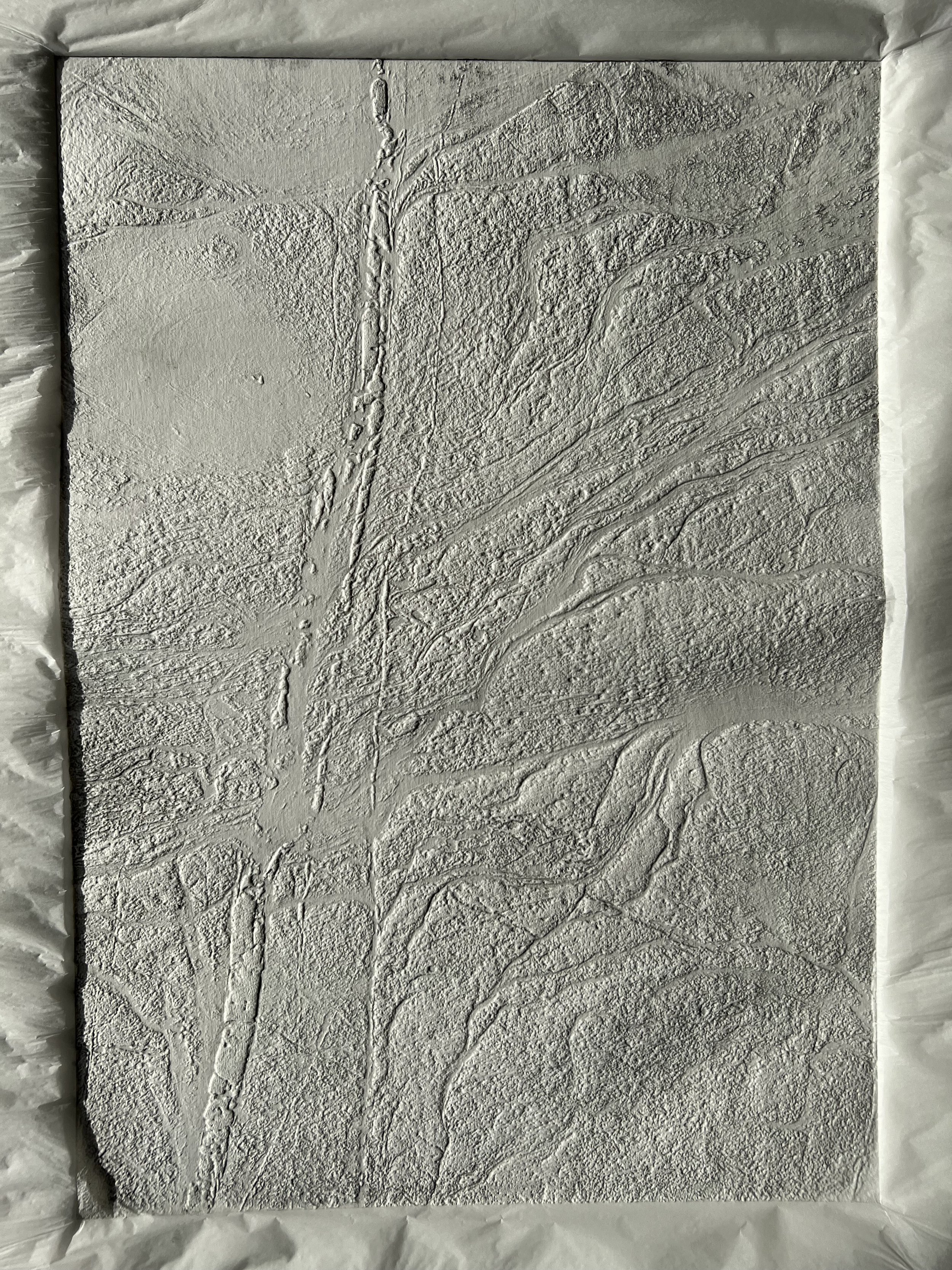
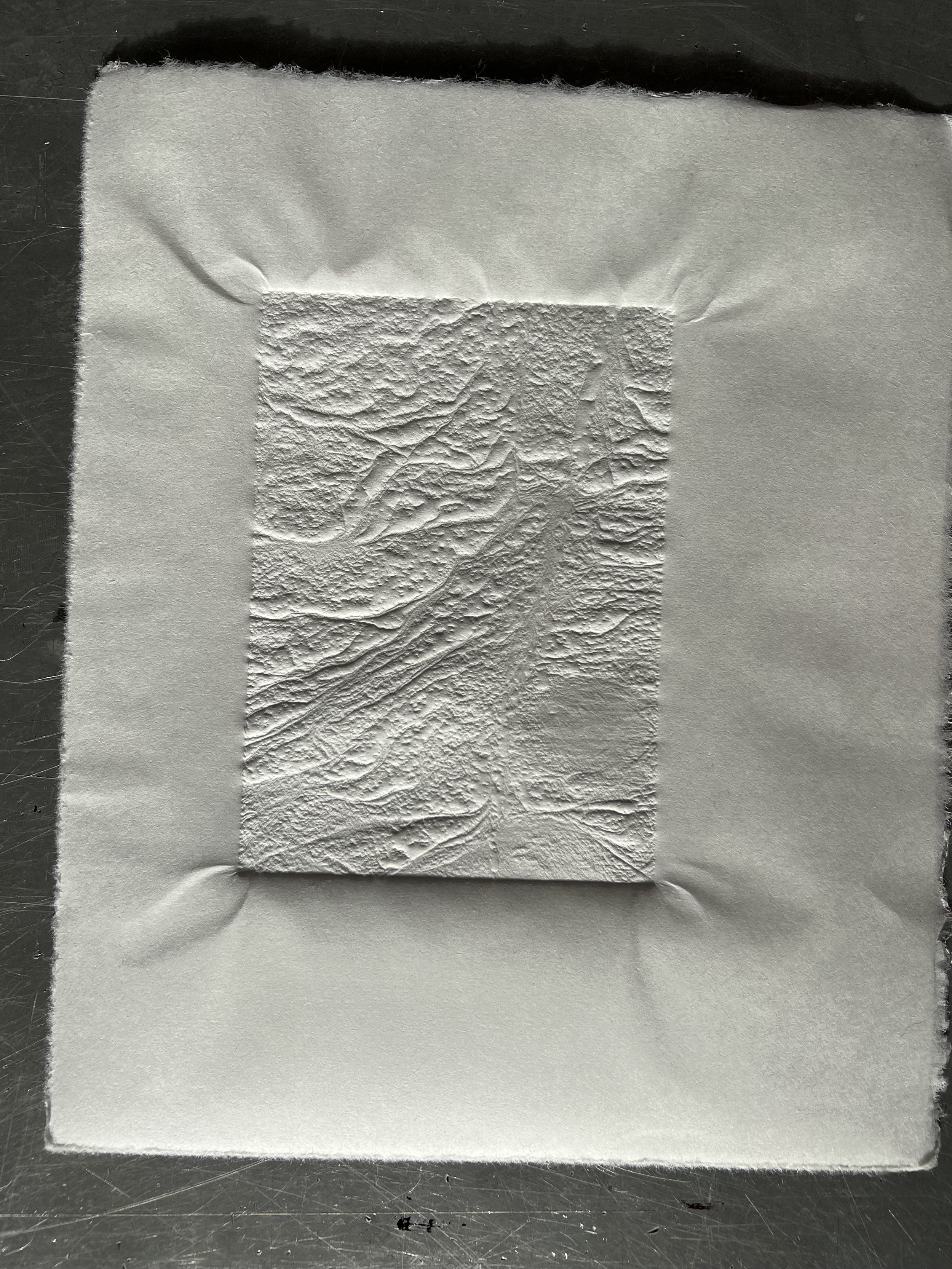
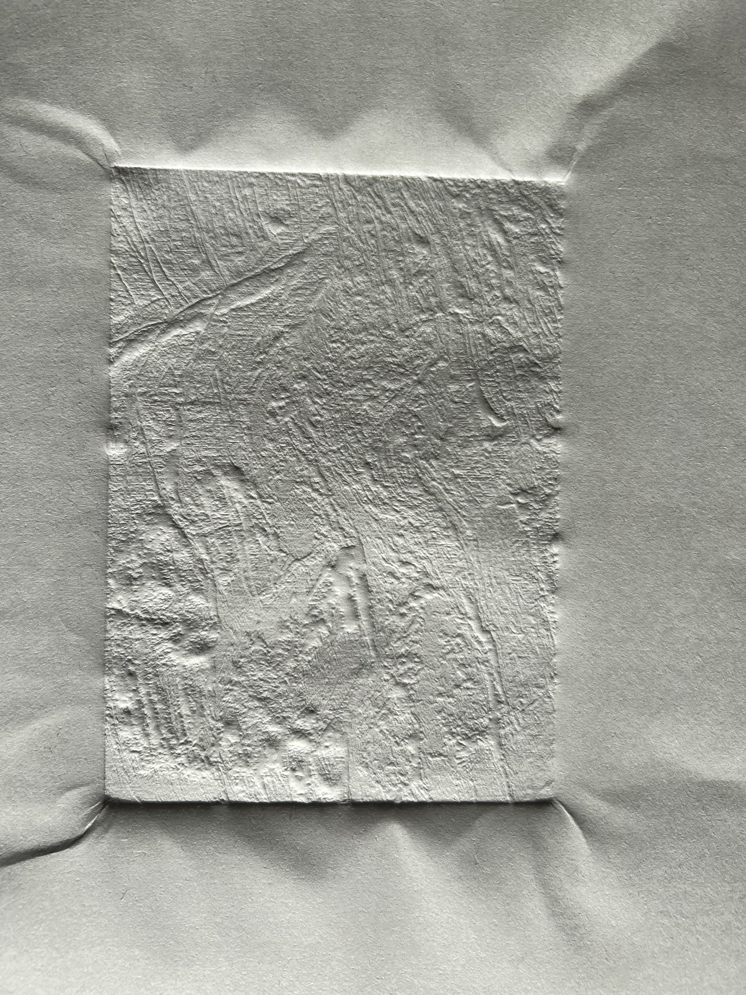
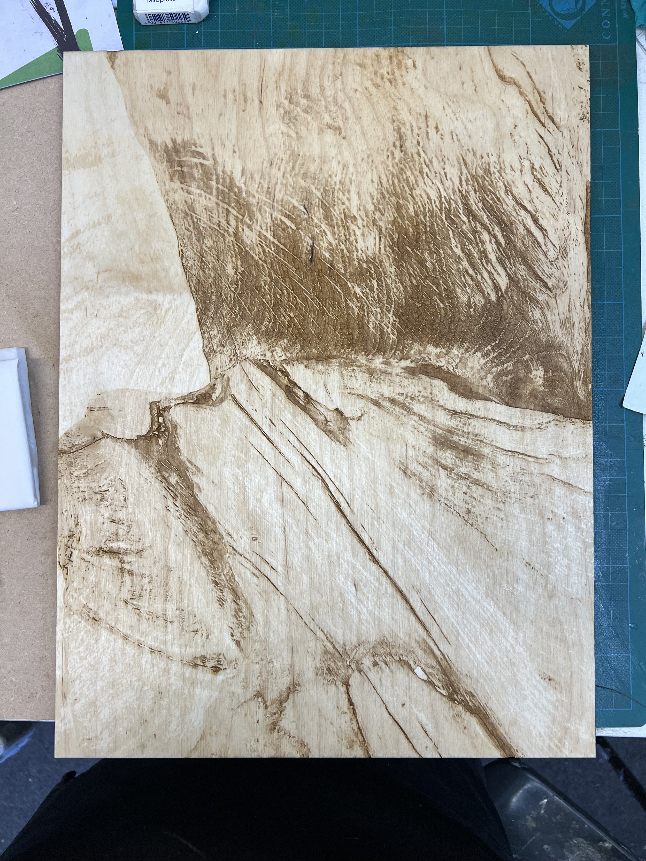
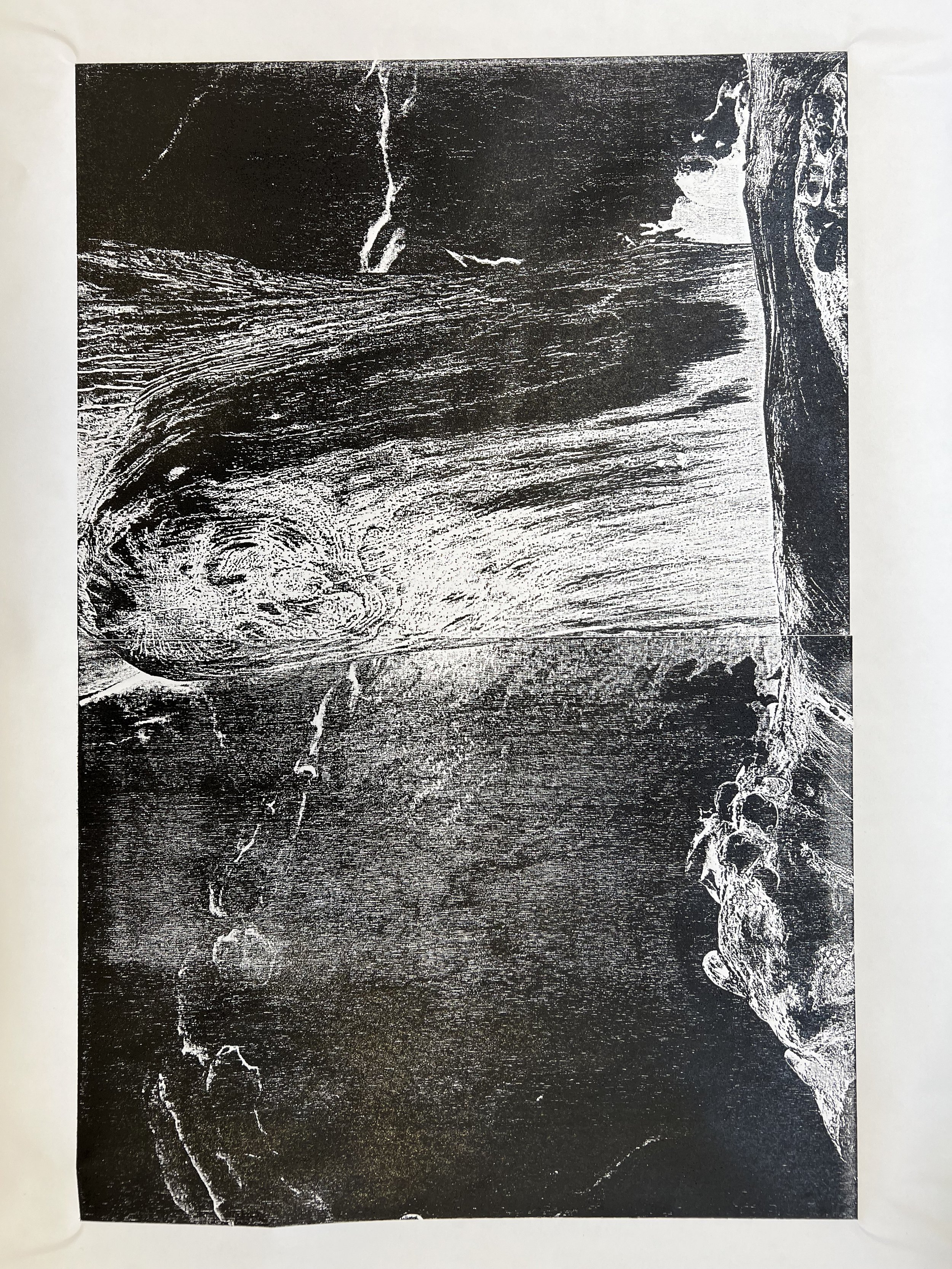
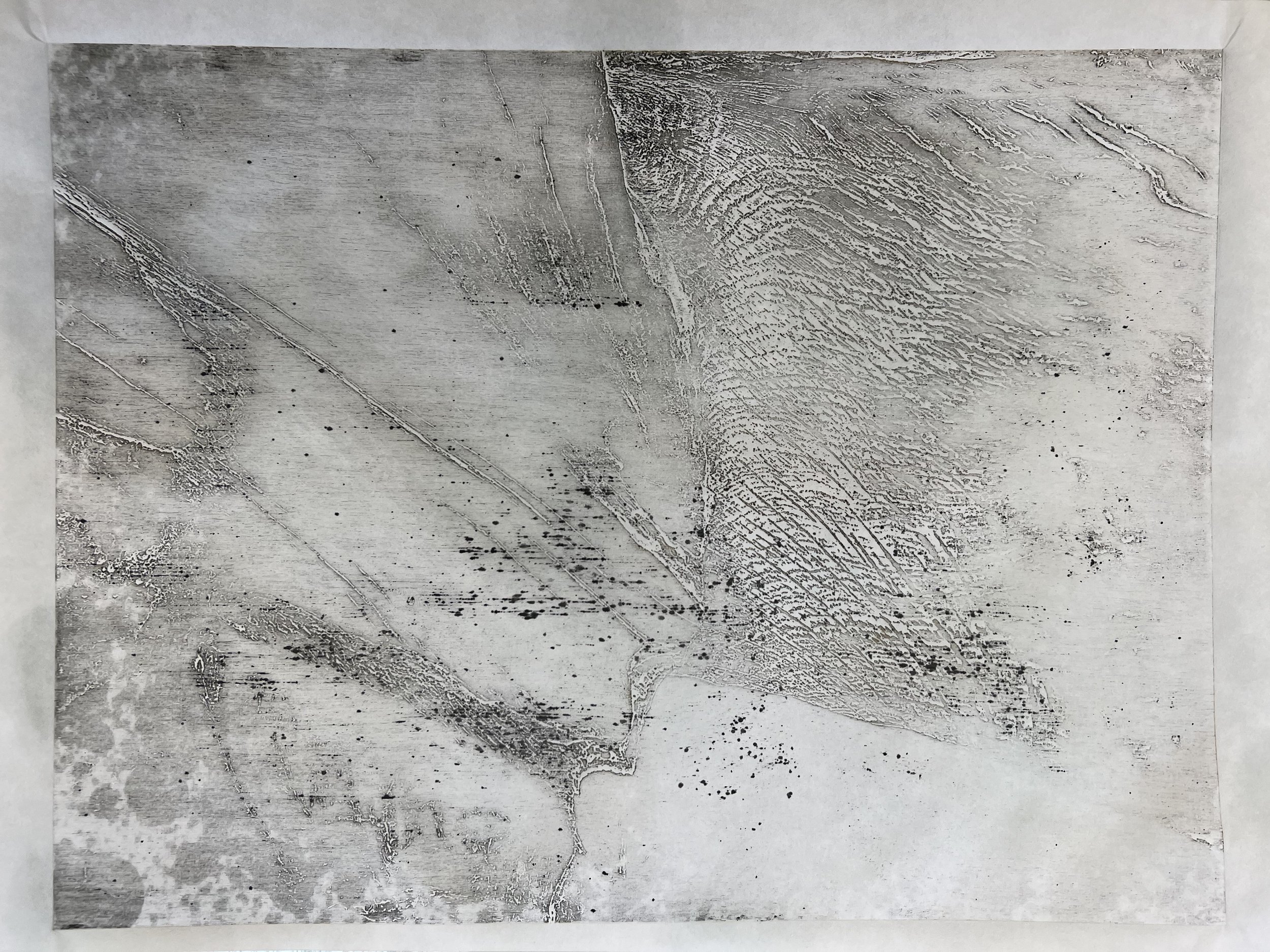
I wanted to try intaglio printing the laser etched wood cuts that I had made in the previous unit, so Brian set up the mid-sized Rochat press with rails the same thickness as the plywood plates and some old, worn collograph blankets. In fact the intaglio print did not work well – the ink obliterated any detail – but the first blind embosses worked well and then, as I took more prints and ink was removed from the plate through ghost prints, the images became much more interesting. Brian suggested using the Beevers hydraulic press to get a deep emboss with these plates, which Pete showed me how to do. Early results were not great – I wasn’t getting a sufficiently deep emboss – and the press itself was hard to use and very heavy. In an experiment for scaling up, I laser etched 4 A3 plates to create an A1 print – the original image was of one of the groynes at Rye Harbour: lots of different texture – wood grain, sand, water and pebbles – and quite ambiguous as to its subject. I made the mistake of not inverting the image, so it relief prints as a negative, but I will try to address this with lighter ink and perhaps coloured paper. I achieved a much deeper emboss by using 3 blankets rather than the normal one.
These experiments gave me the confidence to try going much bigger for Bargehouse, though the time taken to etch those plates militates against scaling up beyond that without repeating some of the images in the final print. With that in mind – and thinking about my proposal for the July show – I have been etching a series of A4 textural ‘looking down’ images, to form the basis of my ceramic tiles and possibly also a large print containing multiple images: a record or map of personal moments of impact or influence. For now, I am printing individually on to kozo or Zerkall relief paper - the trick to achieving a deep emboss with these papers, but avoiding getting an impression of the blanket in the print, is to use dampened cartridge paper between the blankets and the paper.
Taku-hon rubbing revealing the wood grain
laser etching at work

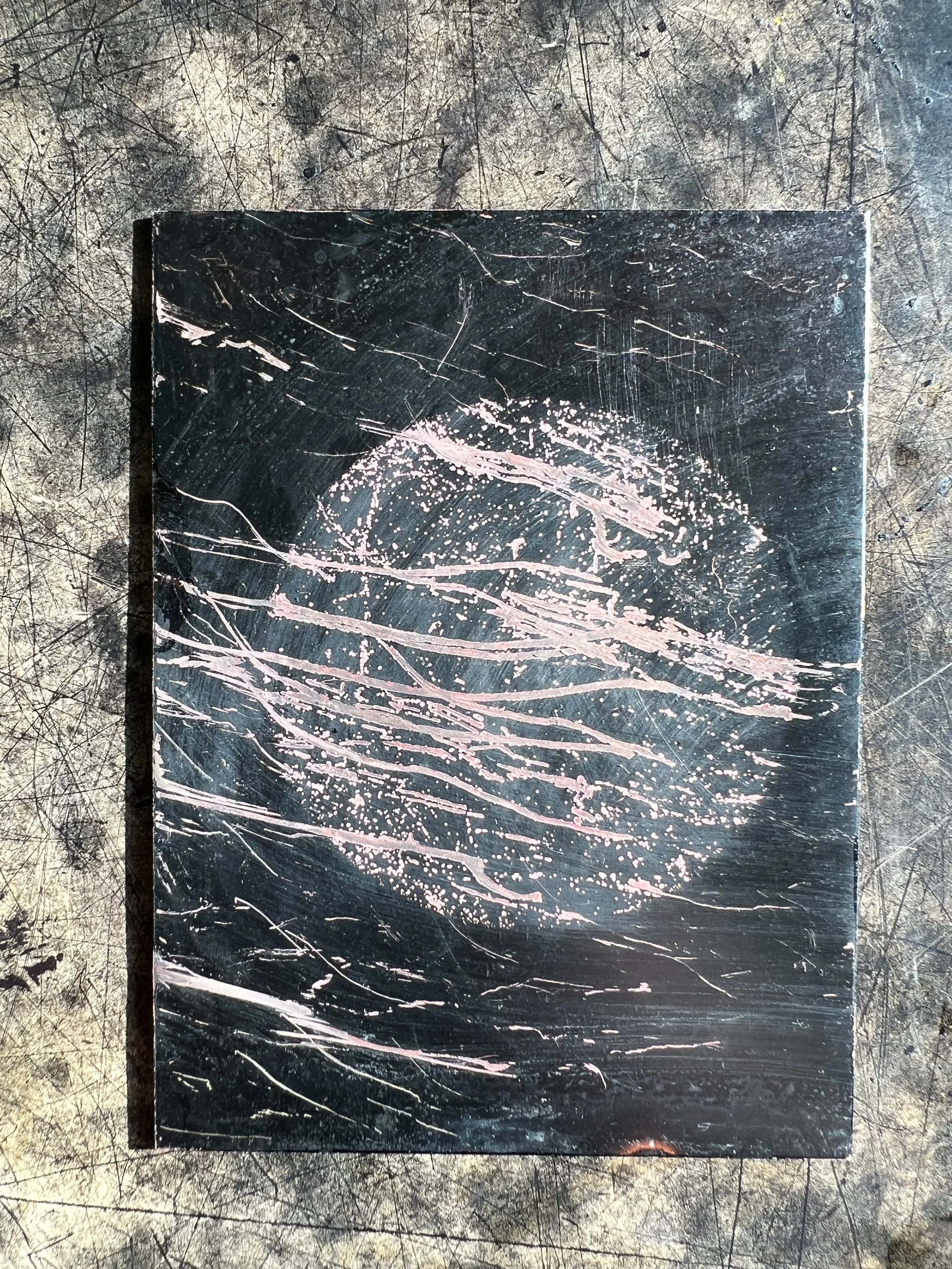
A3 plate of 'Riven' photograph

press set up

press blankets

laser etched plate intaglio inked - where the ink i pushed into the depressions in the plate

on the press bed

first print

printing on to black paper

ghost prints - consecutive prints taken without re-inking the plate

blind emboss in the tissue paper which protects the blankets

smaller A5 plates


testing folds


source photo for an A1 relief print

split into 4 A3 images


first plate laser etched

testing on kozo paper dampened with spray

starting to achieve a deep enough emboss

testing depth of laser etch on ply

and on environmount
laser etch settings for ply

and environmount

source image for Bargehouse print

mixing ink


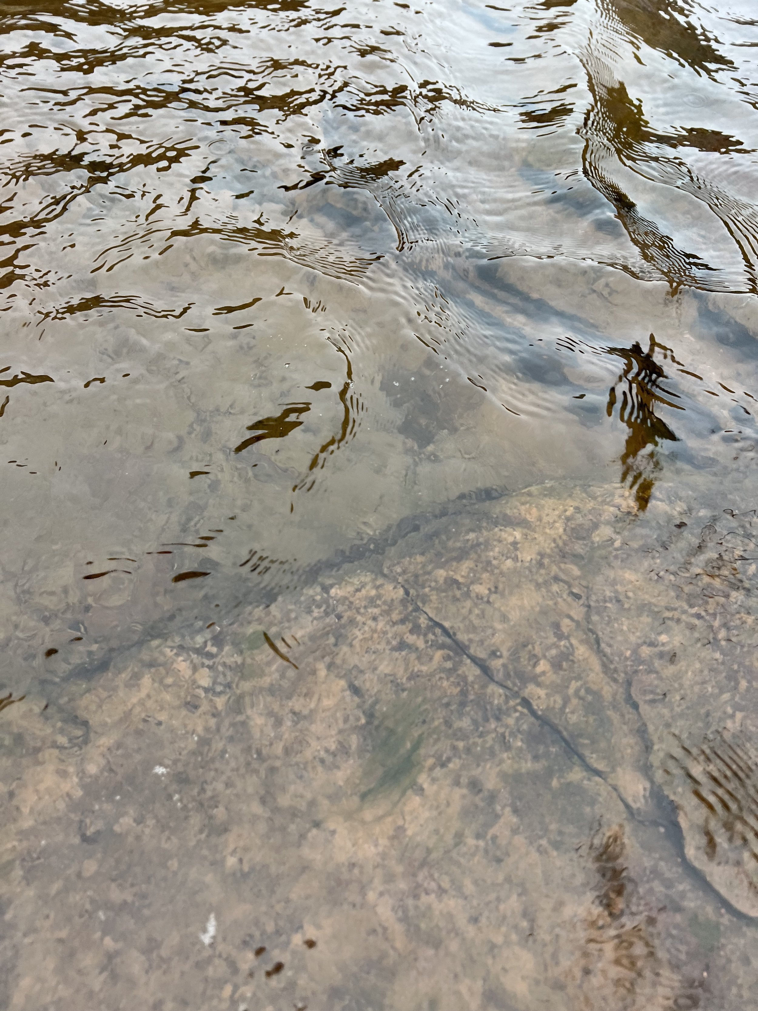
source images for the following plates: Brecon brook

ditch water in South Norwood

Gotland fleece

etched plates


inked plates


press set up

pressure

first prints


subsequent ghost prints


source images: Peckham pavement

fungi in Sydenham woods

Beer rockpool


testing miura folds on relief prints


cyanotype
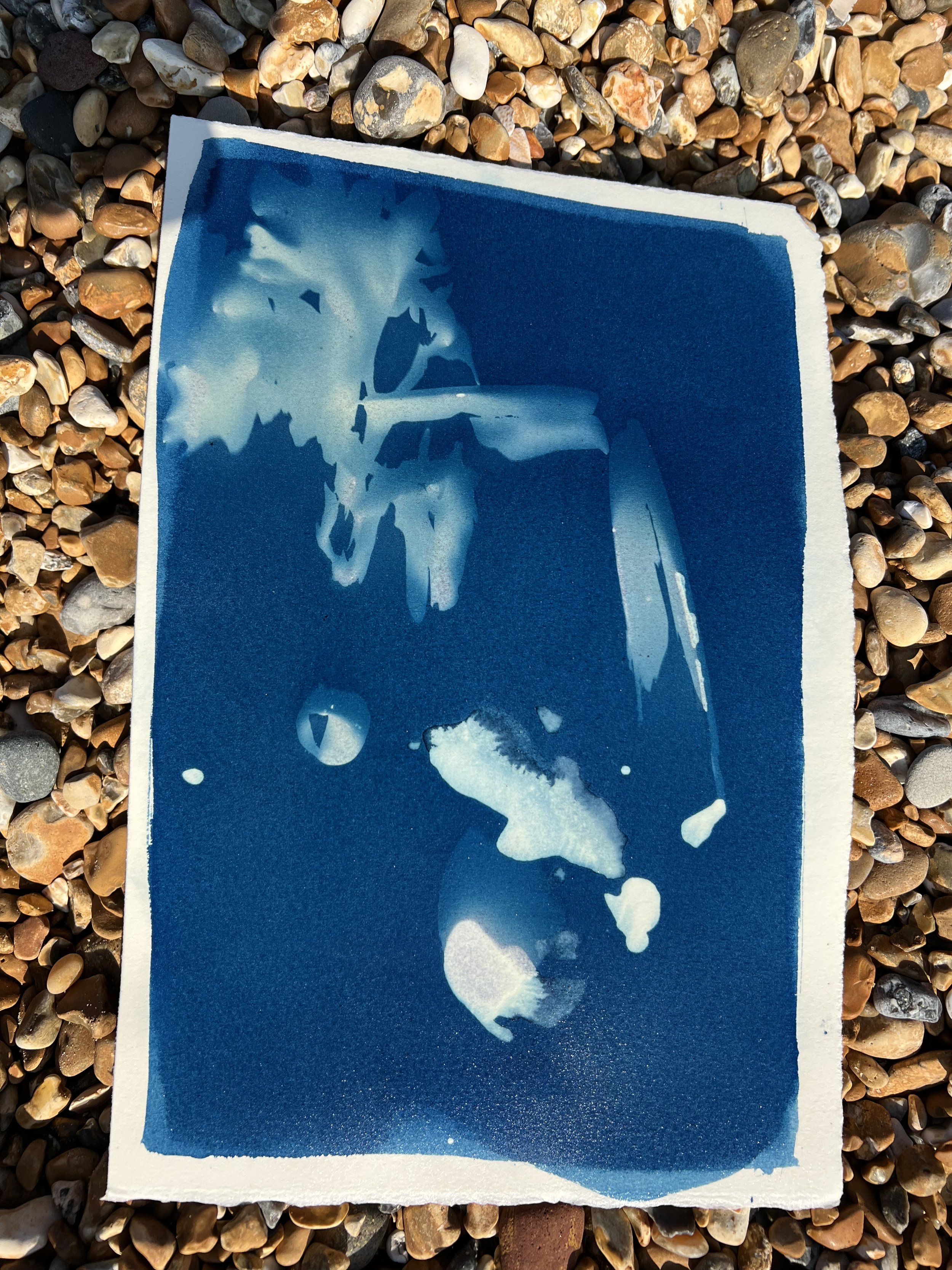
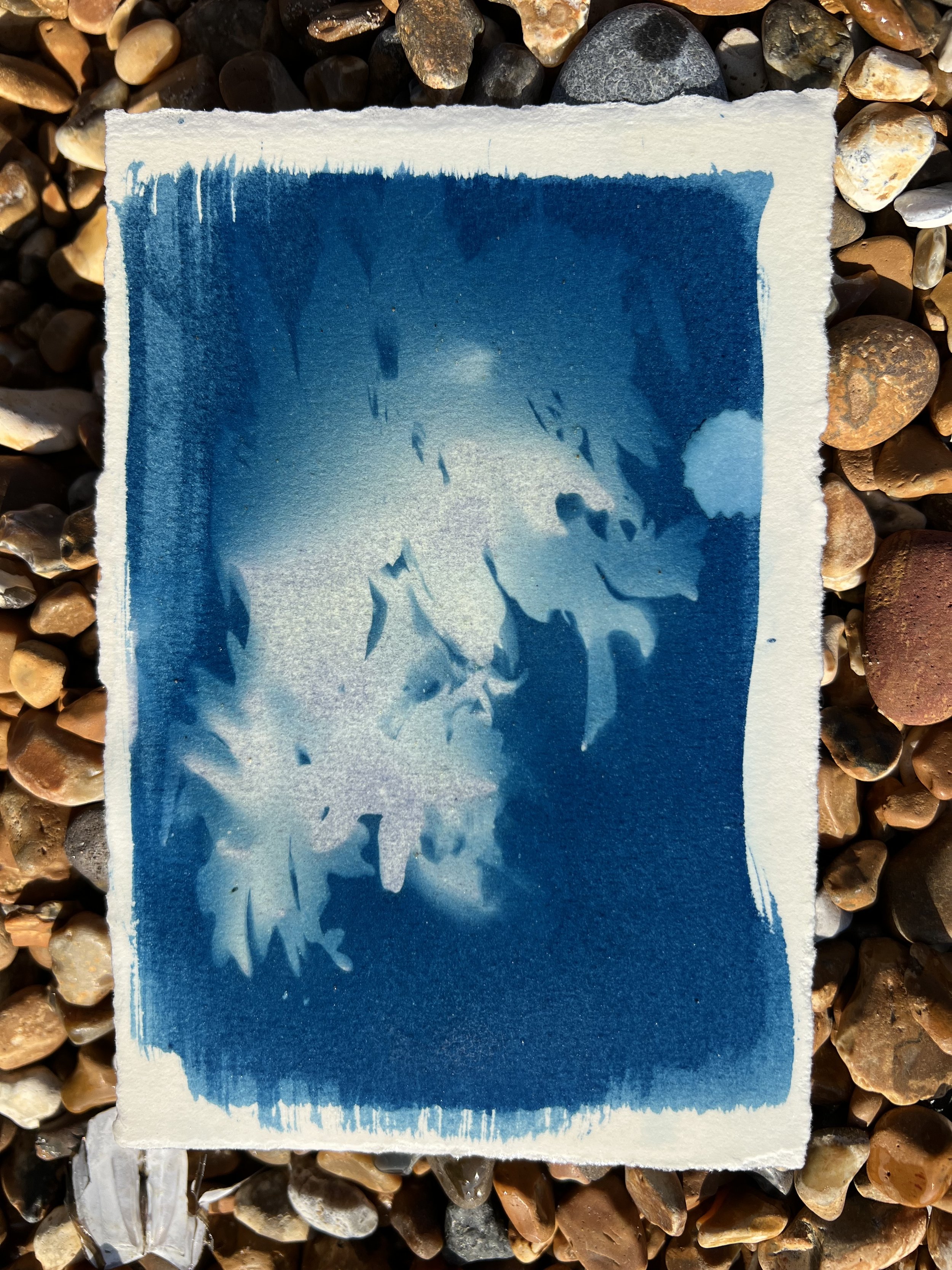
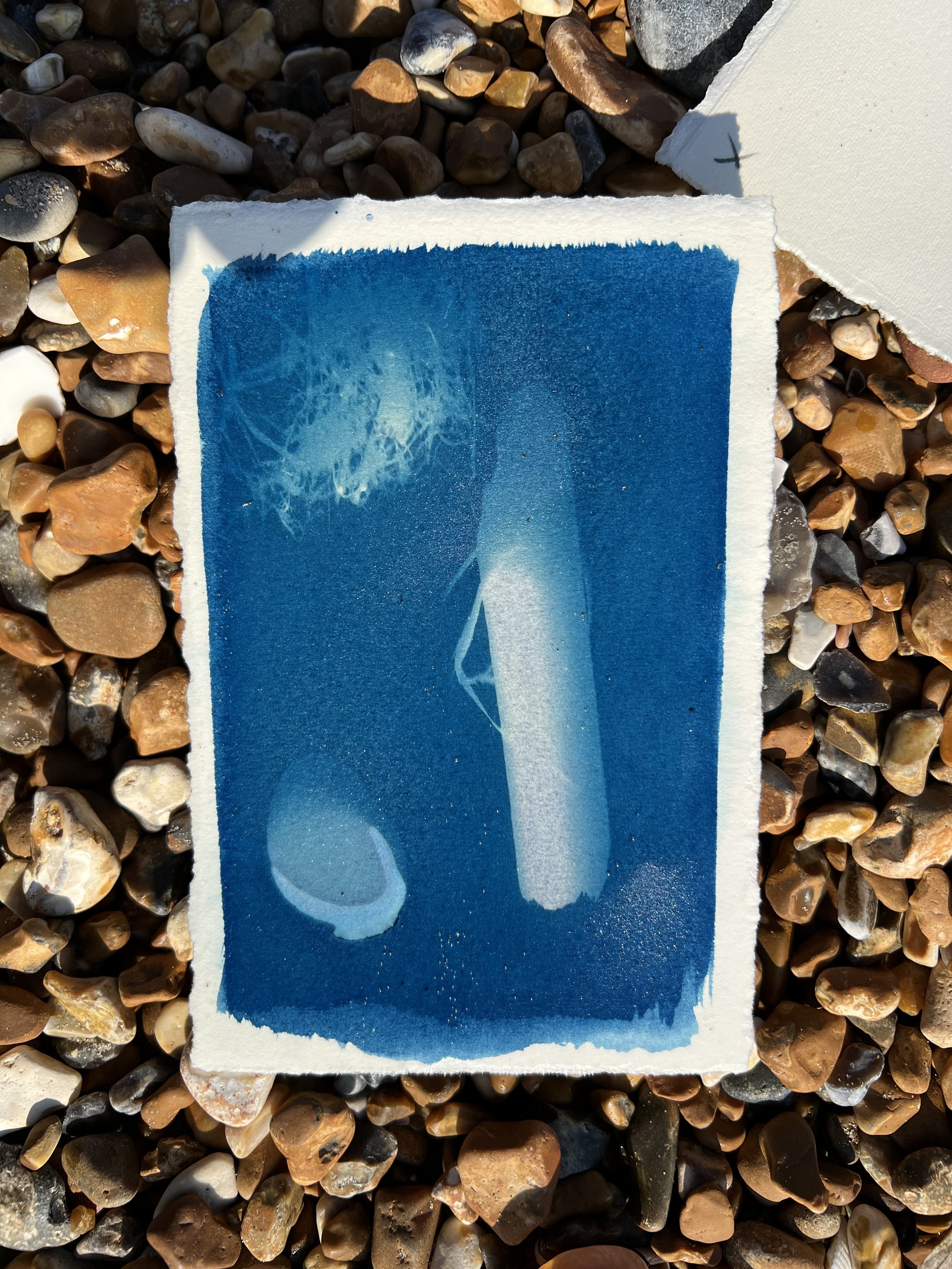
I wanted to revisit cyanotypes and had been thinking of Anna Atkins delicate and detailed prints of seaweed, so thought I would take coated paper with me to the sea to expose and develop some prints there. I was pleased with the results – the randomness of drops of water from inside shells that I placed on the paper, the softness of the edges of the objects because they weren’t pressed into place by a contact printer, the haphazardness of both the exposure and the washing out of the chemicals into the sea (I got my feet wet, of course).
Since I was thinking of scaling up my work, I digitally printed one or two of the resulting prints in black and white on to thick Somerset paper. I then etched a photograph of the nature reserve into these images – juxtaposing images of the landscape with things that exist within it. I would like to explore this idea further – I don’t think the resulting print works as it stands, but there’s something interesting in its concept and haptic nature.
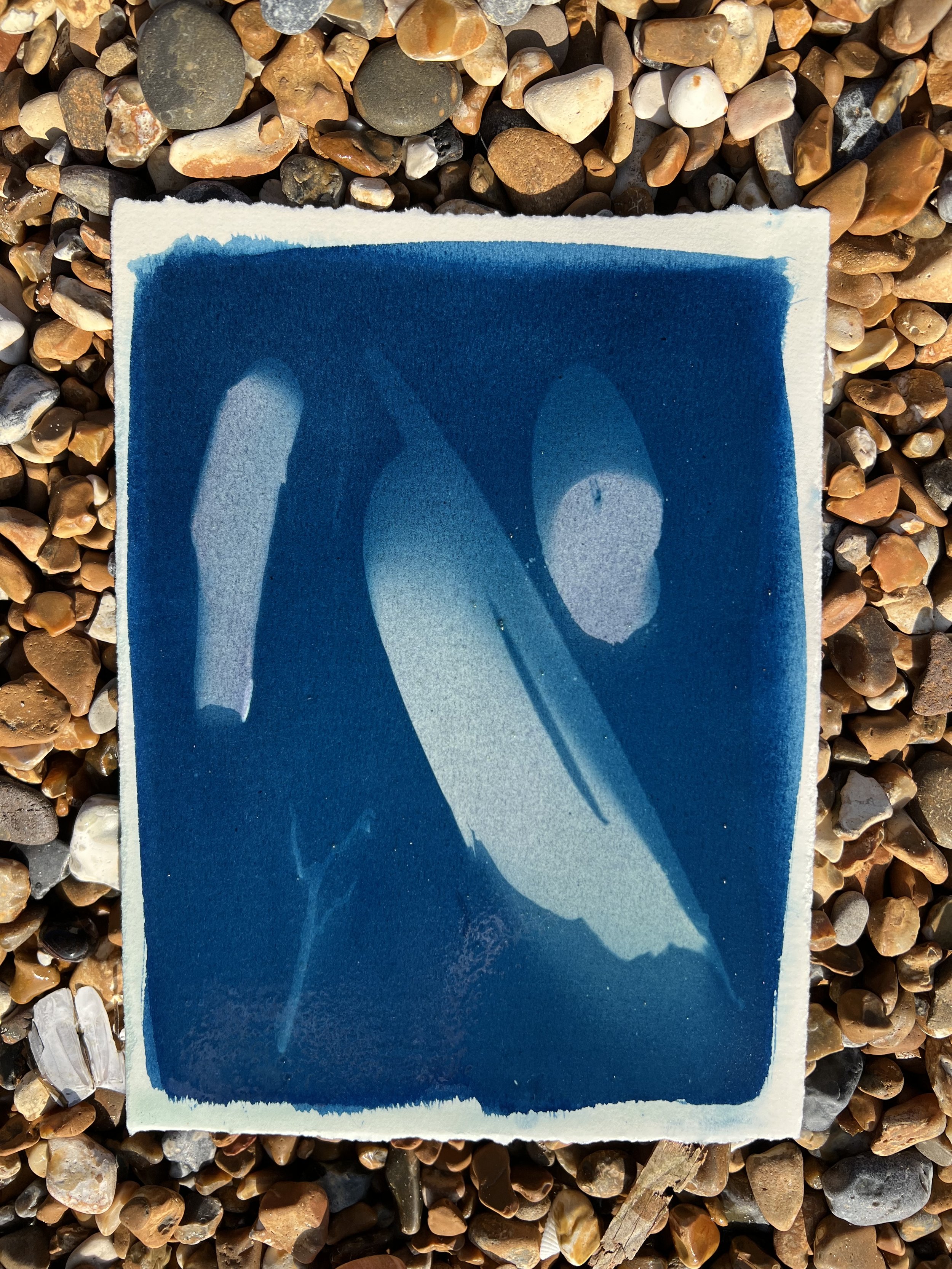
After working with the image of pebbles at the shoreline for Bargehouse, I wanted to try printing it as a cyanotype. I struggled again with using the Hahnemuhle sumi-e paper, which gets a beautiful feathered edge to the coating from the way the it bleeds into the paper, but dries so cockled after coating that it blurs the image. Hayde suggested an additional piece of glass to weigh it down in the exposure unit and really flatten it. The image worked on the Saunders Waterford paper, which shows the pleasing brush strokes at the edge of the coating.


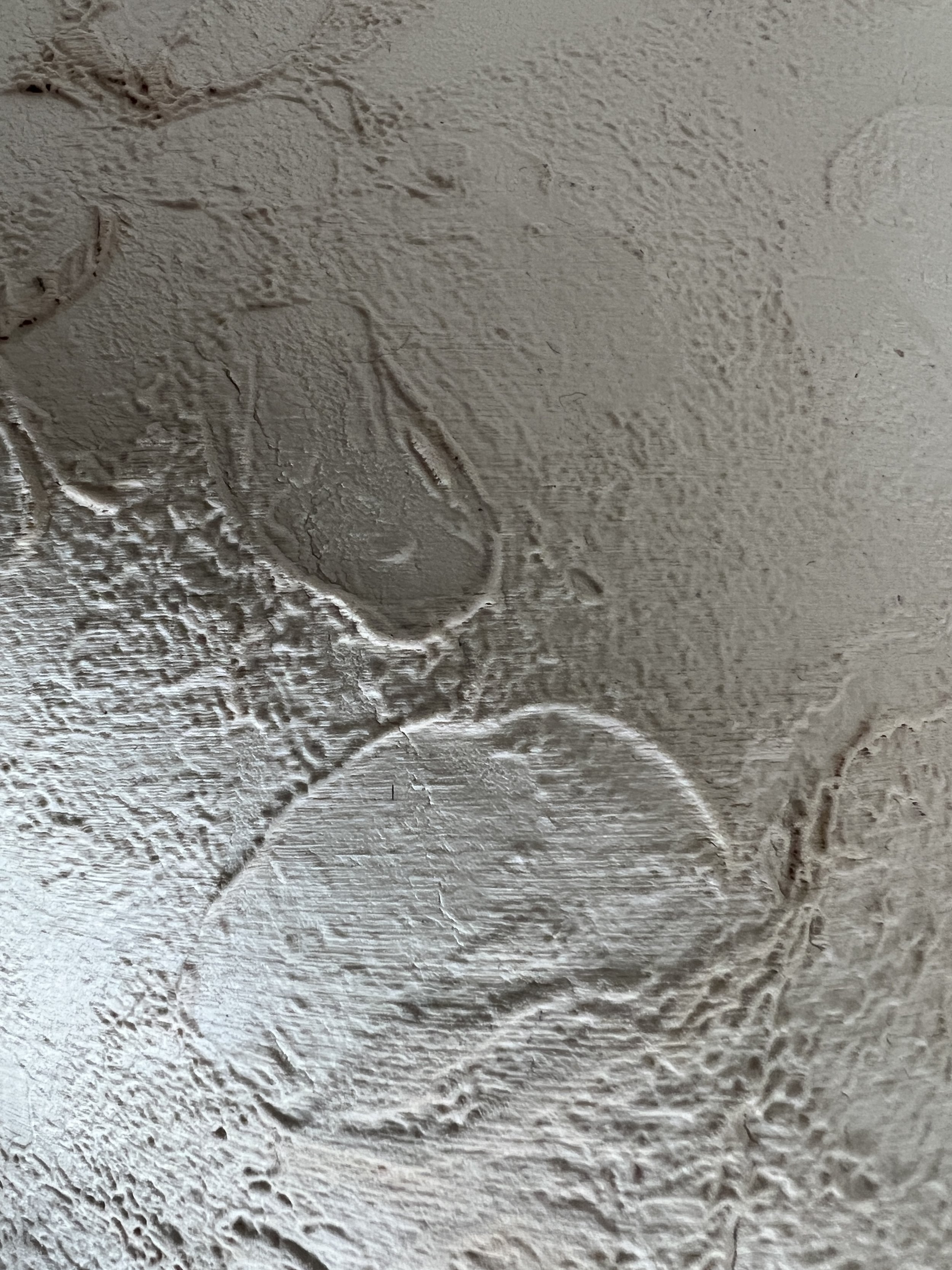
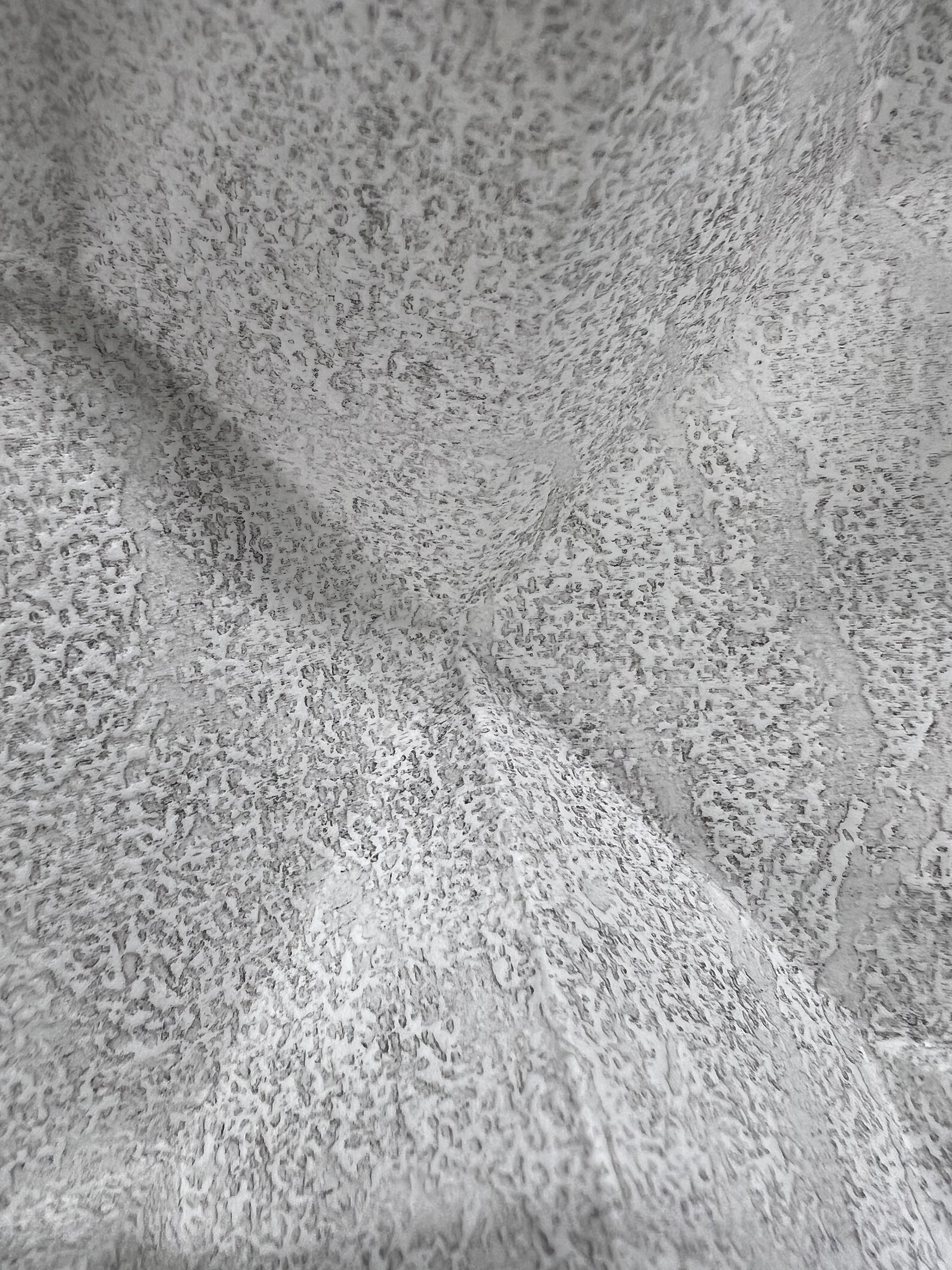
ceramics
I wanted to scale up the work that I had been doing using porcelain to make an impression of the laser etched wood plates – and I wanted to be able to do a better job of making the impression and – more importantly – releasing it from the plate. I decided to approach scale through tiling – cutting the impression from a plate into smaller parts which could be imperfectly reassembled to create the image. Once I had made some tiles though, I tried them out jumbled up – moving away from the image and focusing instead on their tactility and the way that the relief evoked the topography of a landscape. I did manage to produce and fire an A4 size piece – though it was missing one corner – and might think about producing these as stand-alone ‘prints’ if I can improve my technique. My intention is to make a large scale installation of these tiles – an imperfect map of key personal memories – for the summer exhibition in July.